Introduction
In this post we explore the use of a first loss model in the case of the Polar Star Limited relative value commodity fund. To do this we study the monthly return characteristics of the fund using Monte Carlo Analysis.
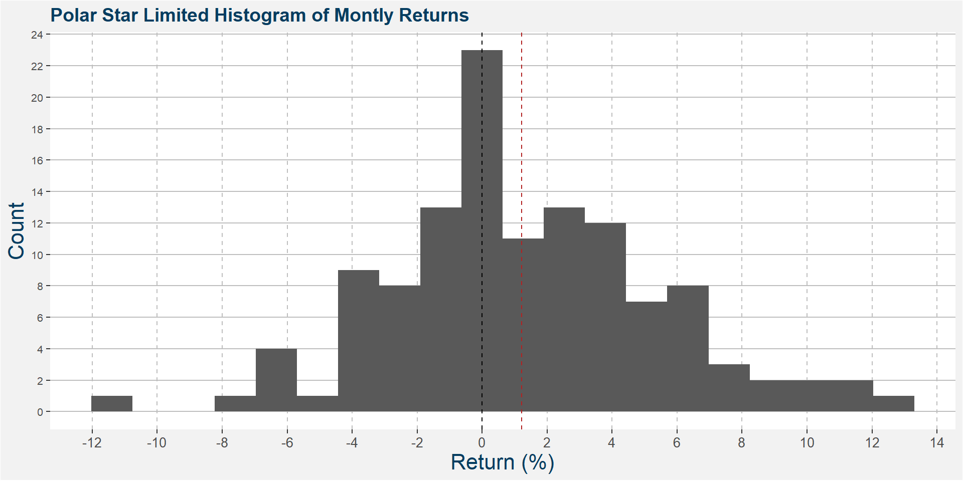
The idea behind the Monte Carlo analysis is to sample returns from the collection of historical returns which can be viewed in the histogram below. The dashed vertical line is set at zero. Notice the asymmetry in the distribution of returns with the right hand side of the plot requiting much more paint compared to the left. This will be reflected in the positive skew, 0.18, of the returns. The red dashed vertical line is at the mean return of 1.22%.
Historical Monte Carlo
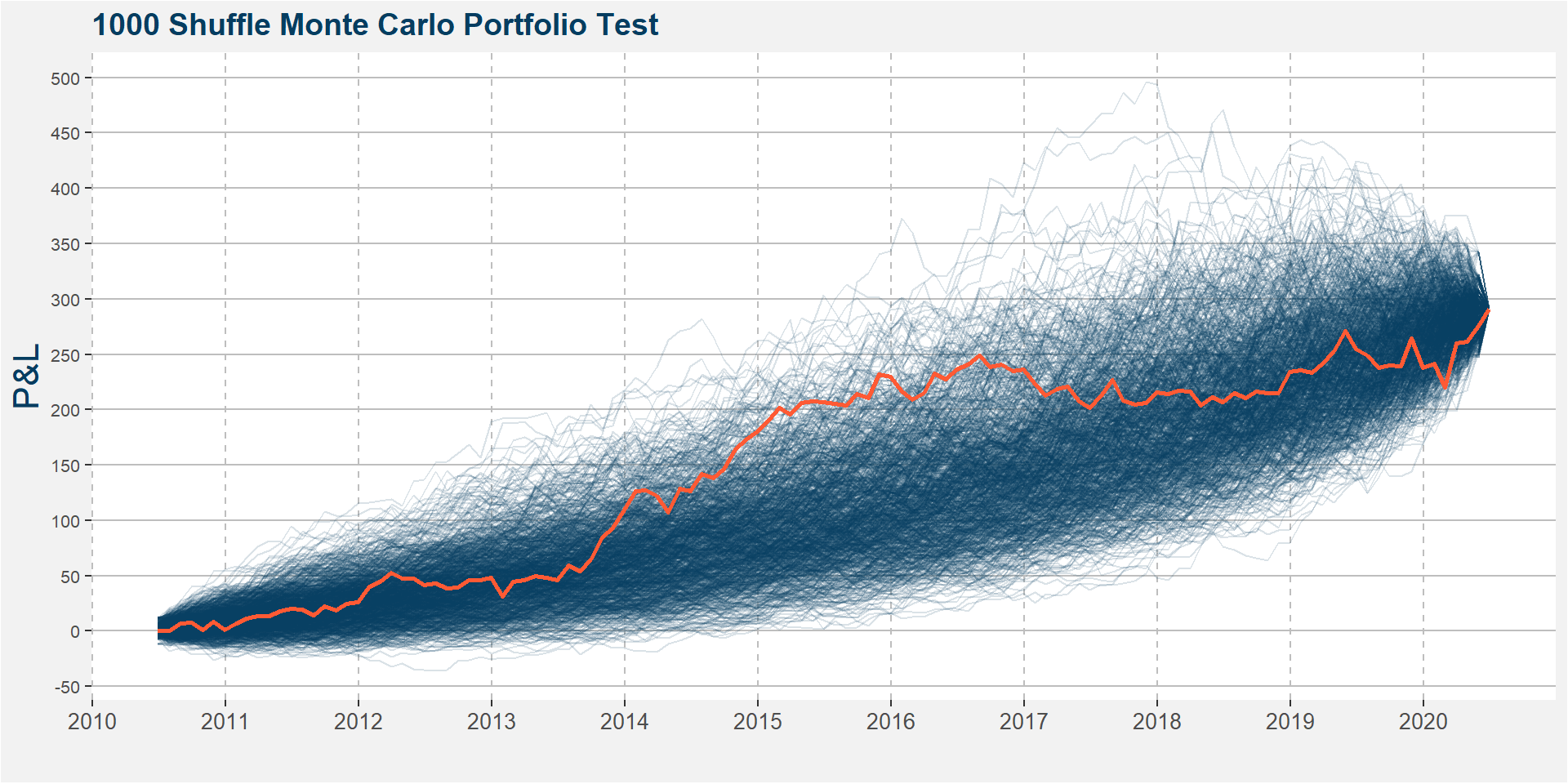
In the plot below we show the results of 1000 differnt return stream shuffles of the historical returns of the Polar Star Limted Fund monthly returns. The realised returns are highlighted by the orange line.
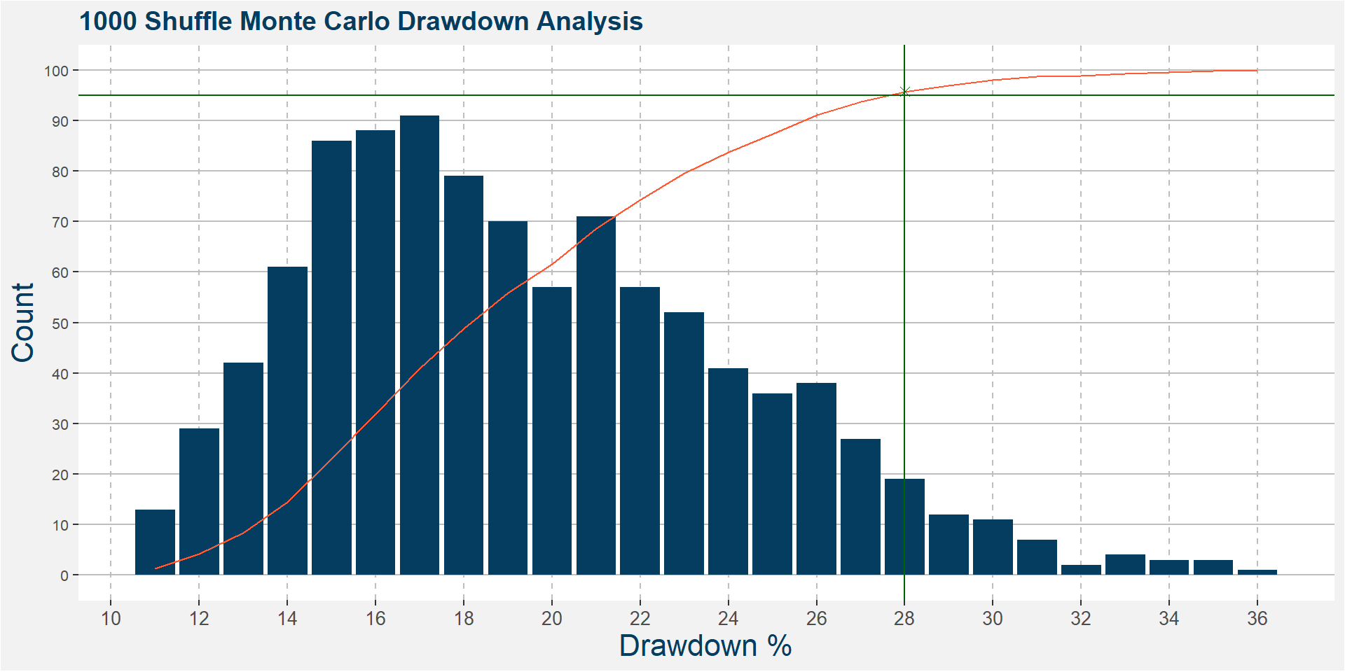
From the entire return stream above we can determine some drawdown statistics, these are shown in the table below and are expressed in percentages. Over the ten year period sampled the smallest drawdown was 11.62%, the deepest drawdown was 36.06% and the average draw was 19.93%.
| Best Draw | Worst Draw | Avg Draw |
|---|---|---|
| 11.62 | 36.06 | 19.93 |
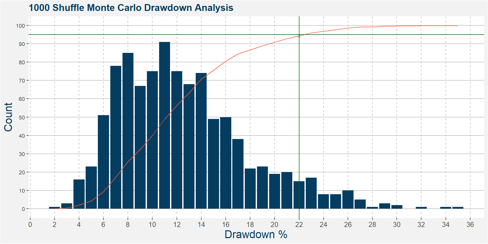
The plot below bins all the maximum drawdowns for each of the 1000 shuffles shown above into percentage bins. The orange line represents the cumulative probability distribution of the maximum drawdown bins and is asymptotically converging to 100. The green x at the intersection of the vertical and horizontal green lines indicate the 95% confidence levels of the maximum drawdowns of the historical shuffled returns series. In words, from the historical returns, it can be argued that there is a 5% probability of seeing a maximum drawdown greater than 28% over the next ten year period.
Three Year Forecast
The data above uses the entire sample, here we restrict the output to a three year window and perform the same analysis as above.
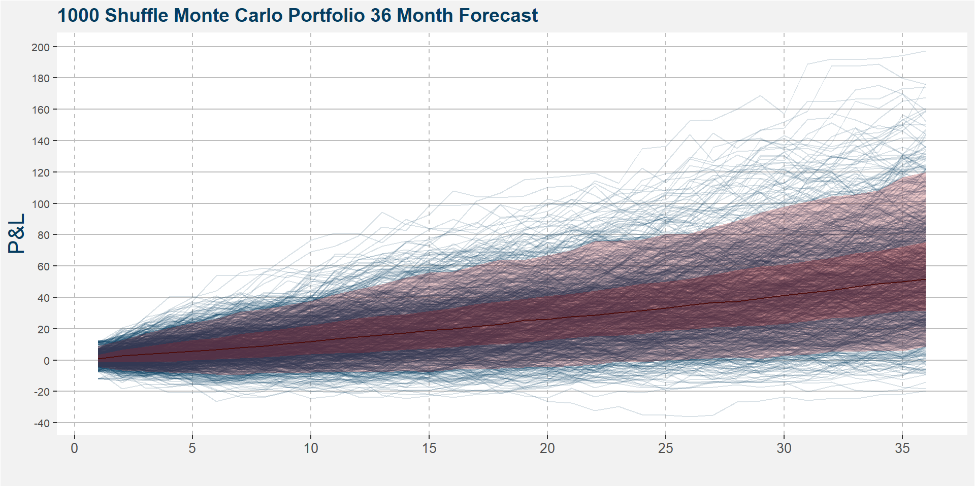
The table below shows the cumulative returns after 12, 24 and 36 months respectively. The column headings, p25, med and p75 refer to the 25th percentile, the median and the 75th percentile. In the plot above this is shown in the darker shaded region. The lighter shaded region shows the 5th to 95th percentile.
| month | p25 | med | p75 |
|---|---|---|---|
| 12 | 4.55 | 14.71 | 26.69 |
| 24 | 16.82 | 31.58 | 48.73 |
| 36 | 31.17 | 51.52 | 75.19 |
Time Window Analysis
Below we show the historical performance of the Polar Star Limited Fund over two and three year rolling periods. The first two plots show the histrograms of returns while the table at the bottom summarises the data.
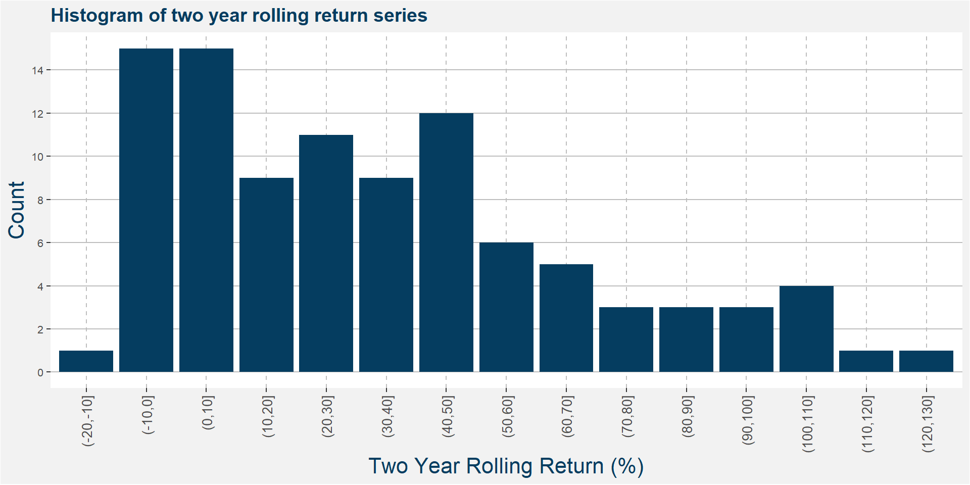
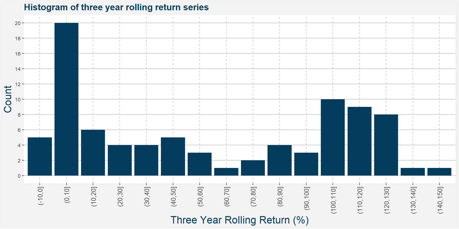
| Statistic | 2 Year | 3 Year |
|---|---|---|
| Best | 121.36 | 140.82 |
| Worst | -10.99 | -5.22 |
| Average | 33.96 | 57.97 |
| Median | 29.25 | 47.00 |
| Last | 27.46 | 29.43 |
| Winning (%) | 83.67 | 94.19 |
| Avg. Pos. Period | 41.57 | 61.67 |
| Avg. Neg. Period | -5.00 | -1.88 |
| # Of Periods | 98.00 | 86.00 |