Introduction
In previous posts we have explored ideas on how to construct fundamental models for forecasting the price of corn and soybean. These models used as input parameters the stock-to-usage numbers calculated from the monthly WASDE reports together with the Dollar index, the mean value of crude in the previous month and the Ruble vs Dollar exchange rate. The aim of this report is to extend these results to a spread between two related commodities, in this case corn and Soybeans. We use the shorthand C vs S for this pair.
When we calculate the price difference between two commodities in the strategy Commodity 1 vs Commodity 2 we follow the convention
\[ S^A = P^A_2 - P^A_1 \] where \(P^A_i\) is the price of contract with symbol \(A\) for commodity \(i\). After all the spreads have been calculated we associate the spreads between two consecutive WASDE reports with the timestamp of the first report. This way we assume that the WASDE reports reflect reality with repect to the underlying fundamentals and we want to study the subsequent spread behaviour. Similar to the spread convention we use the difference between the two fundamentals defined by
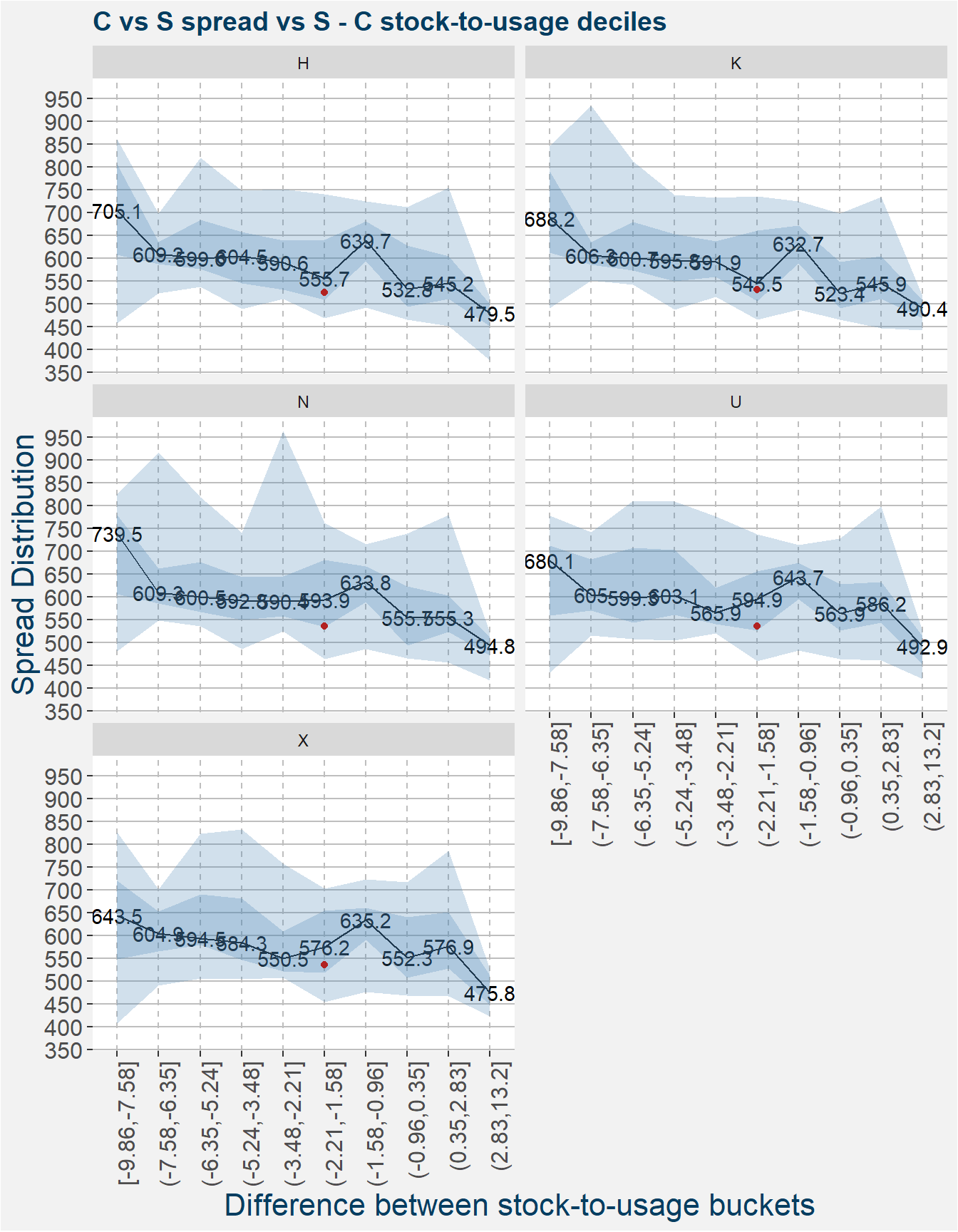
\[ \delta = F_2 - F_1. \] Here \(F_i\) is the value of the particular fundamental of commodity \(i\). In this example we use stock-to-usage values. We collect all the different \(\delta\) values ang group them into decile buckets. This amounts to dividing all the different \(\delta\)’s into ten bucket all containing more or less the same number of entries. Withing these decile buckets we then calculate statistics on the spreads \(S^A\).
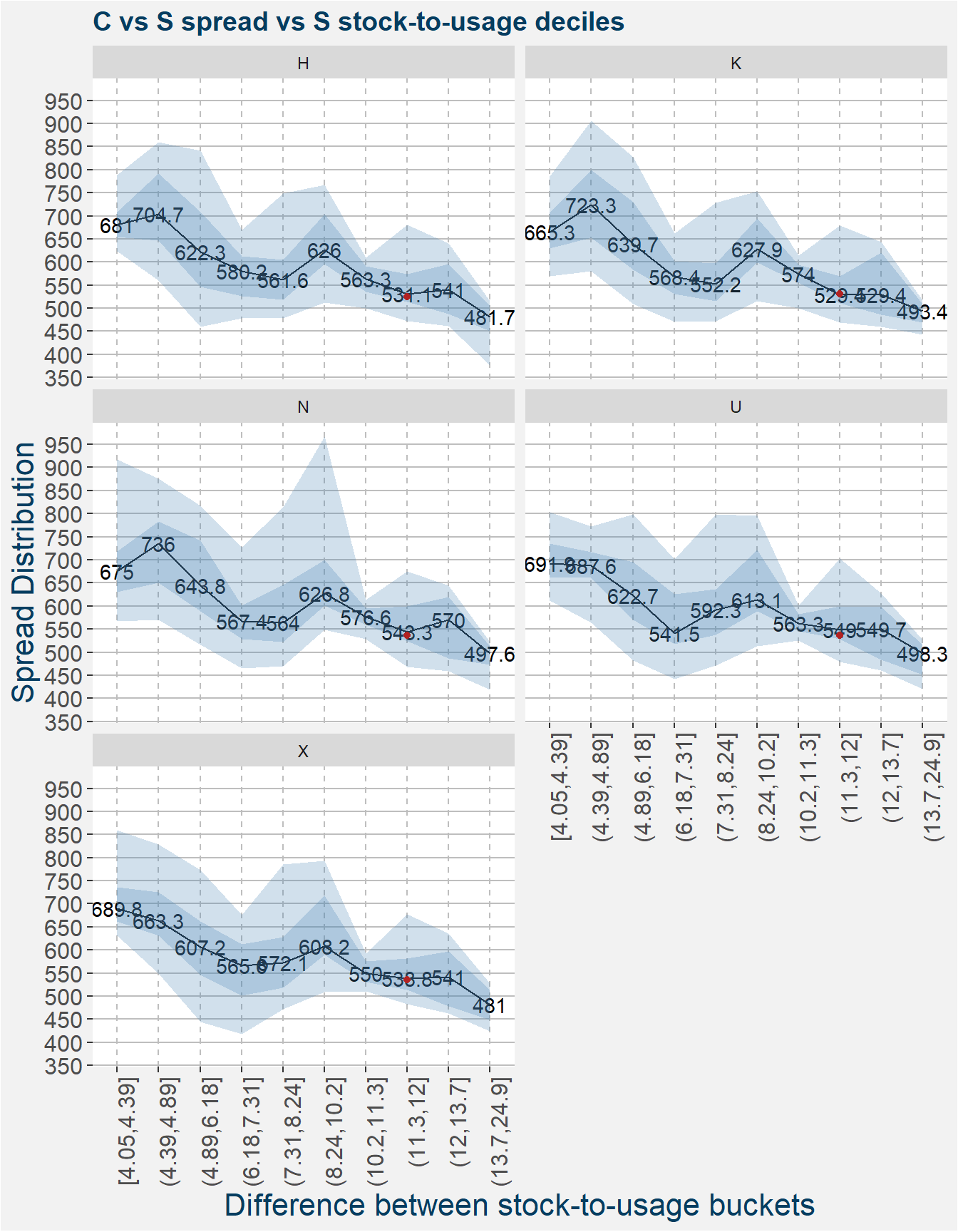
The different plots below show the spread statistics of each commodity contract code calculated withing the fundamental buckets shown on the x-axis. The darker and ligher shaded regions show the 25th to 75th and 5th to 95th percentiles respectively. The solid black lines shows the median spread. The latest value and associated decile bucket of the spread is indicated by the red point on each of the facets. From the plots below we can see that the C vs KW spread is on the lower range of the spread values given the current fundamentals.
In anticipation of the feature importance results we show the spread in the different contract months as a function of comdty2 which in this case refers to soybean stock-to-usage.
Another way to look at the prices of two related commodities is the calculate their price ratios. Similar to the spreads we use the convention
\[ R^A = P^A_2/P^A_1 \] to calculate the ratio of prices between commodities 1 and 2. Continuing with this convention we define the fraction of fundamentals as
\[ \phi = F_2 / F_1. \]
We then follow in exactly the same way we did in the case of the spreads, except we calculate statistics of the price ratios \(R^A\) within each of the decile buckets of the fundamental ratios \(\phi\). The interpretation of the plots below are the same of those of the spread case. Notice that when we express the relative value in terms of a price ratio it is trading at an even greater discount.
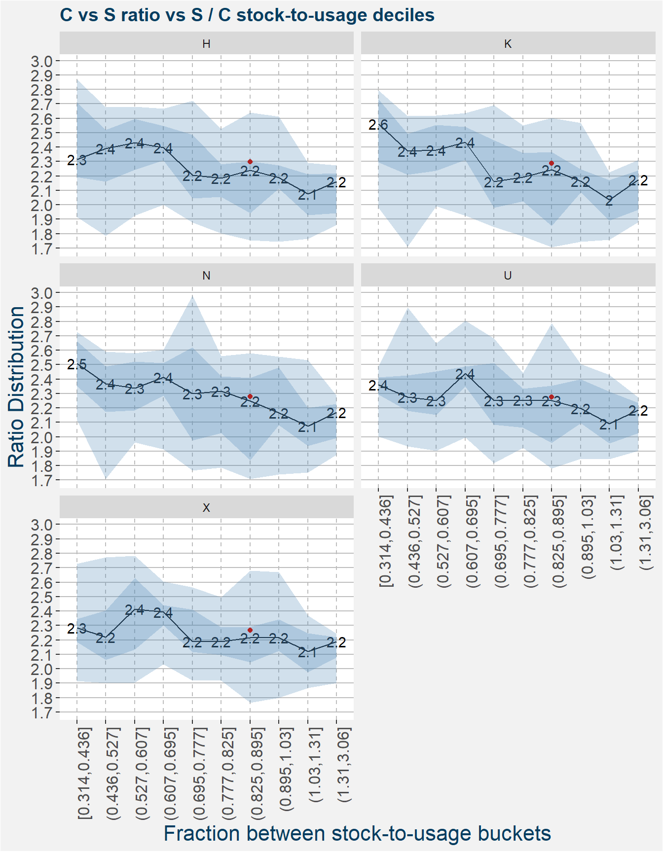
The plots above can give us a quick idea whether the current values of the spreads or ratios are trading at a premium or discount with respect the the prevailing stock-to-usage numbers reported by the USDA in the monthly WASDE report.
In the following we include more fundamental features in an attempt to incorporate some interaction terms that might be present. Below is a list of new features we include:
- daysdiff - the number of days left until the contract expired
- product - the product of the two stock-to-usage numbers
- comdty1 - stock-to-usage of commodity 1, C is this case
- comdty2 - stock-to-usage of commodity 2, S in this case
- lagged features - denoted by lag 1 where we include the results from the previous report
- delta - absolute changes between current and lagged values
- per - percentage changes between current and lagged values
Modeling the Spread
In a previous post we showed some examples how we use techiniques from machine learning in out investment process. One techinique we find particularly interesting is the study of feature importance when using random forests in the modelling process. Similar to what we have done in previous posts (here, here and here) we explore the importance of each of the features we have used in the modelling process.
The barplots below show the feature importance of each of the input features for the different contract codes. The feature with greatest importance is highlighted in orange. The dashed red line shows the value of importance if all the features were equally important. It is interesting to note that the differnt contract codes ahve vastly different features gives the best results for the majority of cases.
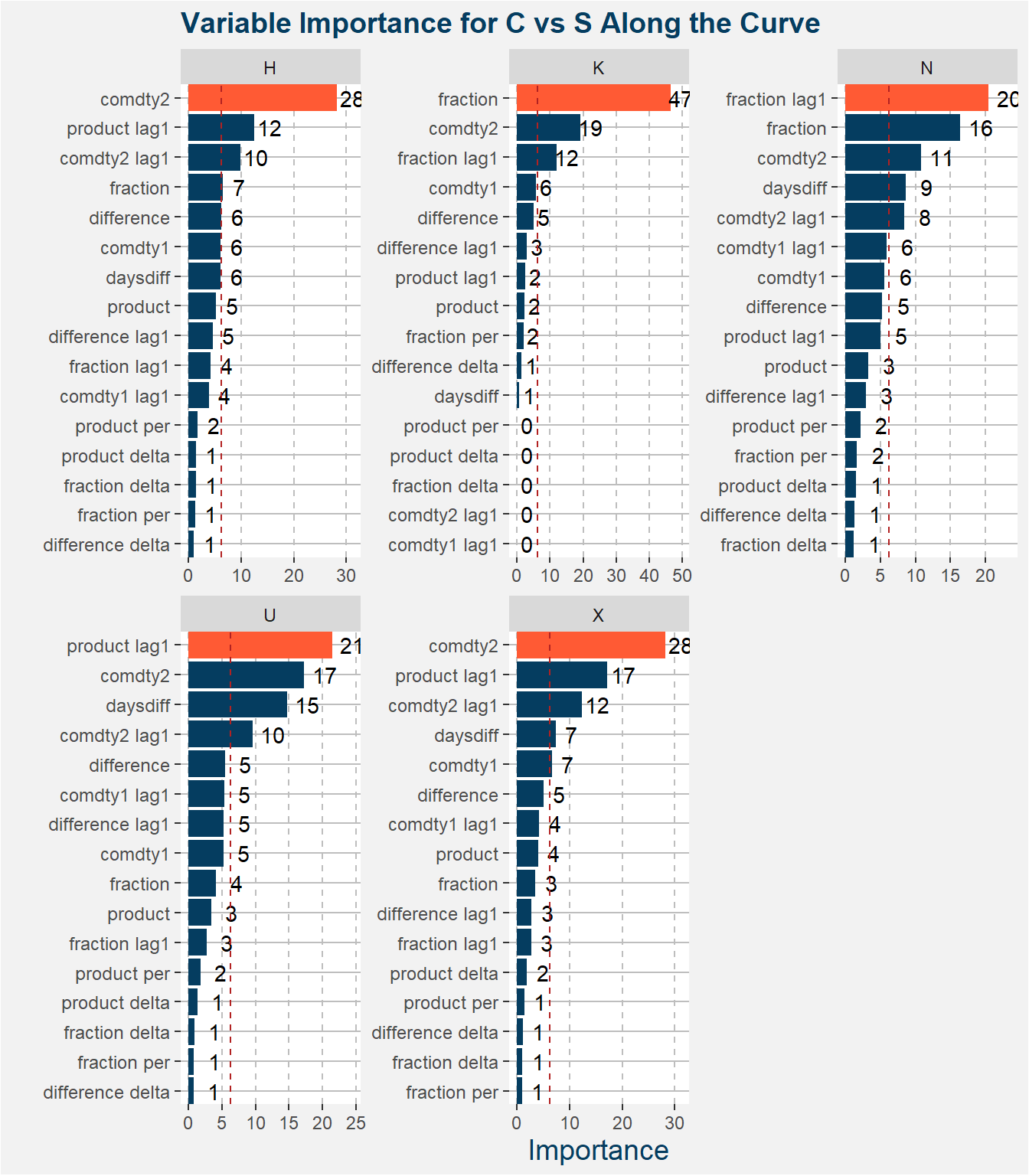
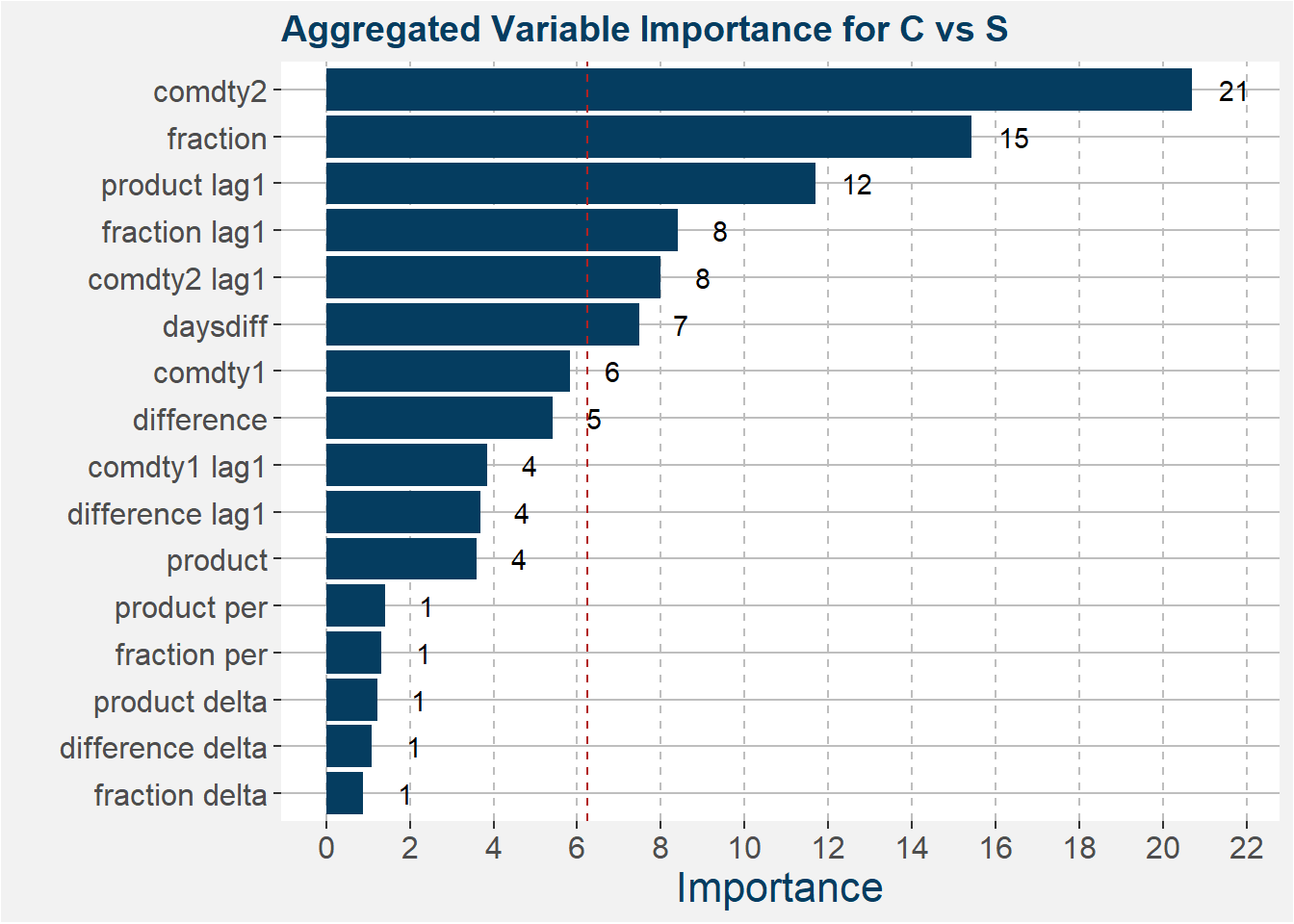
The plot below shows the aggregated feature importance values. From this plot it is evident that the stock-to-use values of S is the main contributing feaure followed by the ration of stock-to-use numbers.
The table below shows the model fit statistics for each contract code.
| code | R squared | mean cv score | std cv test score |
|---|---|---|---|
| H | 0.7090605 | 0.3630267 | 0.1713412 |
| K | 0.5994362 | 0.1709421 | 0.1936641 |
| N | 0.6028963 | 0.3369652 | 0.1621704 |
| U | 0.3090770 | 0.2422736 | 0.2963837 |
| X | 0.5542920 | 0.3591650 | 0.2056932 |
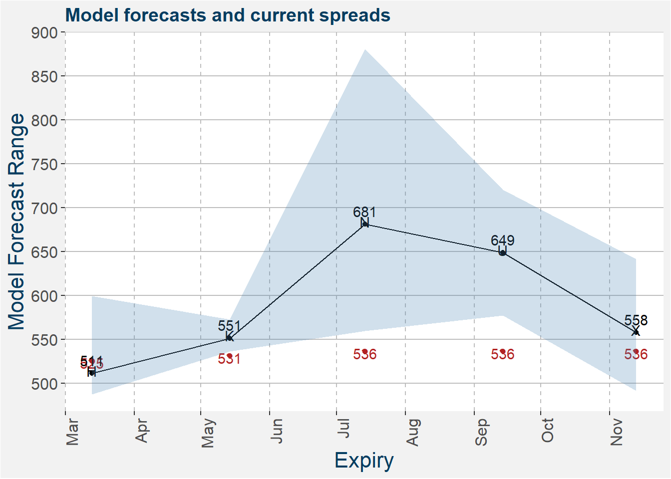
The model predictions together with the latest values of the spreads are shown in the plot below. The shaded regions shows the 25th to 75th percentile of the model predictions. Median predictions are represented by the solid black line. Current C vs S spread values are shown by the red dots.
Modeling the Ratio
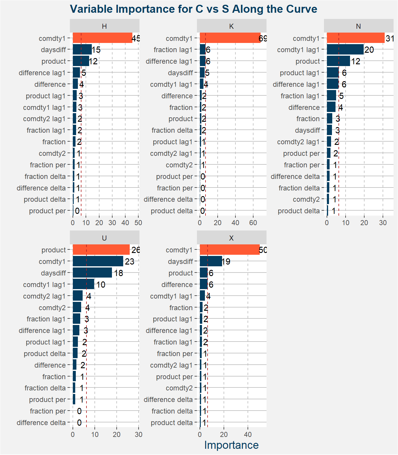
This section follows the same outline as the previous section with the exception that we replace the spread with the ratio. The barplots below show the feature importance of each of the input features for the different contract codes. The feature with greatest importance is highlighted in orange. The dashed red line shows the value of importance if all the features were equally important. It is interesting to note that the comdty1 feature gives the best results for the majority of cases.
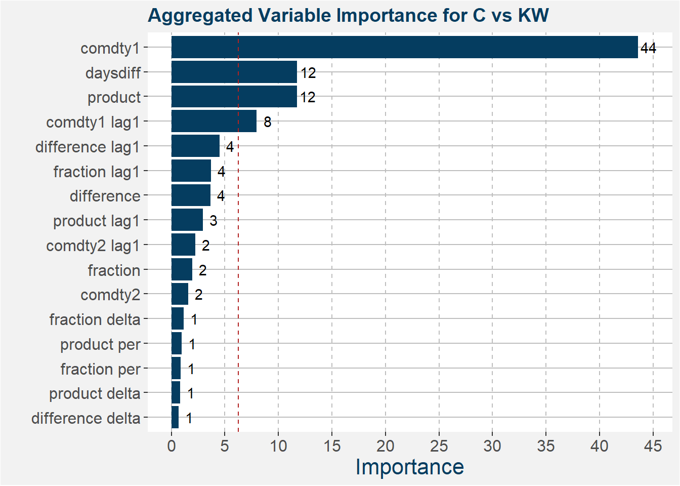
The plot below shows the aggregated feature importance values. From this plot it is even more clear the the comdty1 feature clearly dominated the predictive power of the model. It is also interesting to note that the daysdiff feature comes into play here which might imply that the spread has some kind of seasonal behaviour that we might be able to exploit.
The table below shows the model fit statistics for each contract code.
| code | R squared | mean cv score | std cv test score |
|---|---|---|---|
| H | 0.7783388 | 0.3189690 | 0.2561821 |
| K | 0.7641065 | 0.3465834 | 0.2874712 |
| N | 0.7723643 | 0.2874621 | 0.2202741 |
| U | 0.6318900 | 0.2338196 | 0.2044485 |
| X | 0.5046763 | 0.2826682 | 0.2187174 |
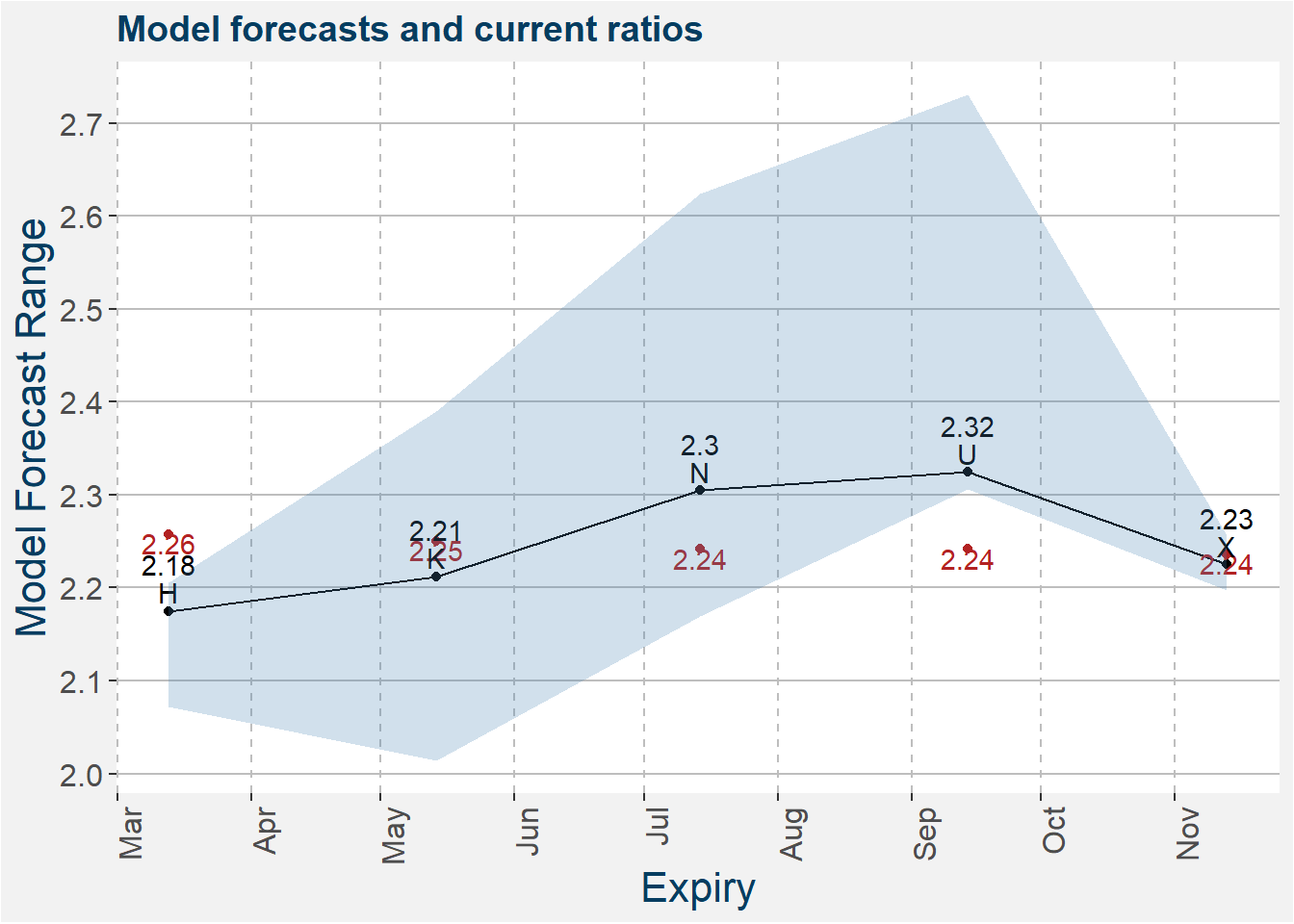
The model predictions together with the latest values of the ratios are shown in the plot below. The shaded regions shows the 25th to 75th percentile of the model predictions. Median predictions are represented by the solid black line. Current C vs S ratio values are shown by the red dots.
Roll Structure
From the modelling of the spread and ratio is seems like there might be an opportunity being long the spread, i.e. long S and short C. In this section we explore how this structure rolls. Throughout we assume a long position in S and a short position in C. We also assume a 1:1 ratio when trading this relative, i.e. long one unit of S and short one unit of C. We only consider data from 1 Jan 2009 onward. The table below shows the roll structure we follow. Consider the first row which represents Januray. In this case we want to have positions in the H contract for both C and S. During February we roll each of those positions forward to the K contracts.
| month | C | S |
|---|---|---|
| 1 | H | H |
| 2 | K | K |
| 3 | K | K |
| 4 | N | N |
| 5 | N | N |
| 6 | U | X |
| 7 | U | X |
| 8 | Z | X |
| 9 | Z | X |
| 10 | Z | F |
| 11 | H | F |
| 12 | H | H |
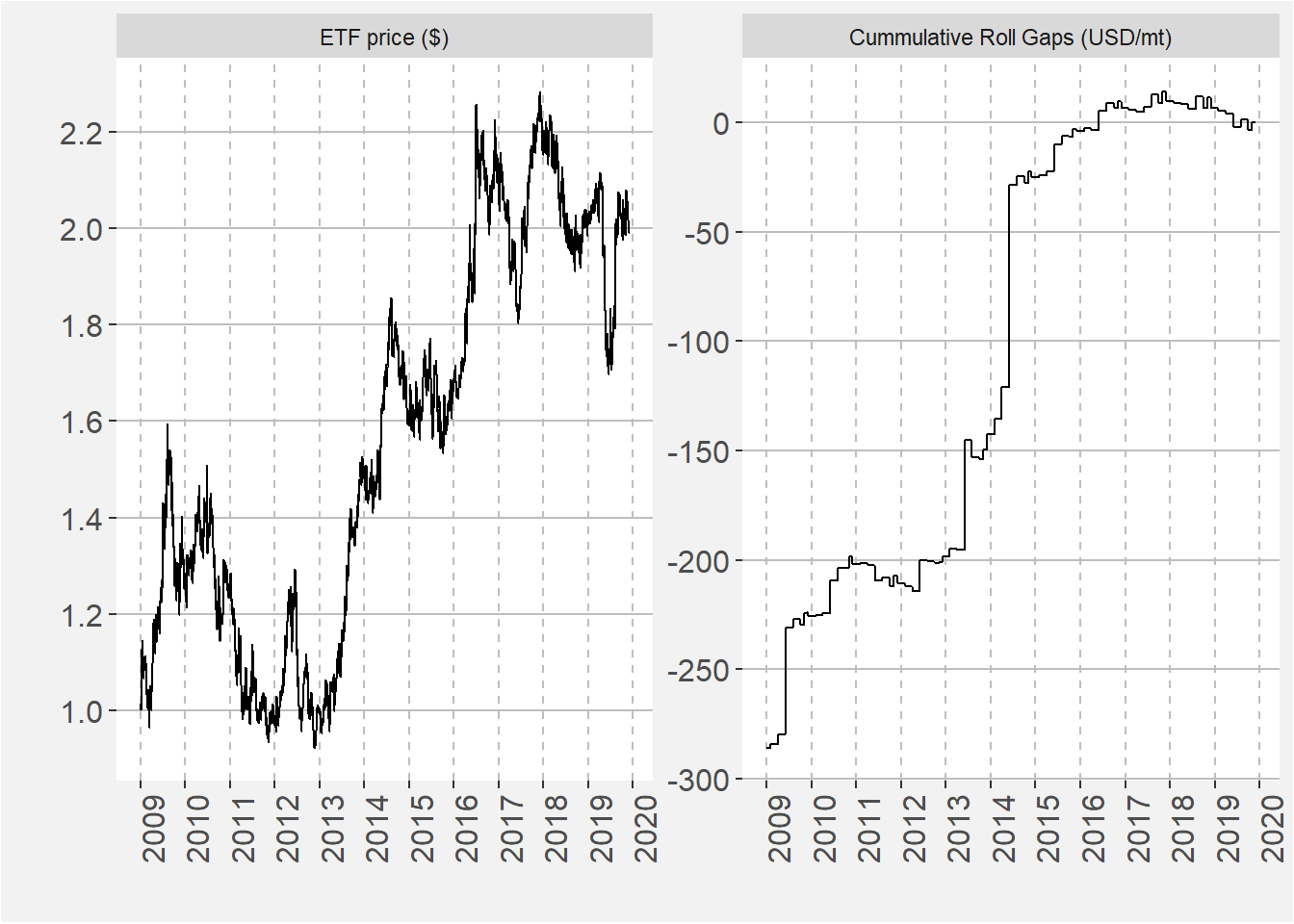
In the facet plot below we show the ETF price and Cummulative Roll Gaps on the left and right respectively. The ETF price shows the value of $1 invested in the spread at the beginning of the time series. The Cummulative Roll Gaps shows the cummulative difference in price (USD/mt) when the structure is rolled forward. Note that the shape of the Cummulative Roll Gaps greatly determines the shape of the evolution of the ETF price. This is the case for most relative value pairs where the term structure of the different commodities plays a major role in the overall return profile. From the data is it clear that sustained periods of positive return coinside with periods where the Cummulative Roll Gaps has a zero or positive slope.
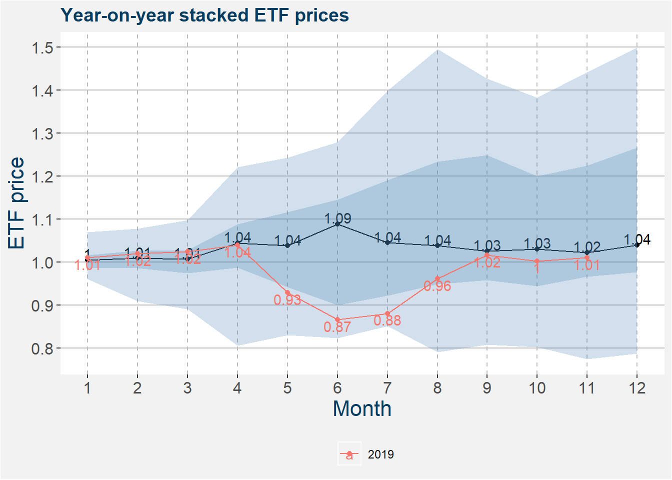
The plot below takes the ETF price data and stackes the normalised data together from the 1st of January to the 31 of December for each year. Within each month we calculate statistics. The 25th to 75th and 5th to 95th percentiles are given by the darker and ligher shaded regions respectively. The median yearly return is represented by the solid black line.. Superimposed on top of the universe ribbon plot the the data for 2018 and as well as 2019. From the plot it is clear that under normal circumstances we can expect to earn a roll return of 4% of the capital allocated to this strategy on a yearly basis.
Below we show the futures curves of C and S. In order to have a flat or positive roll yield we require the curve of the long commodity (S) to have a slope that is less than that of the short commodity (C). By eye it is difficult to see which curve is the steapest.
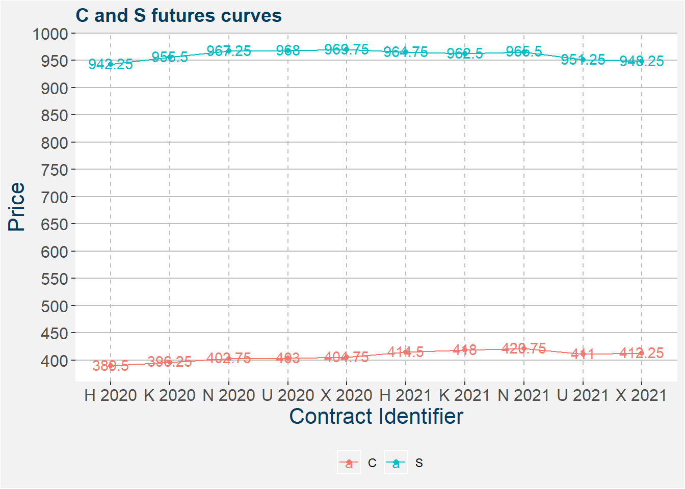
The table below summarises the results. The columns are pretty self-explanatory, save for C change and S change which show the differnce between consecutive prices, i.e. the value of the calendar spread. The Roll Yield the difference between the change in C and S. If the roll yield is positive it indicates favourable roll period. Note that currently the Roll Yields is favourable in the deferred parts of the curve.
| identifier | daysdiff | C price | S price | C change | S change | Roll Yield |
|---|---|---|---|---|---|---|
| H 2020 | 46 | 389.50 | 942.25 | NA | NA | NA |
| K 2020 | 108 | 396.25 | 955.50 | 6.75 | 13.25 | -6.50 |
| N 2020 | 169 | 402.75 | 967.25 | 6.50 | 11.75 | -5.25 |
| U 2020 | 231 | 403.00 | 968.00 | 0.25 | 0.75 | -0.50 |
| X 2020 | 291 | 404.75 | 969.75 | 1.75 | 1.75 | 0.00 |
| H 2021 | 410 | 414.50 | 964.75 | 9.75 | -5.00 | 14.75 |
| K 2021 | 473 | 418.00 | 962.50 | 3.50 | -2.25 | 5.75 |
| N 2021 | 534 | 420.75 | 965.50 | 2.75 | 3.00 | -0.25 |
| U 2021 | 596 | 411.00 | 951.25 | -9.75 | -14.25 | 4.50 |
| X 2021 | 655 | 412.25 | 948.25 | 1.25 | -3.00 | 4.25 |
Note that the roll yield is the difference between to calendar spreads. In the following se use corn and Soybean stock-to-usage to model the different calendarspread involved in the roll process. In this way, if we have to fundamental point of view on the underling stock-to-usage values we can get an idea of how the spread as well as the roll will be affected.
Corn Calendars
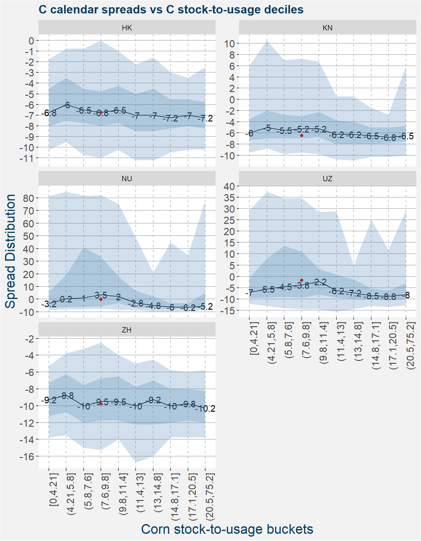
Below we show the spread statistiscs of the corn calendar spreads making up the roll process. From the plots below there is not a great amount of structure in the HK and ZH calendars spreads, the other spreads have better strucutre and will be easier to model. As beofe the current values of the spreads are indicated by the red dots.
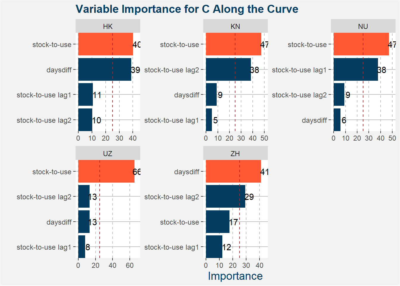
Below we show the feature importances for each of the calendar spreads. We can see that the stock-to-usage and daysdiff features play the biggest roles in the predictive models.
| calRef | R squared | mean cv score | std cv test score |
|---|---|---|---|
| HK | -0.5132399 | -0.5145170 | 0.4259837 |
| KN | -0.2905441 | 0.0683175 | 0.0352093 |
| NU | 0.6387132 | 0.4719729 | 0.1340568 |
| UZ | 0.4542380 | 0.5747438 | 0.1257030 |
| ZH | 0.2349001 | -0.1394719 | 0.2145619 |
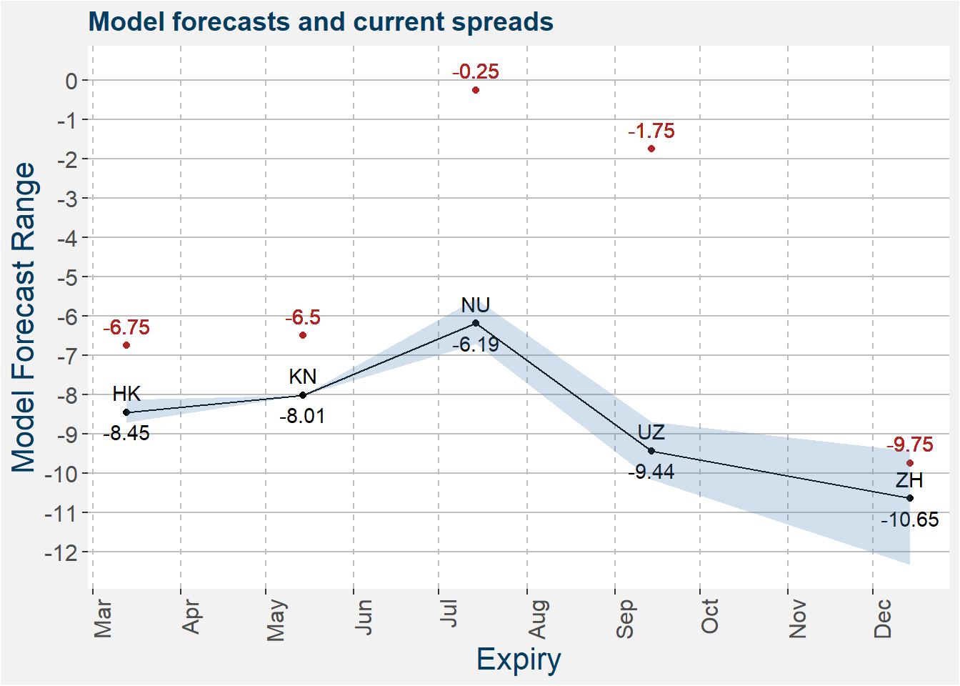
The model predictions together with the latest values of the spreads are shown in the plot below. The shaded regions shows the 25th to 75th percentile of the model predictions. Median predictions are represented by the solid black line. Current C calendar spread values are shown by the red dots. The calendar spreads show some potential to become more contango if the current stock conditions remain unchanged.
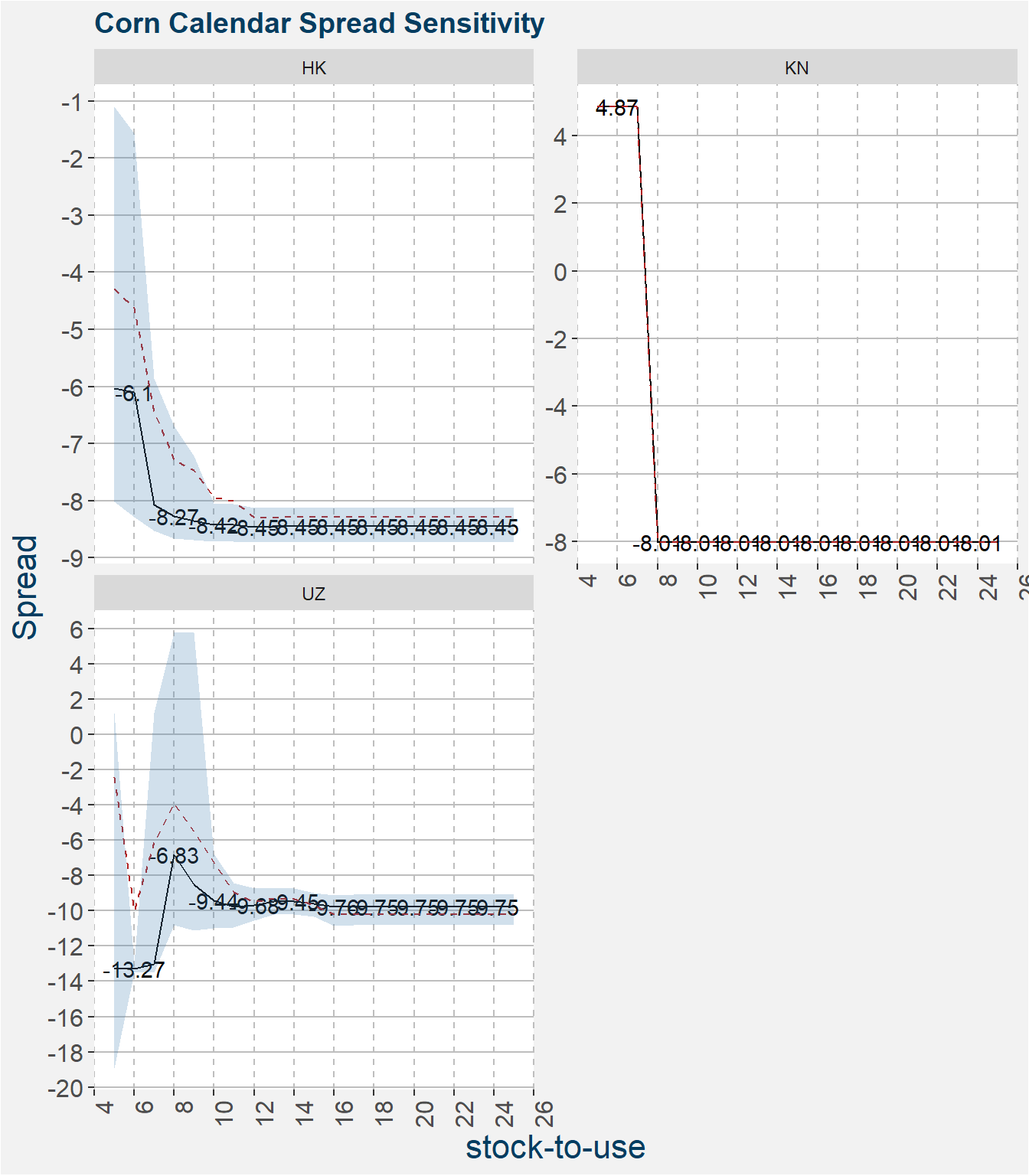
Below we show the calendar spread model sensitivities. These plots measure how a change in the stock-to-usage affects the model prediction of the spread. Similar to before the shaded region represents the 22th to 75th percentile of the model predictions with the median represented by the solid black line. The mean is given by the dashed red line. Here we set the daysdiff feature to 10 days prior to expiry.
Soybean Calendars
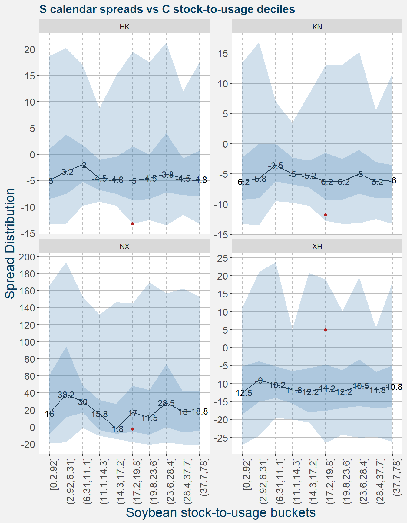
Below we show the spread statistiscs of the soybean calendar spreads making up the roll process. As beofe the current values of the spreads are indicated by the red dots.
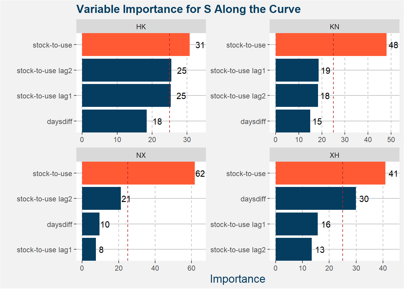
Below we show the feature importances for each of the calendar spreads. We can see that the stock-to-usage and daysdiff features play the biggest roles in the predictive models.
| calRef | R squared | mean cv score | std cv test score |
|---|---|---|---|
| HK | 0.4789642 | 0.0140376 | 0.5733419 |
| KN | -0.7427723 | 0.3582986 | 0.2083044 |
| NX | 0.3256151 | 0.5743976 | 0.0222725 |
| XH | 0.6762214 | 0.1855095 | 0.1273123 |
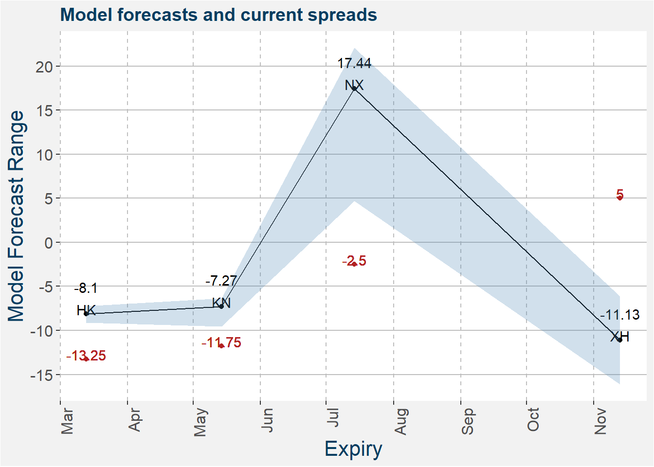
The model predictions together with the latest values of the spreads are shown in the plot below. The shaded regions shows the 25th to 75th percentile of the model predictions. Median predictions are represented by the solid black line. Current KW calendar spread values are shown by the red dots.
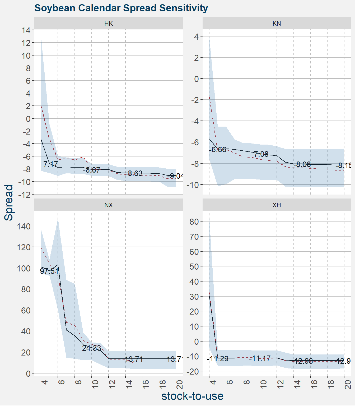
Below we show the calendar spread model sensitivities. These plots measure how a change in the stock-to-usage affects the model prediction of the spread. Similar to before the shaded region represents the 22th to 75th percentile of the model predictions with the median represented by the solid black line. The mean is given by the dashed red line. Here we set the daysdiff feature to 10 days prior to expiry.
Remarks
Currently the spread is fairly priced under the latest fundamentals. If the new season corn stock are high coupled with tigh soybean stocks we will have a very profitable roll scenario.
The interested reader is refered to this post where we explore the different hedging ratios in the corn vs soybean spread.