Introduction
The aim of this write-up is to investigate what fundamental features can be seen as the driver of corn calendar spreads.
For each calendar spread we start out with a random forest model that tries to forecast the value of the spread with input features consisting of the stock-to-usage numbers of
- Argentina
- Brazil
- China
- Russia
- Ukraine
- United States
- World
- World without China
for both corn and soybeans as well as the number of days the front month contract has to expiry. The feature importance is done with classifiction models were we bin the calendar spreads into deciles. The model is then trained to find the spread decile.
The stock-to-usage numbers are determined form monthly WASDE reports and reflect the amount of ending stocks relative to consumption of each of the countries listed.
We compare use six techniques to compare feature importance:
- MDI - Mean Decrease Impurity
- MDA - Mean Decrease Accuracy
- SFI - Single Feature Importance
- CFI - Clustered Feature Importance
- SHAP - Shapley Feature Importance
- PCA - Principle component analysis
The PCA method is used to calculate the weighted tau statistic. The idea is to see how correlated the principle components and the chosen features are. The higher the weighted tau number the better.
After the main features have been extracted be train classication and regression models on the chosen features. We do this to give two different but related points of view. From the classification models we can determine the probabiliy of the spread beying in a particular decile. We can then study how the probabilities change by changing the input features. Secondly we use all of the trees in the regression models to produce regression statistics. Here we are particularly interested in the the 25th to 75th percentile of the regression models.
An interesting aspect of machine learning regression models, in particular random forests, boosted trees and neural networkds, is that they are able to caputure nonlinearities and interaction effects. By interaction effects we mean how the combination of two more more features influence the value we are trying to model. An example of this is how the stock-to-usage of the United States corn stocks affect the ZN spread when the front month contract has lots of time vs only a month left to expiry. In order to study the
- linear,
- non-linear and
- pairwise interaction
terms of the calendar spread models we make use of the fingerprint method of Li, Turkington and Yazdani.
Quick Overview of the Fingerprint method
This section is technical and quite mathematical, the interested reader is encouraged to follow, however the main purpose is to serve as a quick reminder of how the functions are constructed. Feel free to skip to the next section if you are not interested in the technical details. This section follows straight from Li, Turkington and Yazdani.
Denote the model prediction function \(\hat{f}\) we a trying to find as
\[ \hat{y} = \hat{f}(x_1, \dots, x_m) \] In general the prediction function depends on the \(m\) input parameters or features. The partial dependence function only depends on one of the features, \(x_k\). For a given value of \(x_k\), this partial dependence function returns the expected value of the prediction over all other possible values for the other predictors, which we denote as \(x_{\backslash k}\). The partial dependence function is then defined as
\[ \hat{y}_k = \hat{f}_k(x_k) = E[\hat{f}(x_1, \dots, x_{k-1}, x_{k+1}, \dots, x_m)] = \int \hat{f}(x_1, \dots, x_m) p(x_{\backslash k}) dx_{\backslash k} \] where \(p(x_{\backslash k})\) is the probability distribution over \(x_{\backslash k}\).
In practice we follow the following steps:
- Choose a value of the feature \(x_k\), say \(\alpha\)
- Combine this value with one of the actual input vectors for the remaining variables, \(x_{\backslash k}\), and generate a new prediction from the function: \(\hat{y} = \hat{f} (x_1, \dots, x_{k-1}, \alpha, x_{k+1}, \dots, x_m)\).
- Repeat step 2 with every input vector for \(x_{\backslash k}\), holding the value for \(x_k = \alpha\) constant, and record all predictions.
- Average all the predictions for this value of \(x_k\) to arrive at the value of the partial prediction at that point, \(y_{x_k}\).
- Repeat steps 1 through 4 for any desired values of \(x_k\) and plot the resulting function.
The partial dependence function will have small deviations if a given variable has little influence on the model’s predictions. Alternatively, if the variable is highly inf luential, we will observe large f luctuations in prediction based on changing the input values.
Next, we decompose a variable’s marginal impact into a linear component and a nonlinear component by obtaining the best fit (least squares) regression line for the partial dependence function. We define the linear prediction effect, the predictive contribution of the linear component, as the mean absolute deviation of the linear predictions around their average value. Mathematically we write,
\[\text{Linear Prediction Effect}(x_k) = \frac{1}{N} \sum^{N}_{i=1}\left| \hat{I}(x_{k,i}) - \frac{1}{N} \sum^{N}_{j=1} \hat{f}(x_{k,j}) \right|\]
In the above equation, for a given predictor \(x_k\), the prediction \(\hat{I}(x_{k,i})\) , results from the linear least square fit of its partial dependence function, and \(x_{k,i}\) is the \(i\)th value of \(x_k\) in the dataset.
Next, we define the nonlinear prediction effect, the predictive contribution of the nonlinear component, as the mean absolute deviation of the total marginal (single variable) effect around its corresponding linear effect. When this procedure is applied to an ordinary linear model, the nonlinear effects equal precisely zero, as they should. Mathematically we write,
\[ \text{Nonlinear Prediction Effect}(x_k) = \frac{1}{N} \sum^{N}_{i=1}\left| \hat{I}(x_{k,i}) - \hat{f}(x_{k,i}) \right| \]
A similar method can be applied to isolate the interaction effects attributable to pairs of variables \(x_k\) and \(x_l\), simultaneously. The procedure for doing this is the same as given earlier, but in step 1 values for both variables are chosen jointly. The partial dependence function can then be written as
\[ \hat{y}_{k,l} = \hat{f}_{k,l}(x_k, x_l) = E[\hat{f}(x_k, x_{\backslash k}, x_l, x_{\backslash l})] = \int \hat{f}(x_1, \dots, x_m) p(x_{\backslash (k l)}) dx_{\backslash k}dx_{\backslash l} \]
We define the pairwise interaction effect as the demeaned joint partial prediction of the two variables minus the demeaned partial predictions of each variable independently. When this procedure is applied to an ordinary linear model, the interaction effects equal precisely zero, as they should. Mathematically we write,
\[ \text{Pairwise Interaction Effect}(x_k, x_l) = \frac{1}{N^2} \sum^{N}_{i=1} \sum^{N}_{j=1} \left| \hat{f}(x_{k,i}, x_{l, j}) - \hat{f}(x_{k,i}) - \hat{f}(x_{l, j})\right| \]
Corn Calendars
The corn curve consists of contract codes
| code | month |
|---|---|
| H | Mar |
| K | May |
| N | Jul |
| U | Sep |
| Z | Dec |
Below we split the analysis into consecutive and longer dated calendars. The consecutive calendars are formed using the consecutive contract codes in the table above. These are
- HK
- KN
- NU
- UZ
- ZH
The longer dated calendars are examples of other contract codes are have been interested in during the past and include
- HN
- NZ
- ZN
- UH
Consecutive Calendars’ Feature Importances
The consecutive calendars are those the make up the roll schedule of the systematic strategies we consider where corn is involved. A detailed understanding the features that cause the values of these calendar spreads to change will help in determining how to roll the curves forward.
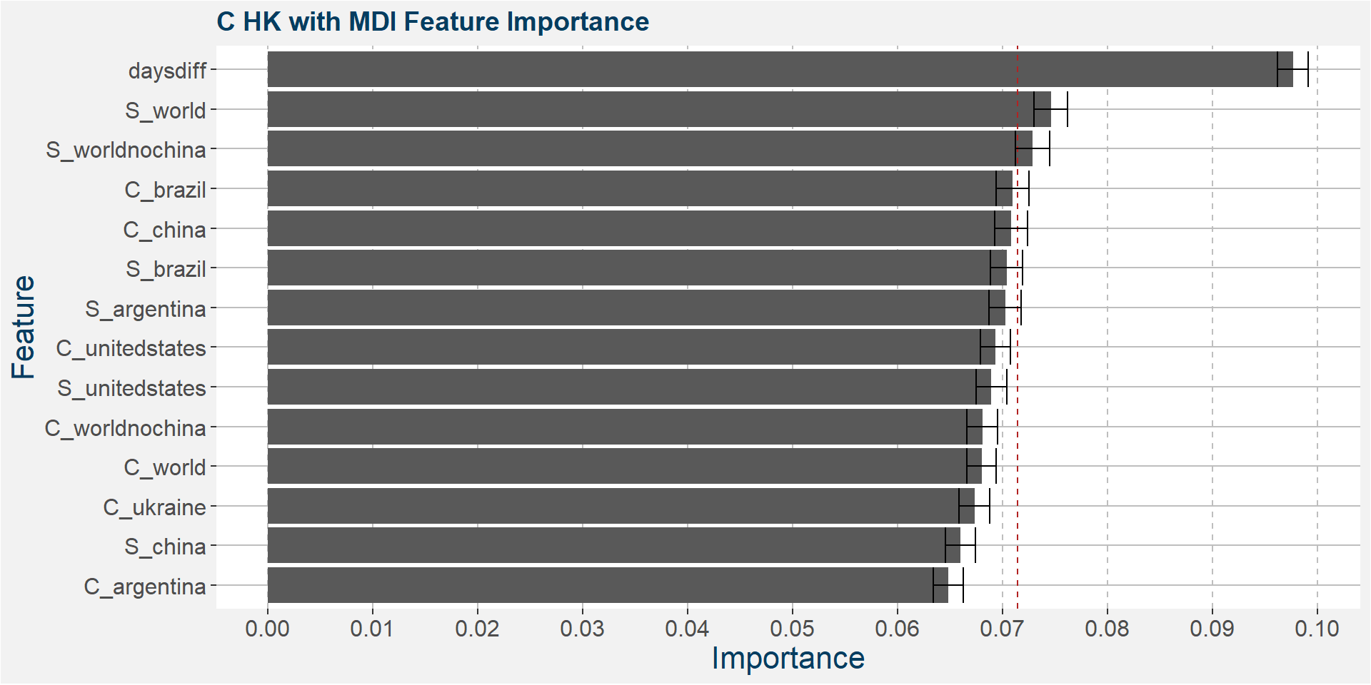
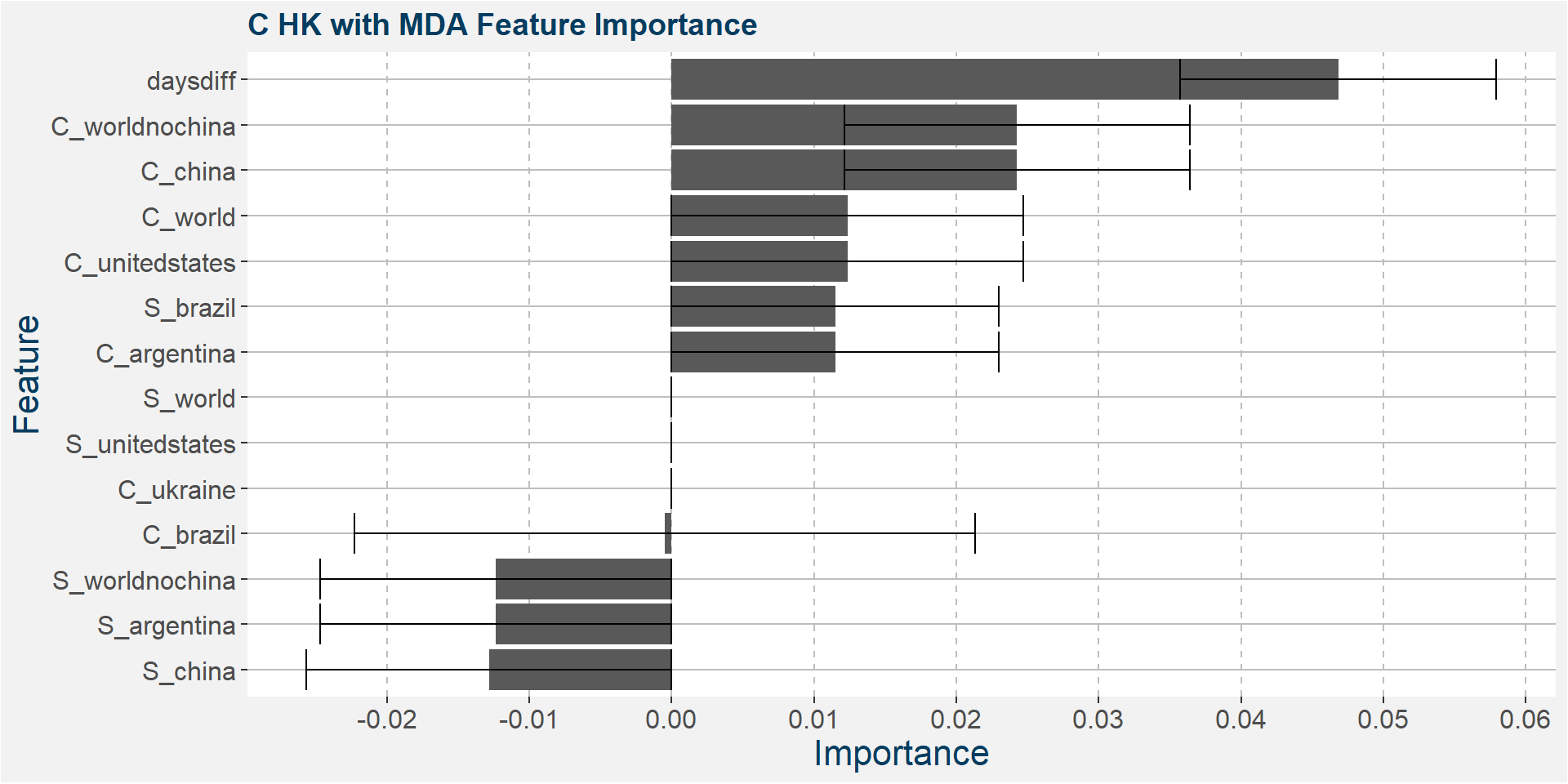
C HK
The table below shows the weighted tau numbers of the different feature importance methods. Here MDI and MDA are the top two methods.
| calRef | method | weighted_tau |
|---|---|---|
| HK | MDI | 0.592 |
| HK | SHAP | 0.269 |
| HK | MDA | 0.147 |
| HK | CFI | -0.049 |
| HK | SFI | -0.542 |
Below we show the feature importances of the HK spread as measured by MDI and MDA. Note that in both cases daysdiff comes out as the top feature. This implies that there is a strong seasonal dynamic in the HK spread. It is interesting to note that the Brazilian corn stocks play a big part in the feature importance. This might be due to the Brazilian harvest taking place in March.

Features included in classification and regression models:
- daysdiff
- S_world
- C_brazil
- S_worldnochina
- S_argentina
- C_worldnochina
- S_brazil
- C_china
- S_unitedstates
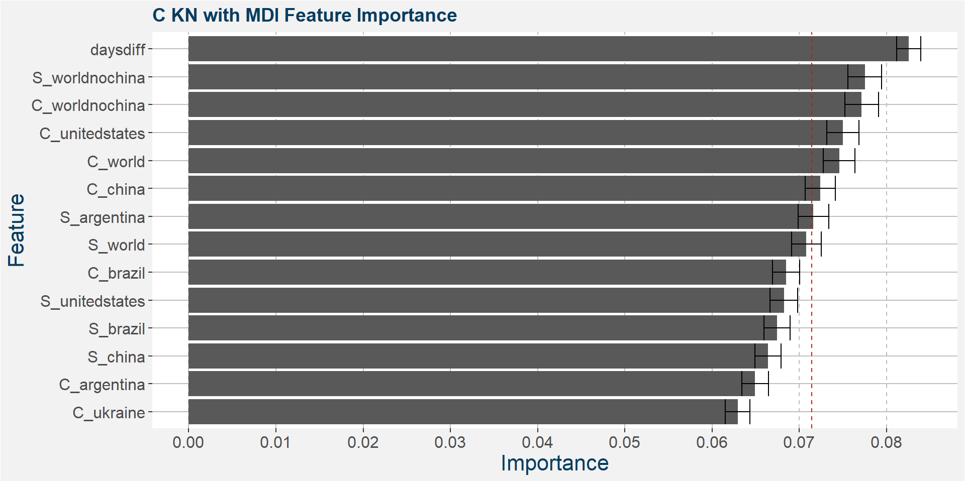
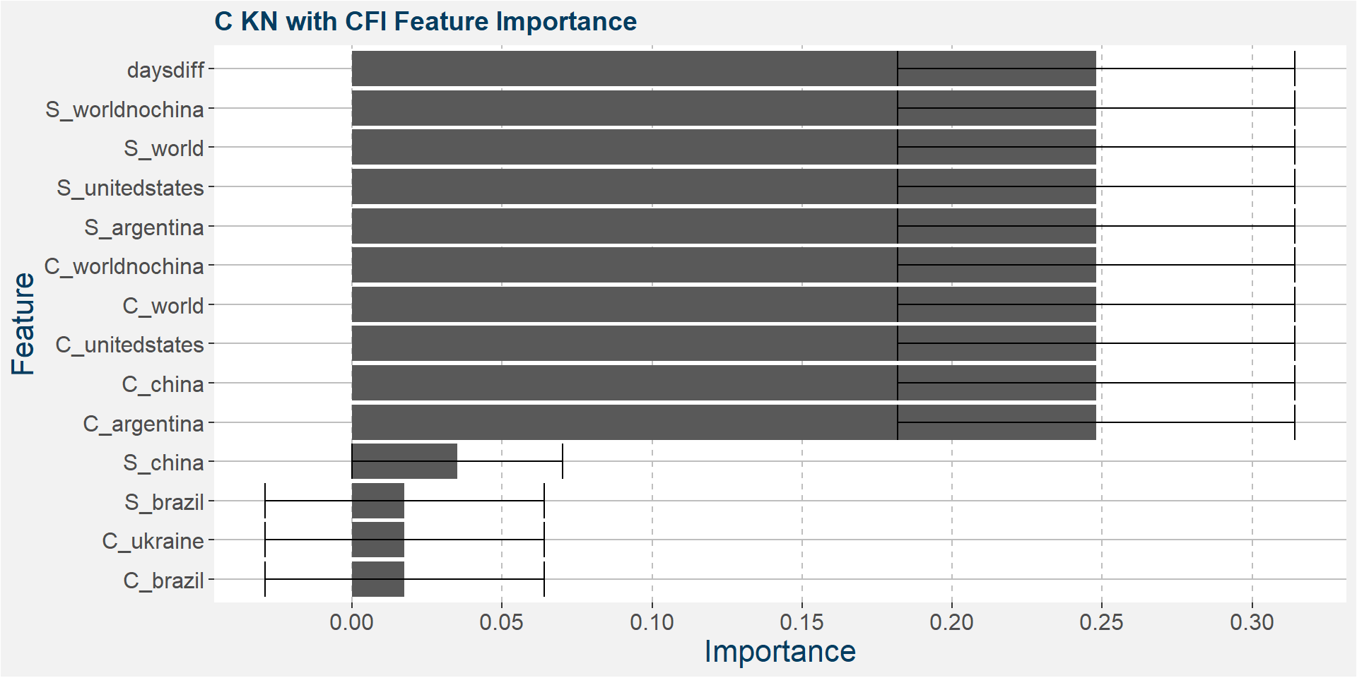
C KN
The table below shows the weighted tau numbers of the different feature importance methods. Here MDI, CFI and SHAP are the top methods.
| calRef | method | weighted_tau |
|---|---|---|
| KN | CFI | 0.346 |
| KN | MDI | 0.294 |
| KN | SHAP | 0.139 |
| KN | MDA | -0.012 |
| KN | SFI | -0.412 |
Below we show the feature importances of the KN spread as measured by MDI, CFI and SAHP. Note that in all three cases daysdiff comes out as one of the top features. Again, this implies that there is a strong seasonal dynamic in the KN spread. It is interesting to note the strong dependence on soybean stocks in all three models.
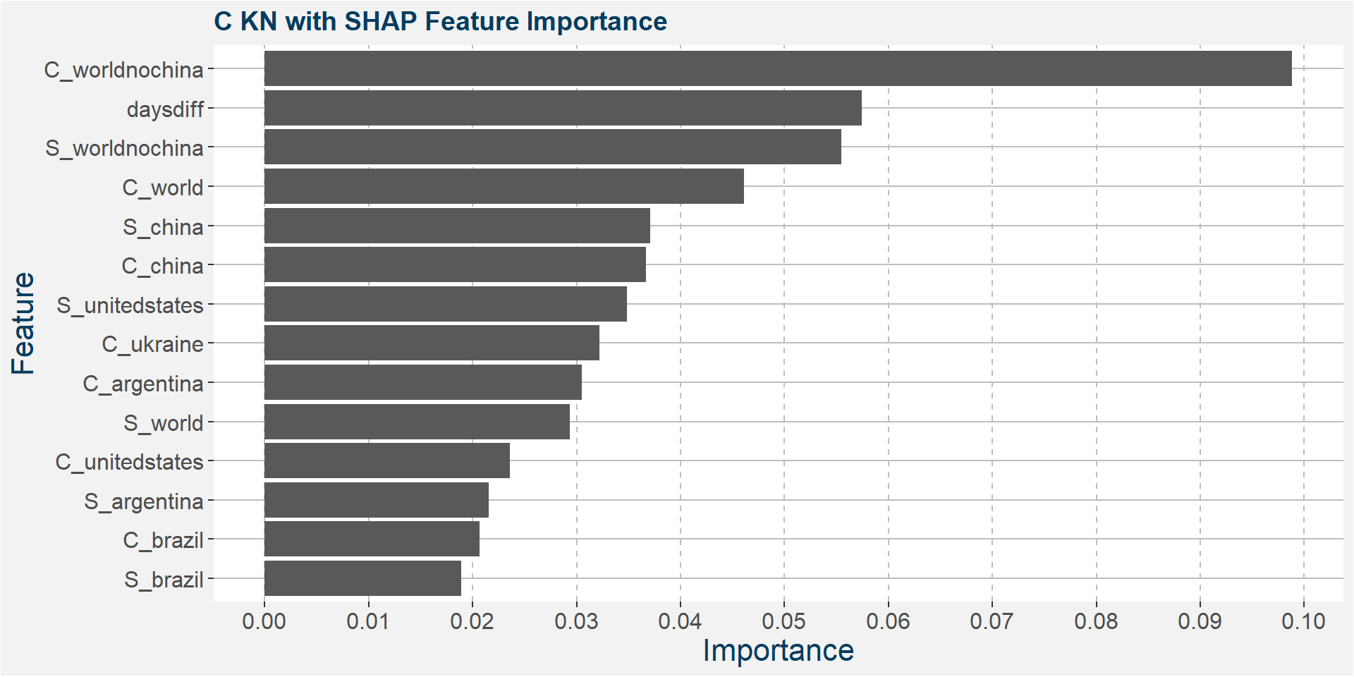
Features included in classification and regression models:
- daysdiff
- C_worldnochina
- S_world
- S_argentina
- C_china
- C_unitedstates
- C_world
- S_worldnochina
C NU
The table below shows the weighted tau numbers of the different feature importance methods. Here CFI and MDI are the top methods.
| calRef | method | weighted_tau |
|---|---|---|
| NU | MDA | 0.297 |
| NU | CFI | 0.294 |
| NU | MDI | 0.276 |
| NU | SFI | 0.010 |
| NU | SHAP | -0.091 |
Below we show the feature importances of the NU spread as measured by CFI and MDI.


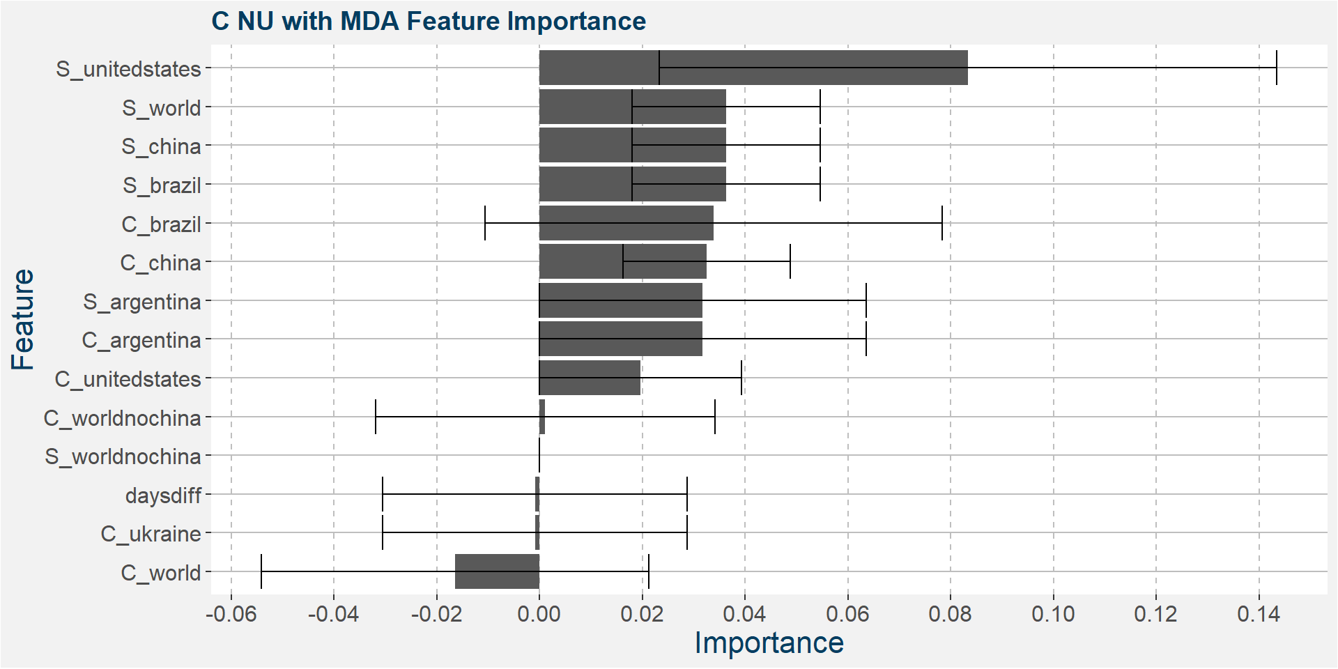
Features included in classification and regression models:
- daysdiff
- S_worldnochina
- S_world
- S_unitedstates
- S_argentina
- C_worldnochina
- C_world
- C_unitedstates
- C_china
- C_argentina
C UZ
The table below shows the weighted tau numbers of the different feature importance methods. Here SHAP and MDI are the top methods.
| calRef | method | weighted_tau |
|---|---|---|
| UZ | SHAP | 0.243 |
| UZ | MDI | 0.232 |
| UZ | CFI | 0.036 |
| UZ | MDA | -0.015 |
| UZ | SFI | -0.273 |
Below we show the feature importances of the NU spread as measured by SAHP and MDI.
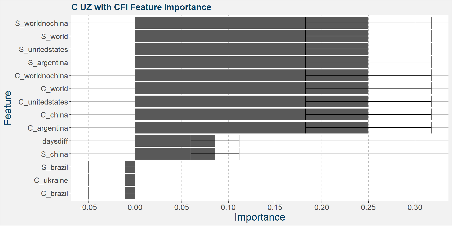
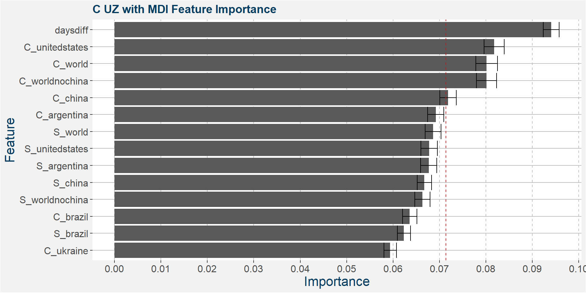
Features included in classification and regression models:
- daysdiff
- C_unitedstates
- C_world
- C_worldnochina
C ZH
The table below shows the weighted tau numbers of the different feature importance methods. Here SHAP and MDI are the top methods.
| calRef | method | weighted_tau |
|---|---|---|
| ZH | CFI | 0.367 |
| ZH | MDI | 0.289 |
| ZH | MDA | 0.246 |
| ZH | SHAP | 0.138 |
| ZH | SFI | 0.066 |
Below we show the feature importances of the NU spread as measured by MDI and SHAP.

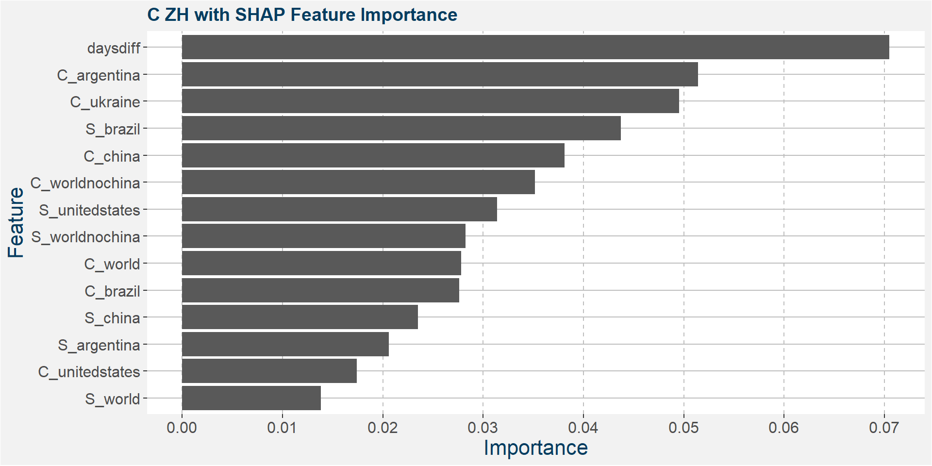
Features included in classification and regression models:
- daysdiff
- S_brazil
- C_argentina
- C_worldnochina
- S_worldnochina
- C_china
Consecutive Calendars’ Models
In this section we explore the classification and regression models on each of the consecutive calendar spreads trained with the features outlined above.
For each of the consecutive calendar spreads we show the classification and regression model results and compare with the results of standard linear models. Not that the inpute feature have been scaled using the min-max scaler for the linear models. In the case of classification models the metric shown is the accuracy for in sample, out of sample and out of bag (oob) results (where applicable).
The metric for the regression models is th R-squared value over the in sample, out of sample and out of bag splits.
C HK
The tables below show the model performance data. Note the out of sample accuracy is improved upon by the Random Forest model. The out of sample regression results are also much better than the linear models.
| sample | type | Logistic Regression | Random Forest |
|---|---|---|---|
| in sample | classification | 0.33 | 1.00 |
| oob | classification | NA | 0.28 |
| out of sample | classification | 0.20 | 0.32 |
| sample | type | Lasso Regression | Linear Regression | Random Forest |
|---|---|---|---|---|
| in sample | regression | 0.15 | 0.31 | 0.88 |
| oob | regression | NA | NA | 0.23 |
| out of sample | regression | 0.09 | 0.21 | 0.72 |
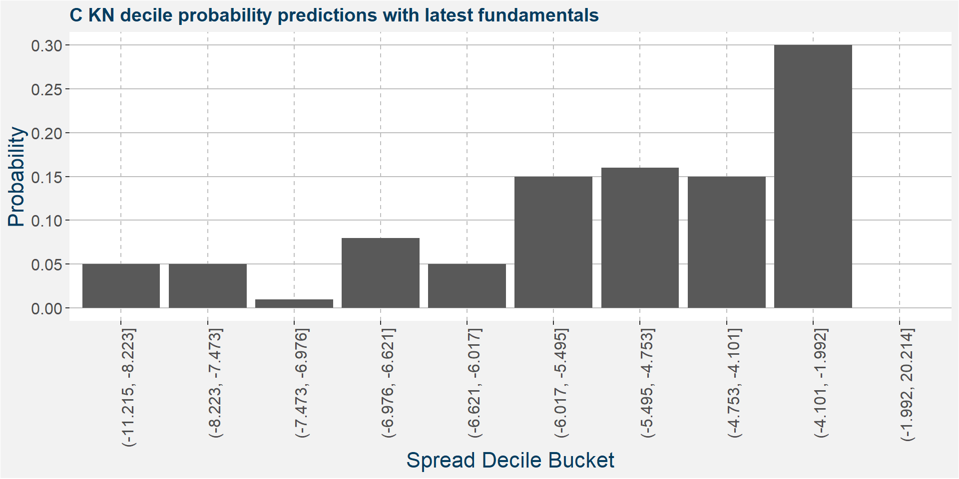
The plot below shows the probability associated with each of the spread deciles using the latest fudamental data as input parameters.
The table below shows the regression model results.
| calRef | p25 | med | avg | p75 |
|---|---|---|---|---|
| HK | -6.96 | -6.3 | -6.13 | -5.96 |
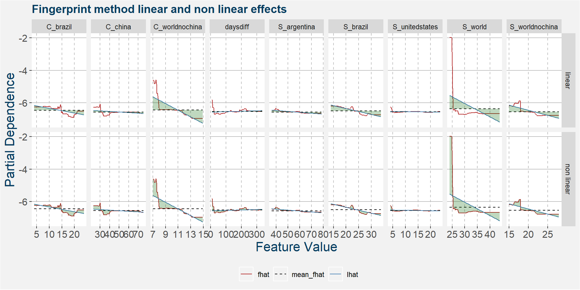
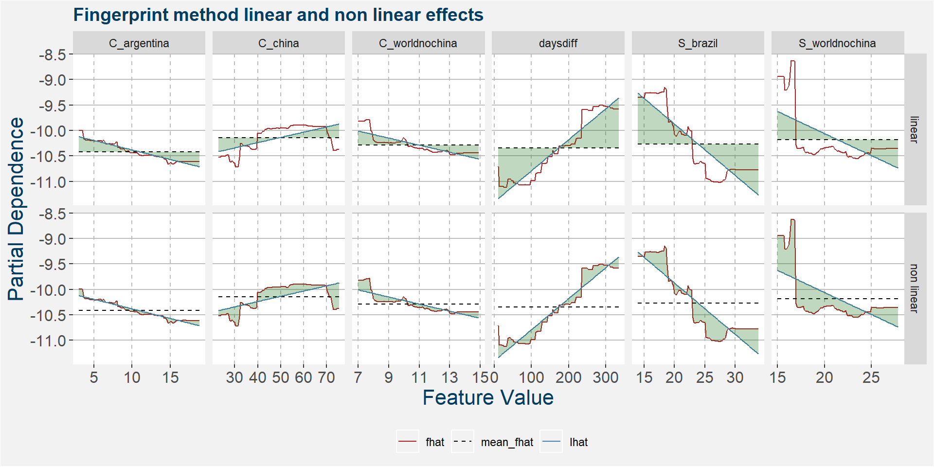
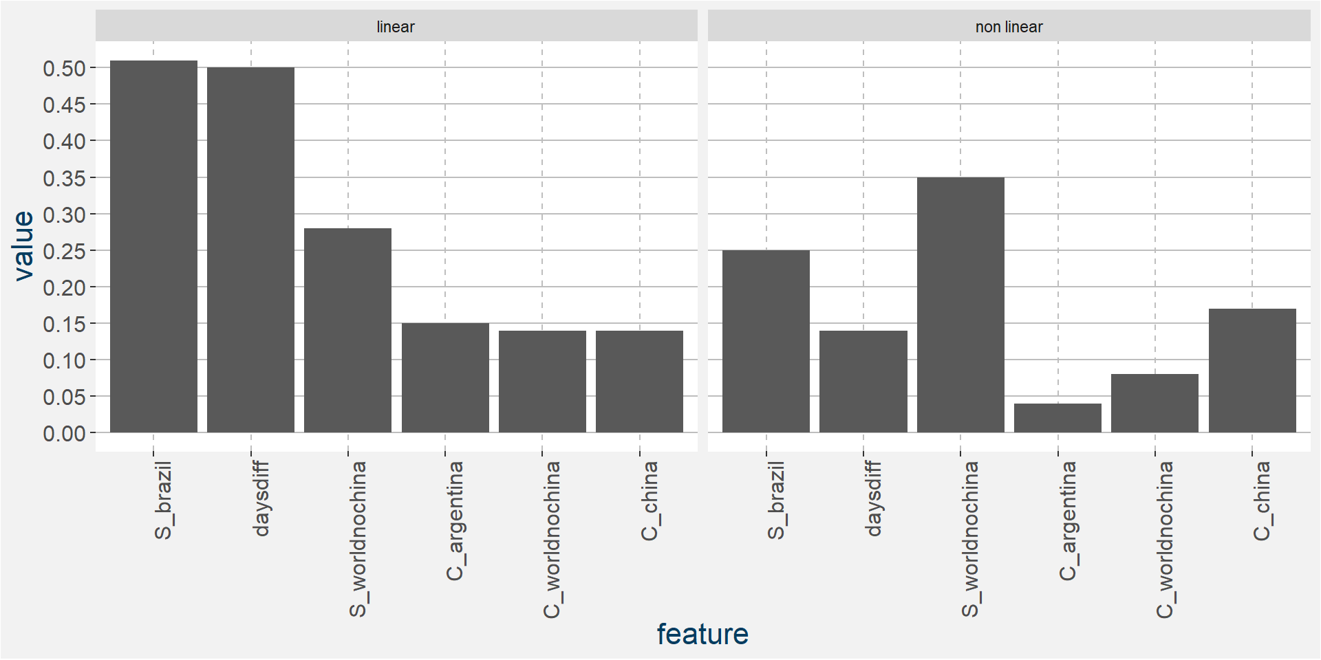
The plot below shows the linear and non linear effects as captured by the fingerprint method. These effects can be measured and compared by the shaded areas in the facet plot below. The greater the shaded area the greater the effect.
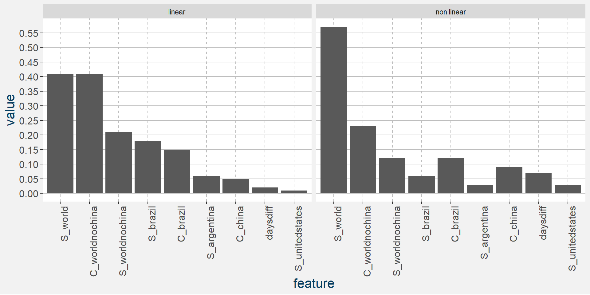
The plot below shows the normalised linear and non-linear effects in a sigle graph for easy comparison. Notice the substantial contribution from the non-linear effects.
C KN
The tables below show the model performance data. Note the out of sample accuracy is improved upon by the Random Forest model. The out of sample regression results are also much better than the linear models.
| sample | type | Logistic Regression | Random Forest |
|---|---|---|---|
| in sample | classification | 0.31 | 1.00 |
| oob | classification | NA | 0.31 |
| out of sample | classification | 0.24 | 0.48 |
| sample | type | Lasso Regression | Linear Regression | Random Forest |
|---|---|---|---|---|
| in sample | regression | 0.32 | 0.39 | 0.85 |
| oob | regression | NA | NA | 0.39 |
| out of sample | regression | 0.28 | 0.42 | 0.77 |
The plot below shows the probability associated with each of the spread deciles using the latest fudamental data as input parameters.
The table below shows the regression model results.
| calRef | p25 | med | avg | p75 |
|---|---|---|---|---|
| KN | -5.74 | -5.22 | -5.17 | -4.88 |
The plot below shows the linear and non linear effects as captured by the fingerprint method. These effects can be measured and compared by the shaded areas in the facet plot below. The greater the shaded area the greater the effect.
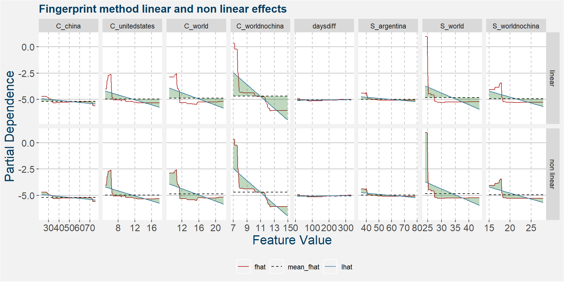
The plot below shows the normalised linear and non-linear effects in a sigle graph for easy comparison. Notice the substantial contribution from the non-linear effects.

C NU
The tables below show the model performance data. Note the out of sample accuracy is improved upon by the Random Forest model. The out of sample regression results are also much better than the linear models.
| sample | type | Logistic Regression | Random Forest |
|---|---|---|---|
| in sample | classification | 0.45 | 1.00 |
| oob | classification | NA | 0.40 |
| out of sample | classification | 0.29 | 0.38 |
| sample | type | Lasso Regression | Linear Regression | Random Forest |
|---|---|---|---|---|
| in sample | regression | 0.82 | 0.83 | 0.97 |
| oob | regression | NA | NA | 0.82 |
| out of sample | regression | 0.73 | 0.75 | 0.89 |
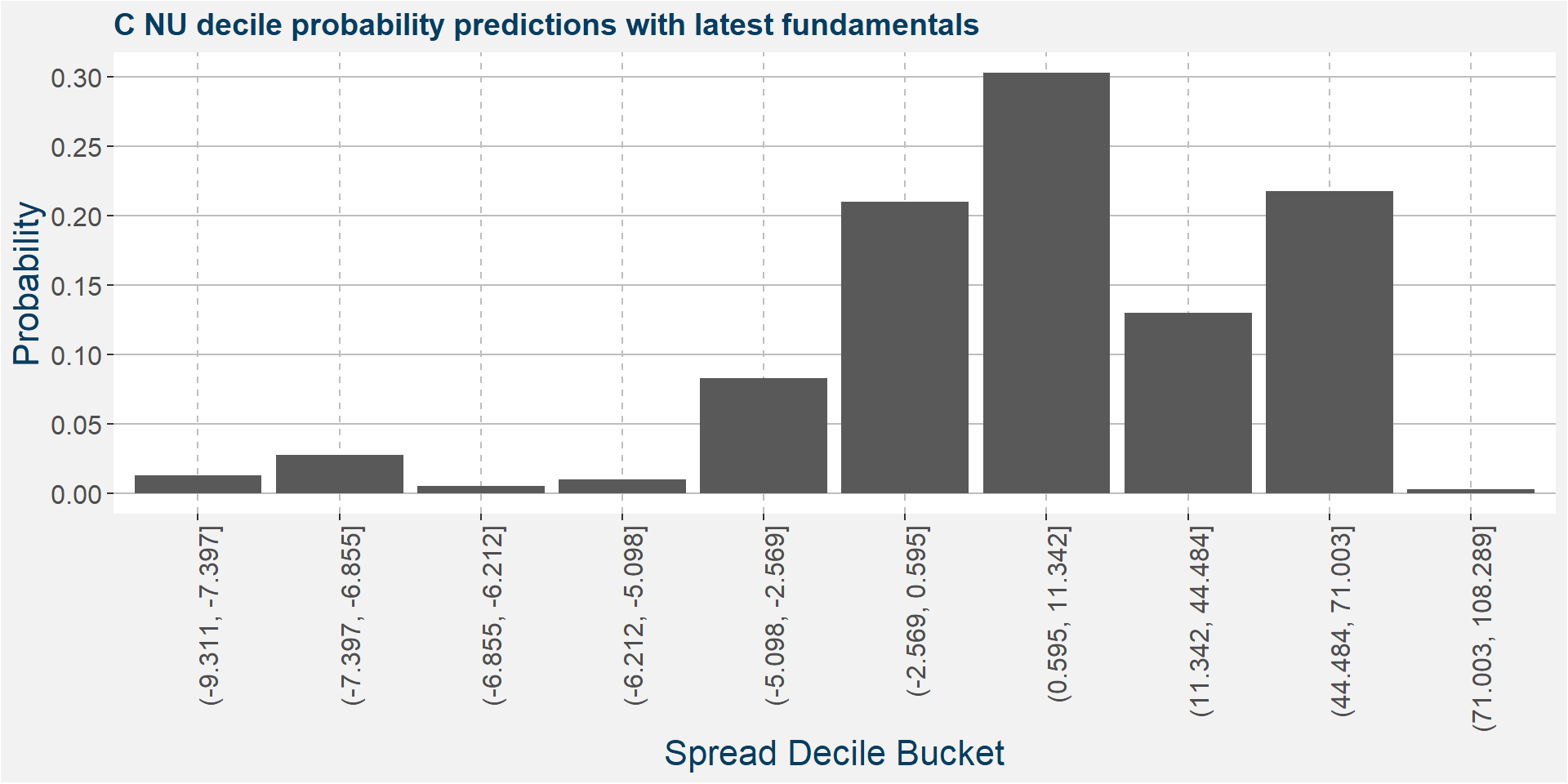
The plot below shows the probability associated with each of the spread deciles using the latest fudamental data as input parameters.
The table below shows the regression model results.
| calRef | p25 | med | avg | p75 |
|---|---|---|---|---|
| NU | -0.39 | 0.84 | 7.66 | 1.41 |
The plot below shows the linear and non linear effects as captured by the fingerprint method. These effects can be measured and compared by the shaded areas in the facet plot below. The greater the shaded area the greater the effect.
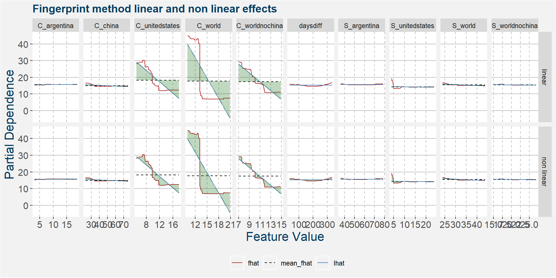
The plot below shows the normalised linear and non-linear effects in a sigle graph for easy comparison. Notice the substantial contribution from the non-linear effects.

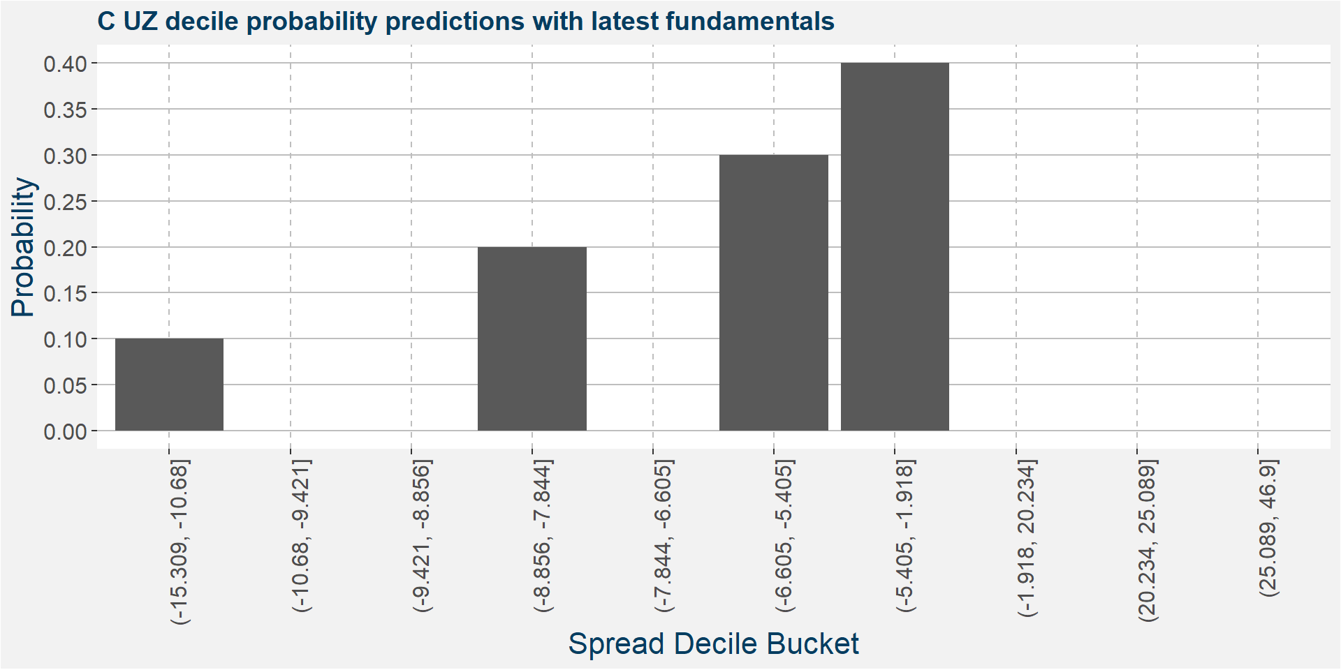
C UZ
The tables below show the model performance data. Note the out of sample accuracy is improved upon by the Random Forest model. The out of sample regression results are also much better than the linear models.
| sample | type | Logistic Regression | Random Forest |
|---|---|---|---|
| in sample | classification | 0.36 | 0.94 |
| oob | classification | NA | 0.37 |
| out of sample | classification | 0.16 | 0.32 |
| sample | type | Lasso Regression | Linear Regression | Random Forest |
|---|---|---|---|---|
| in sample | regression | 0.54 | 0.54 | 0.94 |
| oob | regression | NA | NA | 0.67 |
| out of sample | regression | 0.70 | 0.70 | 0.91 |
The plot below shows the probability associated with each of the spread deciles using the latest fudamental data as input parameters.
The table below shows the regression model results.
| calRef | p25 | med | avg | p75 |
|---|---|---|---|---|
| UZ | -7.28 | -4.54 | -2.77 | -2.72 |
The plot below shows the linear and non linear effects as captured by the fingerprint method. These effects can be measured and compared by the shaded areas in the facet plot below. The greater the shaded area the greater the effect.

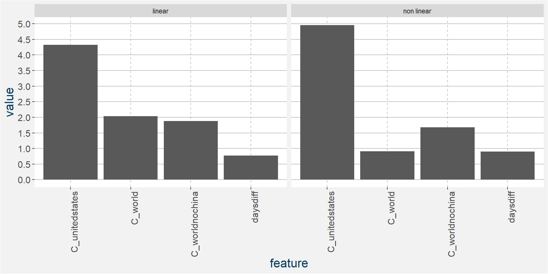
The plot below shows the normalised linear and non-linear effects in a sigle graph for easy comparison. Notice the substantial contribution from the non-linear effects.
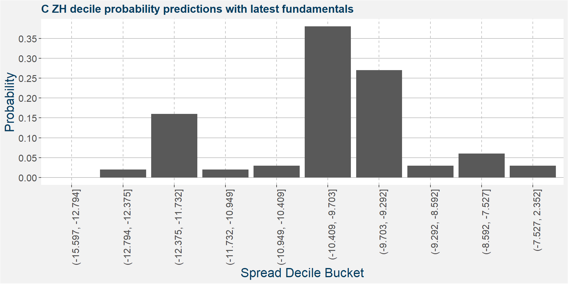
C ZH
The tables below show the model performance data. Note the out of sample accuracy is improved upon by the Random Forest model. The out of sample regression results are also much better than the linear models.
| sample | type | Logistic Regression | Random Forest |
|---|---|---|---|
| in sample | classification | 0.34 | 1.00 |
| oob | classification | NA | 0.23 |
| out of sample | classification | 0.08 | 0.36 |
| sample | type | Lasso Regression | Linear Regression | Random Forest |
|---|---|---|---|---|
| in sample | regression | 0.20 | 0.23 | 0.85 |
| oob | regression | NA | NA | 0.13 |
| out of sample | regression | 0.02 | 0.02 | 0.54 |
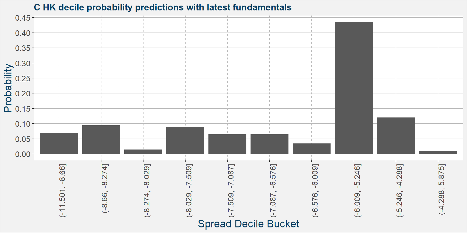
The plot below shows the probability associated with each of the spread deciles using the latest fudamental data as input parameters.
The table below shows the regression model results.
| calRef | p25 | med | avg | p75 |
|---|---|---|---|---|
| ZH | -10.53 | -9.73 | -9.89 | -9.13 |
The plot below shows the linear and non linear effects as captured by the fingerprint method. These effects can be measured and compared by the shaded areas in the facet plot below. The greater the shaded area the greater the effect.
The plot below shows the normalised linear and non-linear effects in a sigle graph for easy comparison. Notice the substantial contribution from the non-linear effects.
Remarks
This was a somewhat technical write-up on the drivers in corn calendar spreads. These models can be explored in the online app. The methods will also be extended to more calendar spreads and different commodities.