1 Introduction
Our bread and butter trades are intercommodity spreads. In this write-up we perform a correlation study between Chicago and Matif wheat.
2 Lead-Lag
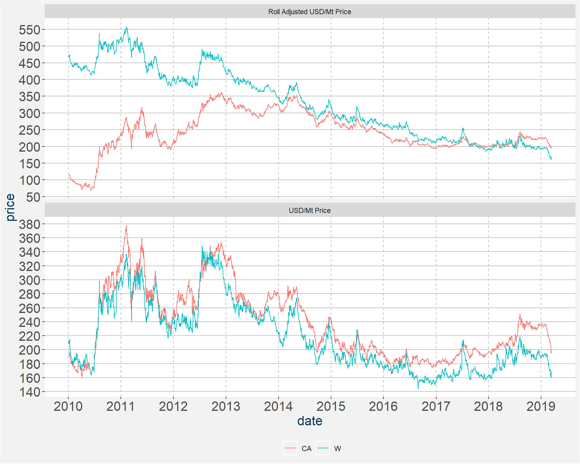
It has been stated that Historically, during the May-Aug weather period CBOT has had a tendency in certain years to rally appreciably with a notable lag in CA prices. In the plots below we investigate this claim. First we determine the roll adjusted price series of the two types of wheat. The top and bottom facets for the first plot show the roll adjusted and un-adjusted prices in USD/Mt. Throughout the blue and red curves represent CBOT and CA wheat respectively.
Stitching the returns of the roll adjusted USD/Mt price series together we can determine the value of a one dollar investment during the periods
- Jan-Apr
- May-Aug
- Sep-Dec
These are shown in the plot below. Here we only show results from 2011. The results for different calendar years can be removed and added by clicking on the particular year in the legend. In the sample below the only calendar years the showed a rally during the May-Aug time period are 2012, 2015 and 2017. Note too that 2015 and 2017 sub violent corrections after the rallies. Studying the behaviour of CA druing these time period does not show a lagged rally in the next season group.
3 Return Distributions
Below we plot the distribution of return of the two rolled time series. Some statistics are show in the table below the graph.
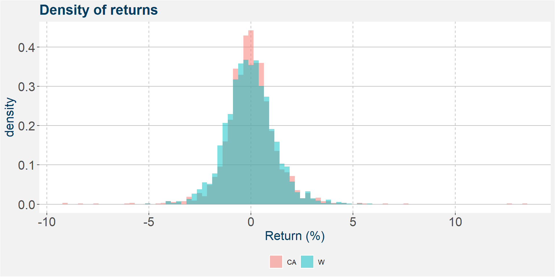
| CA | W | |
|---|---|---|
| mean | -0.0002 | -0.0480 |
| median | -0.0425 | -0.0863 |
| std | 1.3174 | 1.1983 |
| p25 | -0.6951 | -0.7717 |
| p75 | 0.6230 | 0.6712 |
| skew | 0.5841 | 0.2771 |
In the plots below we show the return distrubtions when the prices of the two underlying wheats are cut into four equaly separeted buckets. The table below the plot give some statistics on the distributions within each price bucket. Notice that both the mean and median of the distributions increase with increasing price bucket. So, for greater prices we an expect to see higher returns.
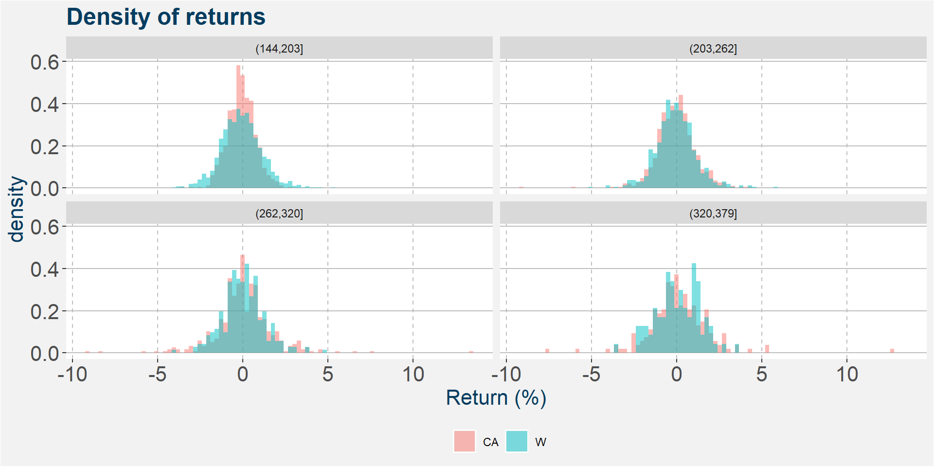
| comdty | variable | (144,203] | (203,262] | (262,320] | (320,379] |
|---|---|---|---|---|---|
| CA | mean | -0.0753 | -0.0193 | 0.0767 | 0.1318 |
| W | mean | -0.0754 | -0.0519 | 0.0214 | 0.0826 |
| CA | median | -0.0903 | -0.0177 | -0.0151 | 0.0581 |
| W | median | -0.1244 | -0.0715 | -0.0440 | 0.0791 |
| CA | std | 0.8051 | 1.1615 | 1.7716 | 1.8375 |
| W | std | 1.1954 | 1.1874 | 1.2056 | 1.2823 |
| CA | p25 | -0.5938 | -0.7556 | -0.7215 | -0.8018 |
| W | p25 | -0.8413 | -0.7061 | -0.6820 | -0.6508 |
| CA | p75 | 0.4454 | 0.6093 | 0.8447 | 0.9854 |
| W | p75 | 0.6212 | 0.6091 | 0.7153 | 1.0365 |
| CA | skew | -0.0040 | -0.5955 | 0.5993 | 1.1383 |
| W | skew | 0.2879 | 0.3043 | 0.3133 | -0.1019 |
4 Return Correlations
First we have a look at year on year correlations. The results are shown in the table below. The results are pretty consistent, only during 2017 did we see the correlations of the low side.
| correlation | |
|---|---|
| 2011 | 0.7156 |
| 2012 | 0.6985 |
| 2013 | 0.6646 |
| 2014 | 0.6721 |
| 2015 | 0.7100 |
| 2016 | 0.6198 |
| 2017 | 0.5903 |
| 2018 | 0.7347 |
| 2019 | 0.6776 |
Next, we consider the monthly correlations. Here we see that correlations peak around September.
| correlation |
|---|
| 0.6738 |
| 0.5997 |
| 0.6373 |
| 0.5756 |
| 0.5993 |
| 0.7013 |
| 0.6209 |
| 0.6457 |
| 0.7069 |
| 0.6497 |
| 0.6391 |
| 0.5278 |
In the table below we show the correlations during each month and year. Notice the correlation breakdown during September 2017.
| 1 | 2 | 3 | 4 | 5 | 6 | 7 | 8 | 9 | 10 | 11 | 12 | |
|---|---|---|---|---|---|---|---|---|---|---|---|---|
| 2011 | 0.7167 | 0.7978 | 0.8081 | 0.7584 | 0.6662 | 0.7918 | 0.5615 | 0.4701 | 0.8452 | 0.7398 | 0.7168 | 0.7550 |
| 2012 | 0.8524 | 0.6294 | 0.8191 | -0.0086 | 0.7261 | 0.8656 | 0.7781 | 0.7613 | 0.8368 | 0.7409 | 0.7823 | 0.5282 |
| 2013 | 0.4806 | 0.3578 | 0.9023 | 0.8359 | 0.5661 | 0.8437 | 0.6625 | 0.7022 | 0.5688 | 0.6641 | 0.2570 | 0.2930 |
| 2014 | 0.7160 | 0.2659 | 0.8662 | 0.6843 | 0.6278 | 0.5473 | 0.3802 | 0.8084 | 0.6241 | 0.7665 | 0.8297 | 0.5679 |
| 2015 | 0.7400 | 0.7799 | 0.7541 | 0.7000 | 0.8368 | 0.7242 | 0.4962 | 0.7335 | 0.6263 | 0.7273 | 0.6165 | 0.4346 |
| 2016 | 0.6797 | 0.5433 | 0.5572 | 0.8099 | 0.6971 | 0.7326 | 0.6672 | 0.5678 | 0.2625 | 0.5052 | 0.6304 | 0.3303 |
| 2017 | 0.6676 | 0.6483 | 0.5915 | 0.2611 | 0.4947 | 0.7584 | 0.8228 | 0.4114 | 0.1605 | 0.4025 | 0.6522 | 0.2589 |
| 2018 | 0.6765 | 0.7076 | 0.6554 | 0.8027 | 0.6334 | 0.8413 | 0.7743 | 0.8390 | 0.7852 | 0.6307 | 0.4357 | 0.7545 |
| 2019 | 0.5921 | 0.6387 | 0.7231 | NA | NA | NA | NA | NA | NA | NA | NA | NA |
Finally the table below gives the correlations between the wheat returns for the price buckets defined below.
| correlation | |
|---|---|
| (144,203] | 0.5951 |
| (203,262] | 0.7115 |
| (262,320] | 0.6384 |
| (320,379] | 0.7507 |
5 Linear Model
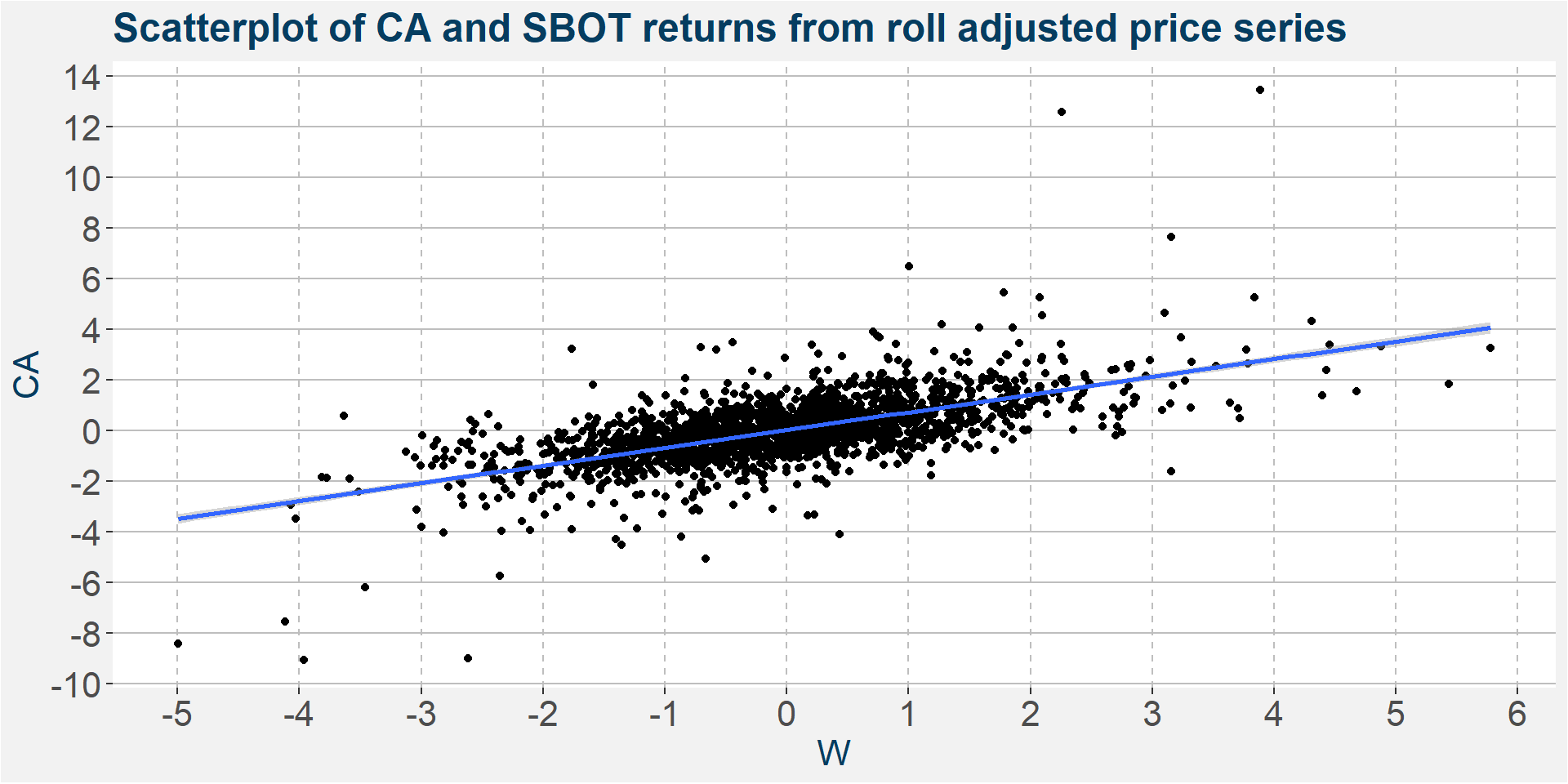
Here we model the CA price as a function of CBOT. From the slope of the linear models we can get an idea of how the returns are correlation with each other. We should expect to see similar results to the previous section.
| year | slope | R-squared |
|---|---|---|
| All Data | 0.7003 | 0.4001 |
Below we zoom in one level and have a look at the slope of the linear curves during each calendar year.
| slope | R-squared | |
|---|---|---|
| 2011 | 1.4018 | 0.5121 |
| 2012 | 0.8322 | 0.4879 |
| 2013 | 0.7188 | 0.4417 |
| 2014 | 0.5650 | 0.4517 |
| 2015 | 0.5967 | 0.5041 |
| 2016 | 0.5227 | 0.3842 |
| 2017 | 0.4032 | 0.3485 |
| 2018 | 0.4762 | 0.5397 |
| 2019 | 0.3684 | 0.4591 |
Below we study the slopes and R-squared values of the monthly linear models.
| slope | R-squared |
|---|---|
| 0.8371 | 0.4540 |
| 0.6450 | 0.3596 |
| 0.8310 | 0.4062 |
| 0.5820 | 0.3313 |
| 0.7602 | 0.3592 |
| 0.7660 | 0.4918 |
| 0.6575 | 0.3855 |
| 0.6904 | 0.4169 |
| 0.7222 | 0.4997 |
| 0.6441 | 0.4221 |
| 0.6182 | 0.4085 |
| 0.4689 | 0.2785 |
Below we consider the slope and R-squared for every year and each month. The results are shown in two tables below. The first shows the slope and the second the R-squared values.
| 1 | 2 | 3 | 4 | 5 | 6 | 7 | 8 | 9 | 10 | 11 | 12 | |
|---|---|---|---|---|---|---|---|---|---|---|---|---|
| 2011 | 1.3197 | 1.4588 | 2.1796 | 1.1003 | 1.4762 | 1.8827 | 1.1674 | 0.8313 | 1.2369 | 0.9616 | 1.0471 | 0.9529 |
| 2012 | 1.4188 | 1.1194 | 0.7384 | -0.0160 | 0.8056 | 0.6381 | 1.0635 | 0.8764 | 0.7473 | 0.7856 | 0.7753 | 0.8648 |
| 2013 | 0.5043 | 0.4549 | 0.8370 | 0.8371 | 0.5219 | 0.8038 | 0.9494 | 0.9313 | 0.5460 | 0.9222 | 0.3240 | 0.3496 |
| 2014 | 0.6973 | 0.0983 | 0.6251 | 0.5935 | 0.5335 | 0.3982 | 0.3083 | 0.7103 | 0.7089 | 0.9930 | 0.6707 | 0.4171 |
| 2015 | 1.0854 | 0.6388 | 0.6125 | 0.5324 | 0.7083 | 0.5189 | 0.4909 | 0.6437 | 0.5525 | 0.6361 | 0.3704 | 0.4896 |
| 2016 | 0.6012 | 0.6633 | 0.6054 | 0.6674 | 0.5178 | 0.6584 | 0.6814 | 0.5193 | 0.1887 | 0.2289 | 0.5264 | 0.1760 |
| 2017 | 0.4677 | 0.4124 | 0.5402 | 0.2080 | 0.3931 | 0.4788 | 0.4125 | 0.2962 | 0.1329 | 0.2567 | 0.6983 | 0.1279 |
| 2018 | 0.4554 | 0.3196 | 0.3359 | 0.3525 | 0.3970 | 0.5990 | 0.4975 | 0.6816 | 0.5348 | 0.4189 | 0.2975 | 0.4498 |
| 2019 | 0.4897 | 0.3235 | 0.3408 | NA | NA | NA | NA | NA | NA | NA | NA | NA |
Similar to the correlation breakdown we saw in the previous section during Septemver 2017, we can see a break in the R-squared values of the linear model during this same period.
| 1 | 2 | 3 | 4 | 5 | 6 | 7 | 8 | 9 | 10 | 11 | 12 | |
|---|---|---|---|---|---|---|---|---|---|---|---|---|
| 2011 | 0.5137 | 0.6365 | 0.6531 | 0.5751 | 0.4438 | 0.6270 | 0.3153 | 0.2209 | 0.7144 | 0.5473 | 0.5138 | 0.5700 |
| 2012 | 0.7267 | 0.3961 | 0.6710 | 0.0001 | 0.5272 | 0.7493 | 0.6055 | 0.5795 | 0.7003 | 0.5489 | 0.6120 | 0.2790 |
| 2013 | 0.2310 | 0.1280 | 0.8142 | 0.6987 | 0.3204 | 0.7118 | 0.4389 | 0.4930 | 0.3235 | 0.4411 | 0.0660 | 0.0859 |
| 2014 | 0.5126 | 0.0707 | 0.7504 | 0.4683 | 0.3941 | 0.2995 | 0.1445 | 0.6534 | 0.3895 | 0.5875 | 0.6884 | 0.3225 |
| 2015 | 0.5476 | 0.6082 | 0.5687 | 0.4900 | 0.7002 | 0.5245 | 0.2462 | 0.5380 | 0.3923 | 0.5290 | 0.3800 | 0.1889 |
| 2016 | 0.4620 | 0.2951 | 0.3104 | 0.6560 | 0.4860 | 0.5366 | 0.4451 | 0.3224 | 0.0689 | 0.2552 | 0.3974 | 0.1091 |
| 2017 | 0.4457 | 0.4203 | 0.3499 | 0.0682 | 0.2447 | 0.5752 | 0.6769 | 0.1693 | 0.0258 | 0.1620 | 0.4253 | 0.0670 |
| 2018 | 0.4577 | 0.5007 | 0.4296 | 0.6443 | 0.4012 | 0.7078 | 0.5995 | 0.7039 | 0.6166 | 0.3977 | 0.1898 | 0.5693 |
| 2019 | 0.3506 | 0.4079 | 0.5229 | NA | NA | NA | NA | NA | NA | NA | NA | NA |
Finally the table below gives the correlations between the wheat returns for the price buckets defined below. Notice that the slope is greater for higher price buckets.
| slope | R-squared | |
|---|---|---|
| (144,203] | 0.4747 | 0.3541 |
| (203,262] | 0.7602 | 0.5062 |
| (262,320] | 1.0906 | 0.4075 |
| (320,379] | 0.8193 | 0.5635 |
6 The Spread
In this section we study the spread between CA and W. Throughout we assume a long position in CA and short position in W. From a curve point of view this makes sense because of the carry that is available in W. The fist plot below shows the value of a one dollar investment in the spread since January 2011. The table below the plot gives some summry statistics on the performance of this strategy. Note we do not include trading costs here.
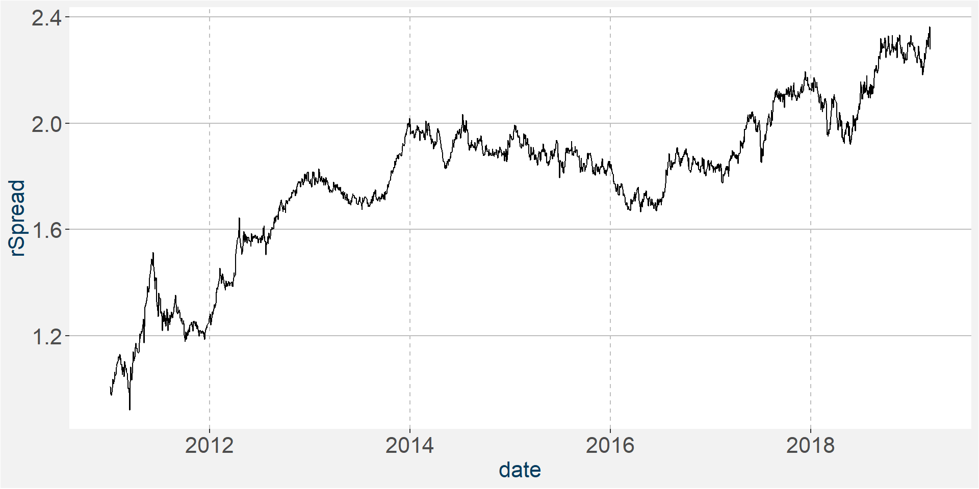
| spreadReturns | |
|---|---|
| Annualized Return | 0.1090 |
| Annualized Std Dev | 0.1721 |
| Annualized Sharpe (Rf=0%) | 0.6331 |
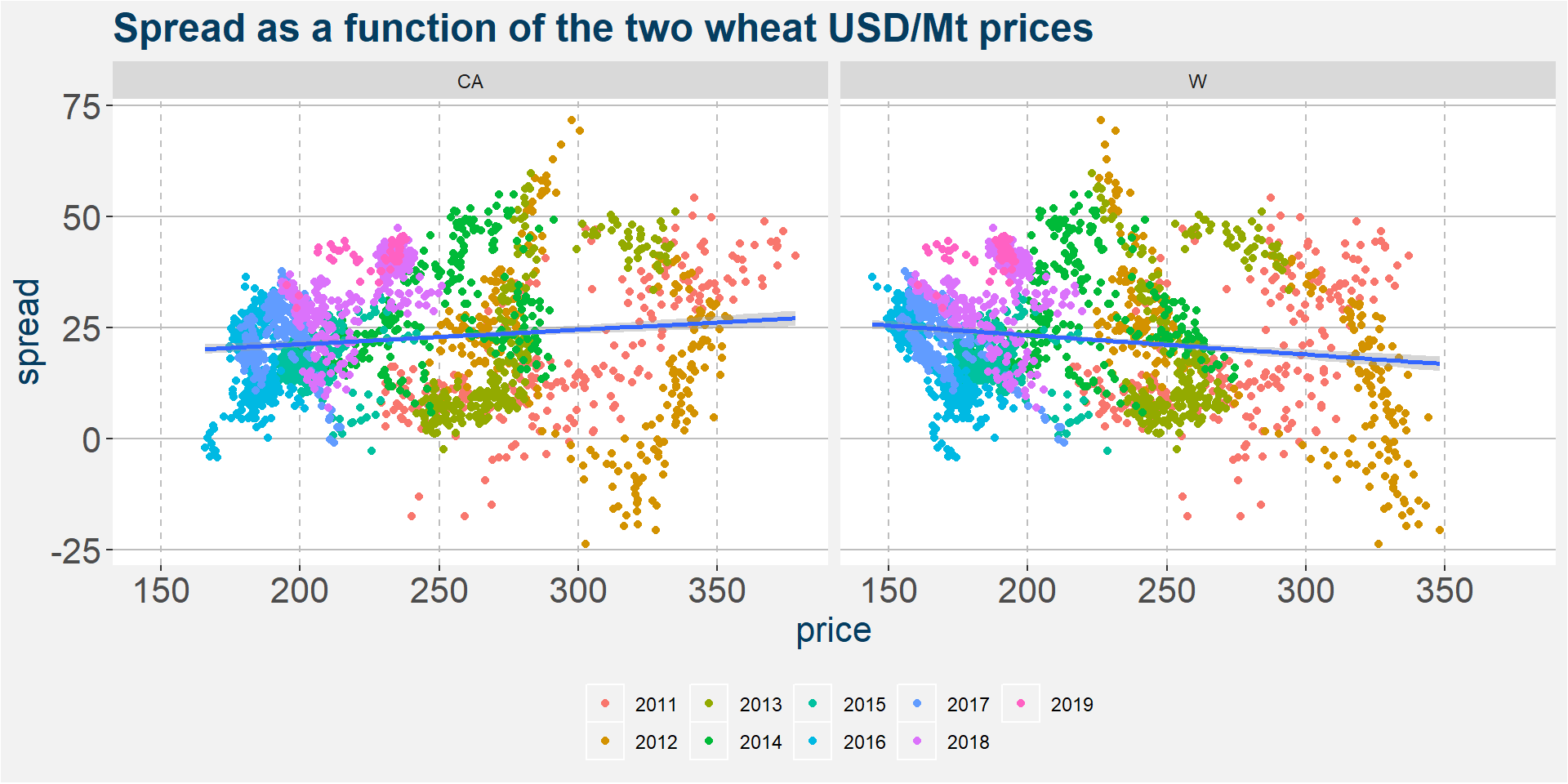
In the plot below we investigate whether there is a relationship between the spread and the value of each of the underlying wheat contracts. As before all prices are expressed in USD/Mt. We superimpose linear fits to both plots. Notice the different slopes, positive for CA and negative for W. The data is so spread out that it is not clear if either of the two commodities can be consider the dirver of the spread.
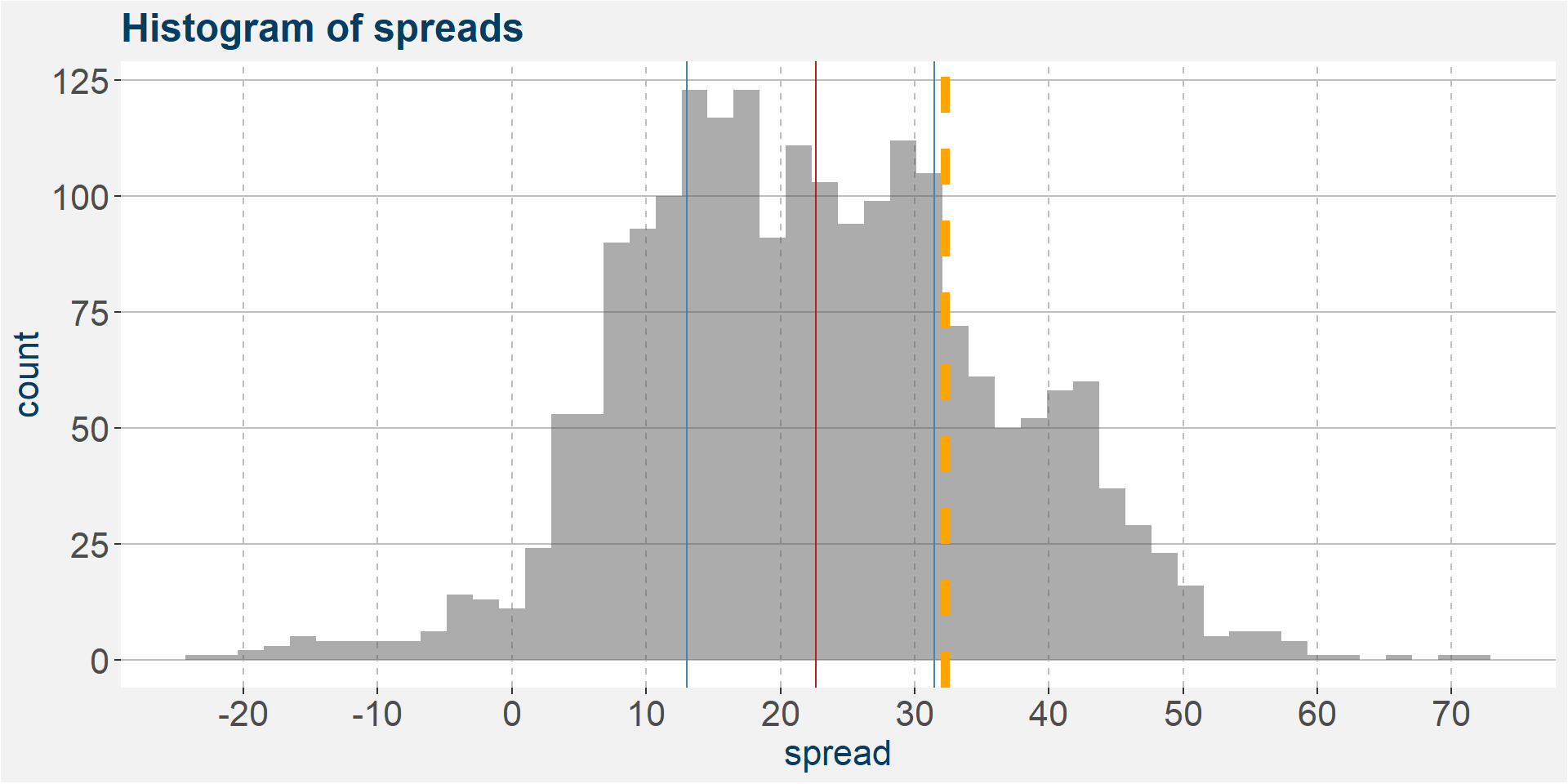
From the above plot we can define a floor in the spread at a value of around 0. It is very seldom that W trades above CA. This can be made even more clear by the histogram shown below. The value of the current F1 spread is given by the thick orange line.
7 Remarks
- We cannot see a definite lead-lag effect in the data where a rally in W precedes one in CA
- The two commodities are highly correlated
- The spread seems to have a lower bound
- Being short W generated the majority of the profit
- Most of the profit comes from the difference in roll yields
- Slope of the return fit varies between 0.58 and 0.77 for the May-Aug period
- Correlations vary between 0.6 and 0.7 for the May-Aug period