Introduction
Traditionally we identify possible inter-commodity and calendar spreads based on whether the spread is stretched or suppressed compared to historical levels. As a reference we normally use the period closest to expiration of the first contract, say the last forty days before exipry, to compare the spreads. This method can be enhanced by studying the seasonal tendancies of the different spreads. Intuitively this makes to most sense for cyclical commodities such as the agricultural and meats markets.
The guys at Facebook have recently open sourced their time series forecasting package called Prophet. It is available in both R and Python and is pretty intuitive to use if you are familiar with the structure of packages like scikit-learn and Tensor Flow. The model decomposes the time series into
- Piecewise trend (L1-regularised trend shifts),
- Seasonality (Fourier series),
- Holiday Effects (Dummy variables) and
- i.i.d noise
Here is a link to a youtube video where the developer gives a talk about the package and shows a couple of examples.
Example
The best way to show what the API can do is to illustrate it with an example. Here we consider the corn ZN spreads. The plot below shows all the spreads on a the same rescaled time axis. Here we arbitrarily choose this to be in some period over 2000. The current front spread is highlighted in red. By eye it looks like there is some seasonal trends present in the spreads, save for the one outlier. This occurred during 2012 which was a big drought year.

In the plot below we stretch out the spreads. Here too the seasonality becomes aparent. In previous corn posts we have seen that there was a fundamental change in the market dynamics after 2007. For this reason will only use data from 2008 onwards.
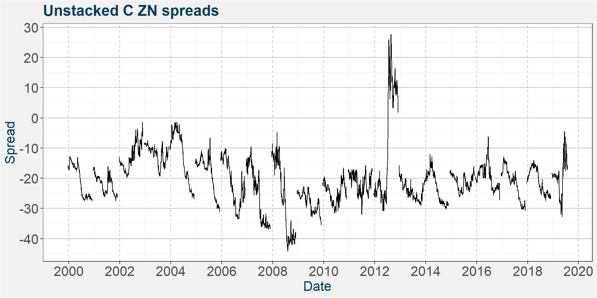
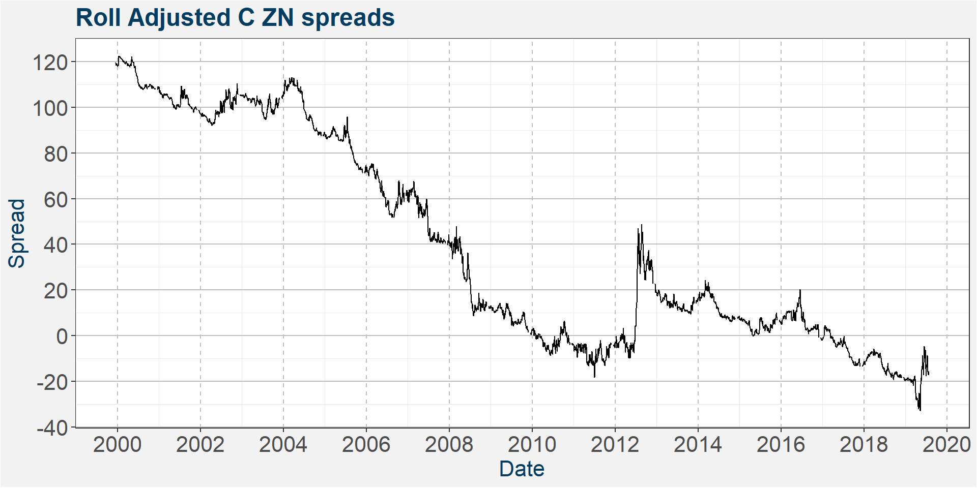
Another way to create a time series to model is to stack the different calendar spread in a similar way in which we would create a roll adjusted continuous future’s time series. In the plot below we use a backwards additive roll method. All this mean is that we alight the start of one calendar spread with the end of the previous calendar spread. The idea behind this is that the time series model might be able to model this roll adjusted series better because it does not contain the discontinuities of the unadjusted series. The plot below shows what the roll adjusted calendar spreads look like.
Unadjusted Time Series
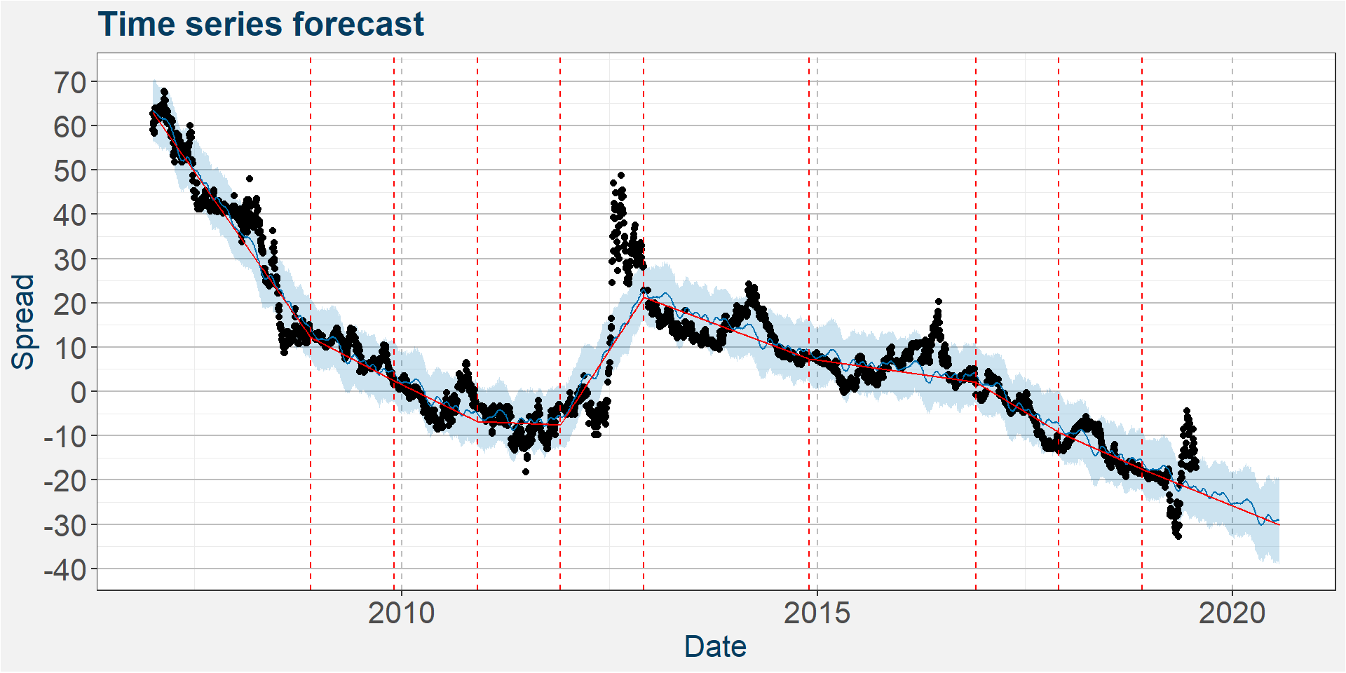
In the plot below we show the time series forecast superimposed on top of the actual data. The blue line gives the model predictions together with a confidence interval here represented by the blue shaded region. We also perform a forcast into the future. This is the section to the right where there is not any actual spread data present. The dashed red lines show the piecewise trend change points. By eye the model does a reasonable job at modeling the time series. It is only the stress period duirng 2012 that falls well outside the error bars.

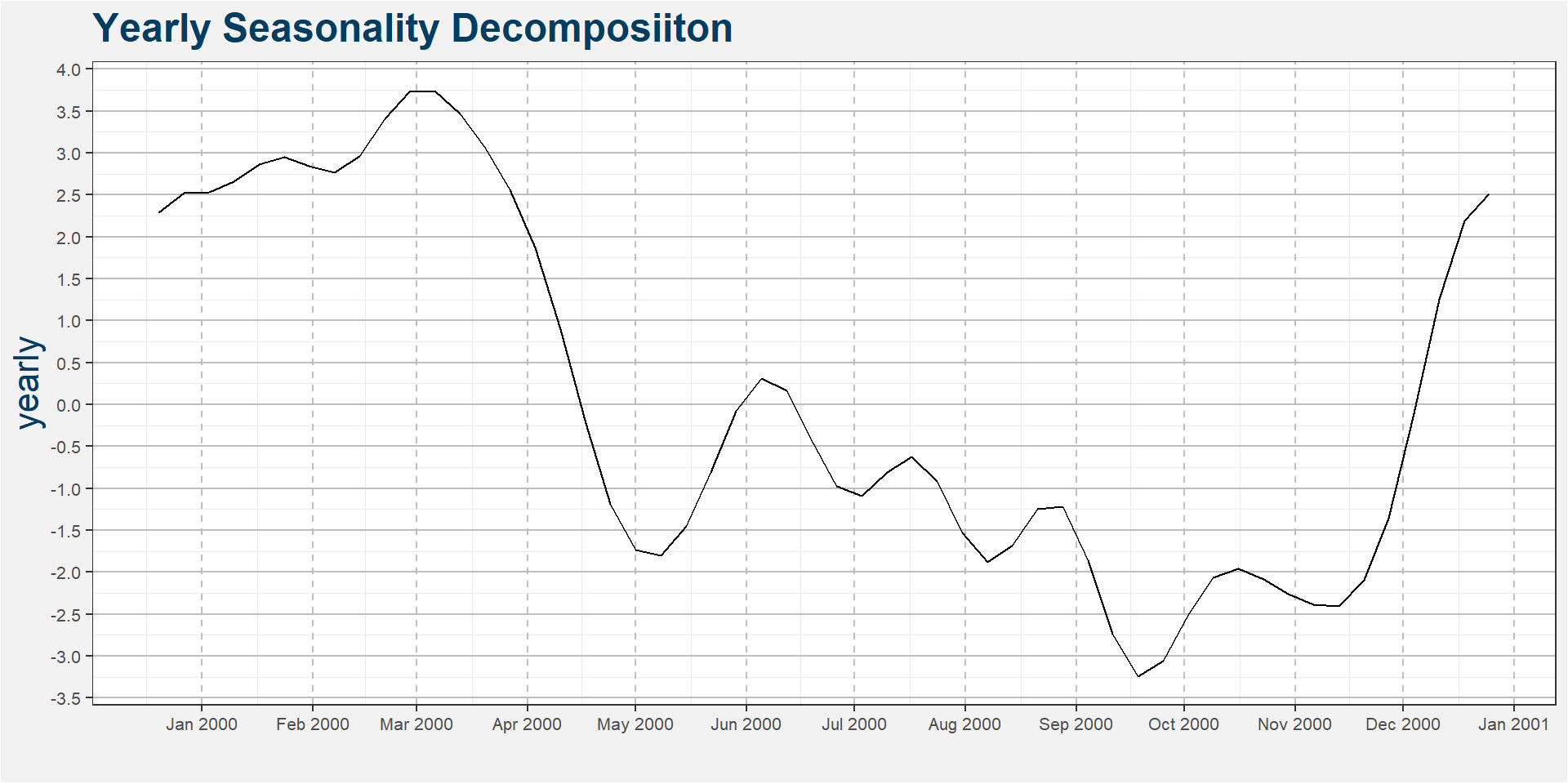
The plot below shows the decomposition of the time series according to yearly seasonality. Our aim is not to forecast the values of the spread in order to create a trading signal, rather we want to study the decomposition of the historical time series to find possible seasonal enrty and exit points for different calendar spreads. Taking the results of the time series decomposition at face value we see that the spread decreases by nearly 7 cents from the beginning of March to mid September. Another drop worth noticing is from March to May, in this case a decrease of nearly 5.5 cents.
Roll Adjusted Time Series
In the plot below we show the time series forecast superimposed on top of the actual data. The blue line gives the model predictions together with a confidence interval here represented by the blue shaded region. We also perform a forcast into the future. This is the section to the right where there is not any actual spread data present. The dashed red lines show the piecewise trend change points. By eye the model does a reasonable job at modeling the time series. It is only the stress period duirng 2012 that falls well outside the error bars.
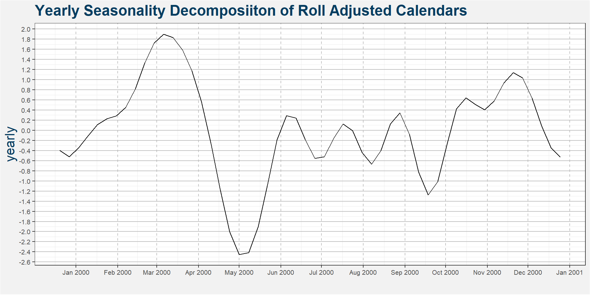
The plot below shows the decomposition of the time series according to yearly seasonality. Our aim is not to forecast the values of the spread in order to create a trading signal, rather we want to study the decomposition of the historical time series to find possible seasonal enrty and exit points for different calendar spreads. Taking the results of the time series decomposition at face value we see that the spread decreases by nearly 5 cents from the beginning of March to May. After this period there seems to be an oscillating upward trend which we don’t observe in the unadjusted time series.
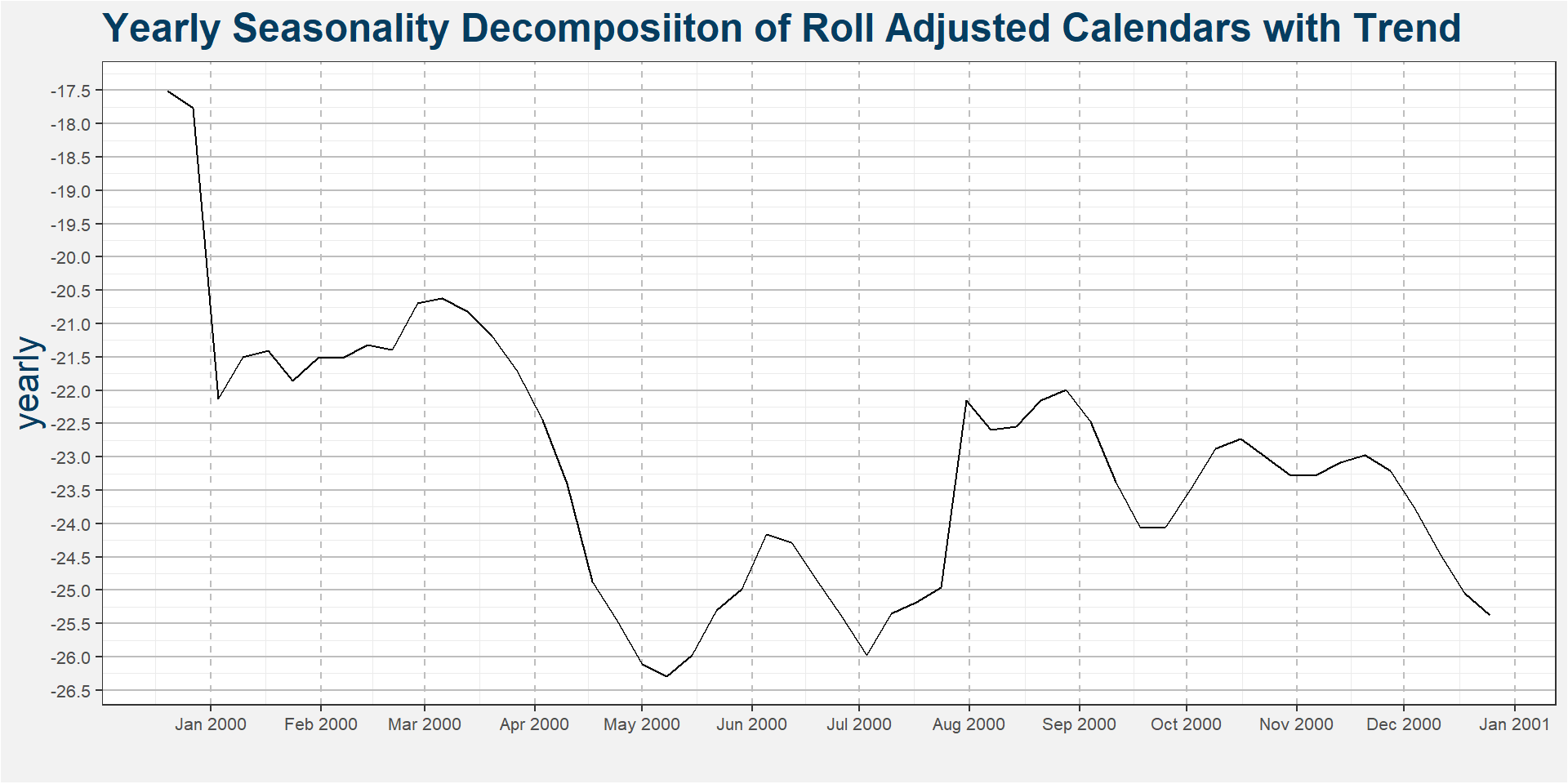
The roll adjusted calendar have a much stronger trend due to the significant carry component present in the corn market. We can capture this carry component by including the trend. The results can then be seen in the image below. Here the steep jump together with the carry component give a 6 cent decrease in the spread from March through Setepmber. This gives a similar result to the unadjusted model.
Compare with the current spread
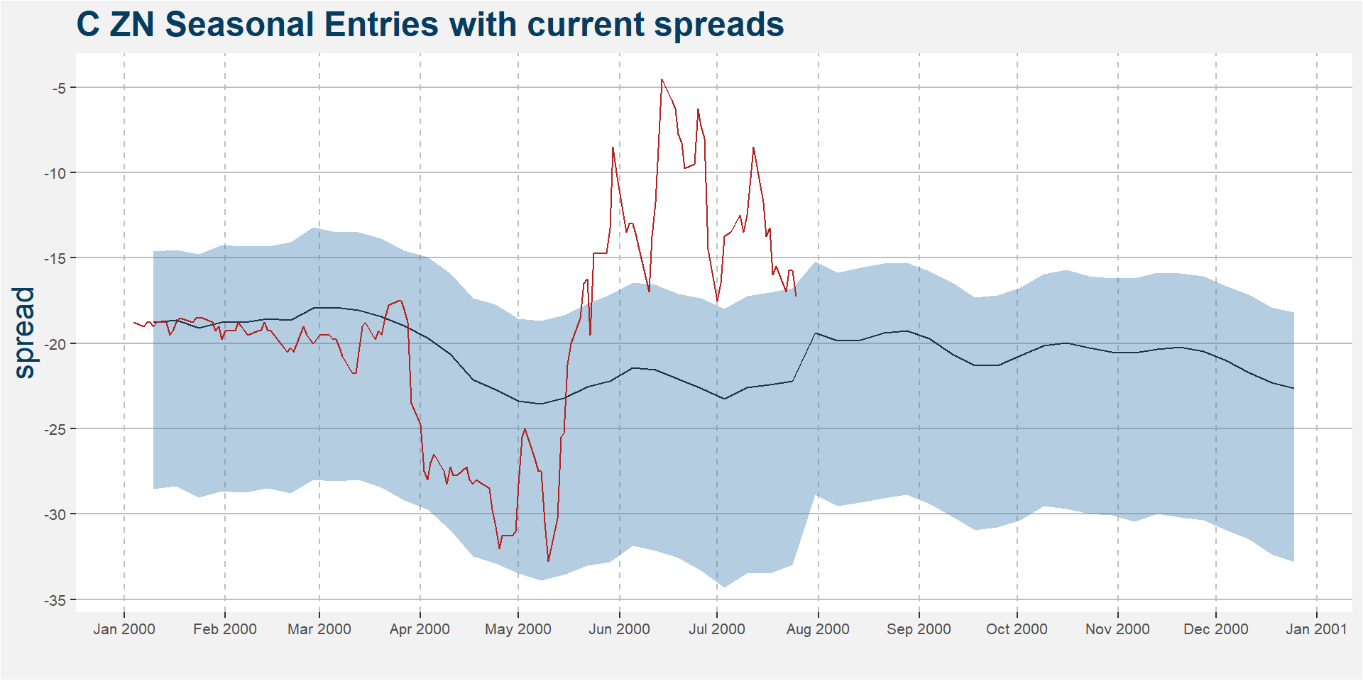
The plot below shows the current value of the C Z9 CN0 spread in red. Superimposed on top of the spread is the yearly seasonality with trend. Here a good time to short the spread is from the second week of April. Historically the largest contango move occurs between April and May, with a slow carry trickle leading towads expiry.
Remarks
- Using the above method on each calendar of every commodity we hope to identify seasonal entry and exit windows.
- The method can easily be extended to inter-commodity spreads .
- From this we can generate a monthly notification of what kind of seasoanl moves we are likely to expect.
- These results will be added to Shiny soon.