Introduction
The goal of this write-up is to study the main fundamental drivers or the board soybean crush. We define the board crush as the difference between the price of soybeans and the crushed components consisting of soybean meal and soybean oil. The table below highlights the contract specifications of the three sommodities used in creating the crush spread.
| comdty | units | constractsize | pricebasis | crncybasis | name | exchange | tonspercontract |
|---|---|---|---|---|---|---|---|
| BO | Pounds | 60000 | USd/Lb | USD | Soybean Oil | Cbot | 27.21557 |
| S | Short Bushels | 5000 | USd/Sbushel | USD | Soybean | Cbot | 136.07911 |
| SM | Short Ton | 100 | USD/St | USD | Soybean Meal | Cbot | 90.71940 |
In this link the CME give supporting documentation of the board crush spread. Below we quote directly from their pdf document
When a bushel of soybeans weighing 60 pounds is crushed, the typical result is 11 pounds of soybean oil, 44 >pounds of 48 percent protein soybean meal, 4 pounds of hulls and 1 pound of waste. Although soybean meal can be delivered with different levels of protein, the CBOT Soybean Meal futures contract specifications are for 48 >percent protein
From the above excerpt and the contract spec table we can determine the contract sizing for the board crush. The calculations are given below.
\[ \text{crush margin} = \left(\text{SM} \times \frac{44}{60} + \text{BO} \times \frac{11}{60} \right) - \text{S} \]
\[ 1 \text{ contract S} = 5000 \text{ bu S} \rightarrow 5000 \times 60 \times \frac{44}{60} = 220000 \text{ lb SM} = 110 \text{ short ton SM} = 1.1 \text{ contract SM} \]
\[ 1 \text{ contract S} = 5000 \text{ bu S} \rightarrow 5000 \times 60 \times \frac{11}{60} = 55000 \text{ lb BO} = 0.917 \text{ contract BO} \]
\[ S:SM:BO = 1:1.1:0.917 \]
The Bloomberg tickers for the soybean crush is SRA Comdty. In the bloomberg description it states that the soybean crush is calculated using the formula
\[ \text{Soybean Crush} = (\text{SM in \$/t}) \times 0.022 + (\text{BO in \$/cwt}) \times 0.11 - \text{S \$/bu}. \] A long crush position is expressed as
- long 11 lots of SM
- long 9 lots of BO
- short 10 lots of S
if we want to be short crush the directions are reversed.
The table below shows which contract codes of the three commodities go into creating the spread with a particular code. Note that most of the spread codes have the same contract code as the underlying commodities, it is only in the V and Z cases that the X contract of soybeans is used because it does not have a V or Z contract.
| code | S | SM | BO |
|---|---|---|---|
| F | F | F | F |
| H | H | H | H |
| K | K | K | K |
| N | N | N | N |
| Q | Q | Q | Q |
| U | U | U | U |
| V | X | V | V |
| Z | X | Z | Z |
Our aim is to model the value of the spread as a function of the stock-to-usage ratios of
- Soybeans
- Soybean Meal
- Soybean Oil
in
- United States
- Brazil
- Argentina
This gives nine different input features. In order to include some measure of the passage of time we also include the number of days until the ealiest expiry of the contracts making up a particular spread. In the following we consider each of the spread codes individually. For feature importance analysis we start with all the features included and model the spread using a random forest regression model with 3-fold cross validation. We keep 20% of the data for out of samples testing. The feature importance of the input features are sorted from least to greatest importance. The least important feature in then droppen and the process is repeated until only a single feature remains.
The performance statistics of the iterated models are plotted and instpected for elbows. These elbows are then used to create a model with less features that still has stable out of sample performance. The fingerprice method of Li, Turkington and Yazdani is then used to investigate the linear and non linear effects present in the model. For an overview of the mathematics involved in the model the reader is redirected to this wirte up.
Unsupervised Machine Learning
In this section we perform t-SNE visualisation of the fundamental data and spreads. Recall that we are interested in the the stock-to-usage numbers of three commodities over three different countries. These values together with the spread, which we are trying to forecast, makes for a ten dimensional space which is not easy to visualise. To help us visualise the feature space we make use of an unsupervised machine learning technique called t-SNE.
t-SNE stands for t-distributed stochastic neighour embedding, a complicated name but it serves a very simple purpose. It maps samples from their higher dimensional space into a two dimensional space so they can be visualised. While some distortion is inevitable t-SNE does a great job of representing the distances between the samples.
Below we show the t-SNE plots for each of the contract codes. Red and blue dot represents contacts that expire in and before 2005 and after 2005 respectively. We include the point for expiries in 2019 and 2020 using black dots and triangles respectively.
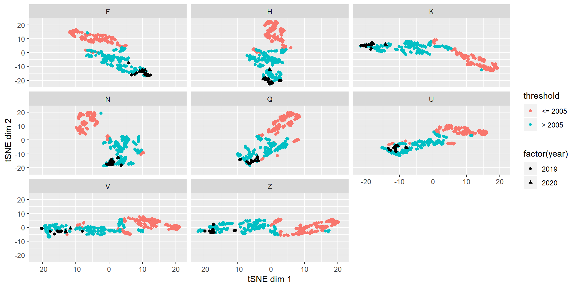
For most of the contract codes we see a separation of the crush spread and fundamentals before and after 2005. We can also see that the most resent data fits in the post 2005 bucket. In the following we use data post 2005 to model the spreads of the different contract codes. This way we only throw out data that is the most different from the data we are interested in.
F
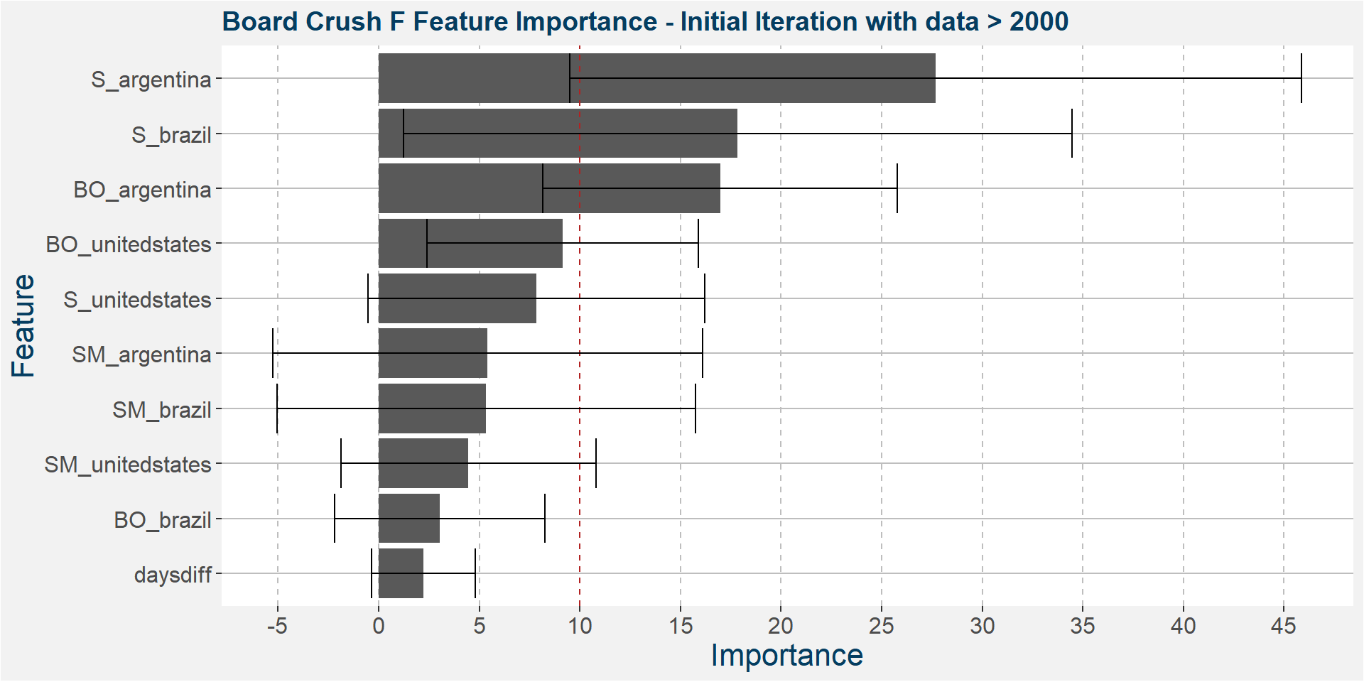
The plot below shows the average feature importance associated with each of the input features. The error bars represent one standard deviation away from the means. The red vertical bar shows the value of importnace for which all the features will have the same importance. As a general rule of thumb, only those features with importances greater than this threshold value will give significant contributions to the model predictions.
Below it is interesting to note that Argentine soybeans stock-to-usage is the dominant predictive feature with Brazilian soybean and soybean oil stock-to-usage coming in second and third.
The plot below shows the evolution of the model performance metrics for each iteration. Notice that the in sample results are pretty stable up to iteration 6 before it breaks down.
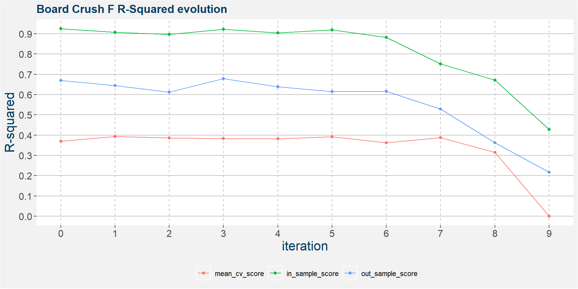
In the 6th iteration above we have
- S_argentina
- S_brazil
- BO_argentina
- BO_unitedstates
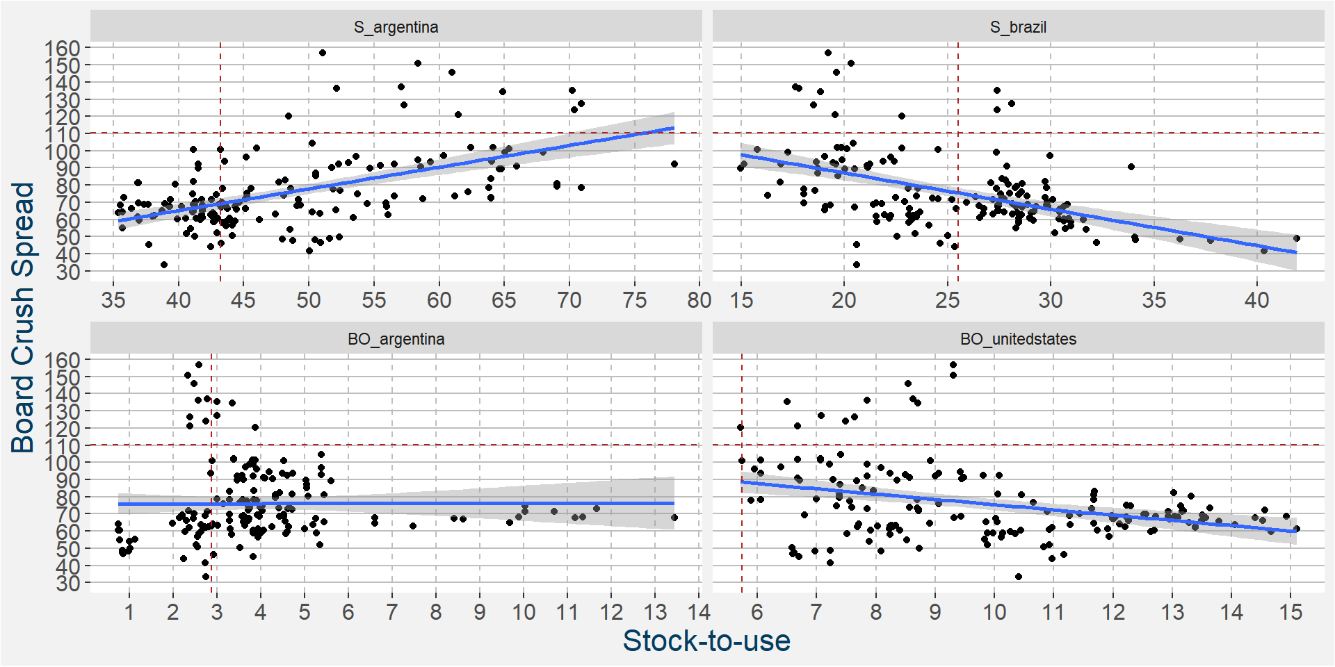
ramaining as the main predictive features without much of a loss in performance statistics from the full feature model. In the plot below we show the scatter plots of the board crush as a function of these input features. Note the differences in the slopes superimposed on the scatter plots, particularly in the case of soybean stocks in Argentina and Brazil showing positive and negative correlations respectively. Current values of the spread and fundamentals are given by the dashed horizontal and vertical lines.
The plot below shows the linear and non linear effects as captured by the fingerprint method on the 4 dominant features above. These effects can be measured and compared by the shaded areas in the facet plot below. The greater the shaded area the greater the effect.
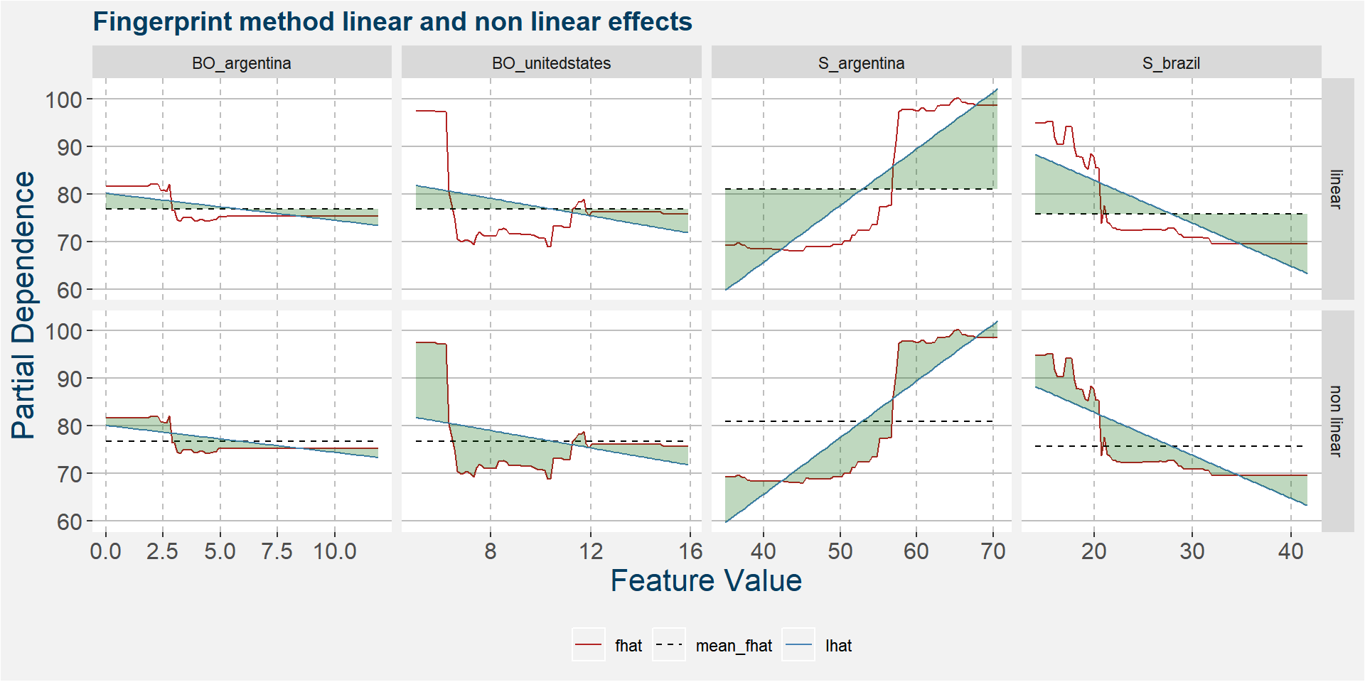
The table below shows the normalised ranked shaded areas of the plot above. Note that the linear effects from the Argentine and Brazilian soybean stock-to-usage number contribute the most. The first non linear effect that enters the picture is that of United States soybean oil stocks.
| feature | effect | value |
|---|---|---|
| S_argentina | linear | 10.70 |
| S_brazil | linear | 6.32 |
| BO_unitedstates | non linear | 5.89 |
| S_argentina | non linear | 5.36 |
| S_brazil | non linear | 4.29 |
| BO_unitedstates | linear | 2.52 |
| BO_argentina | linear | 1.70 |
| BO_argentina | non linear | 1.67 |
H
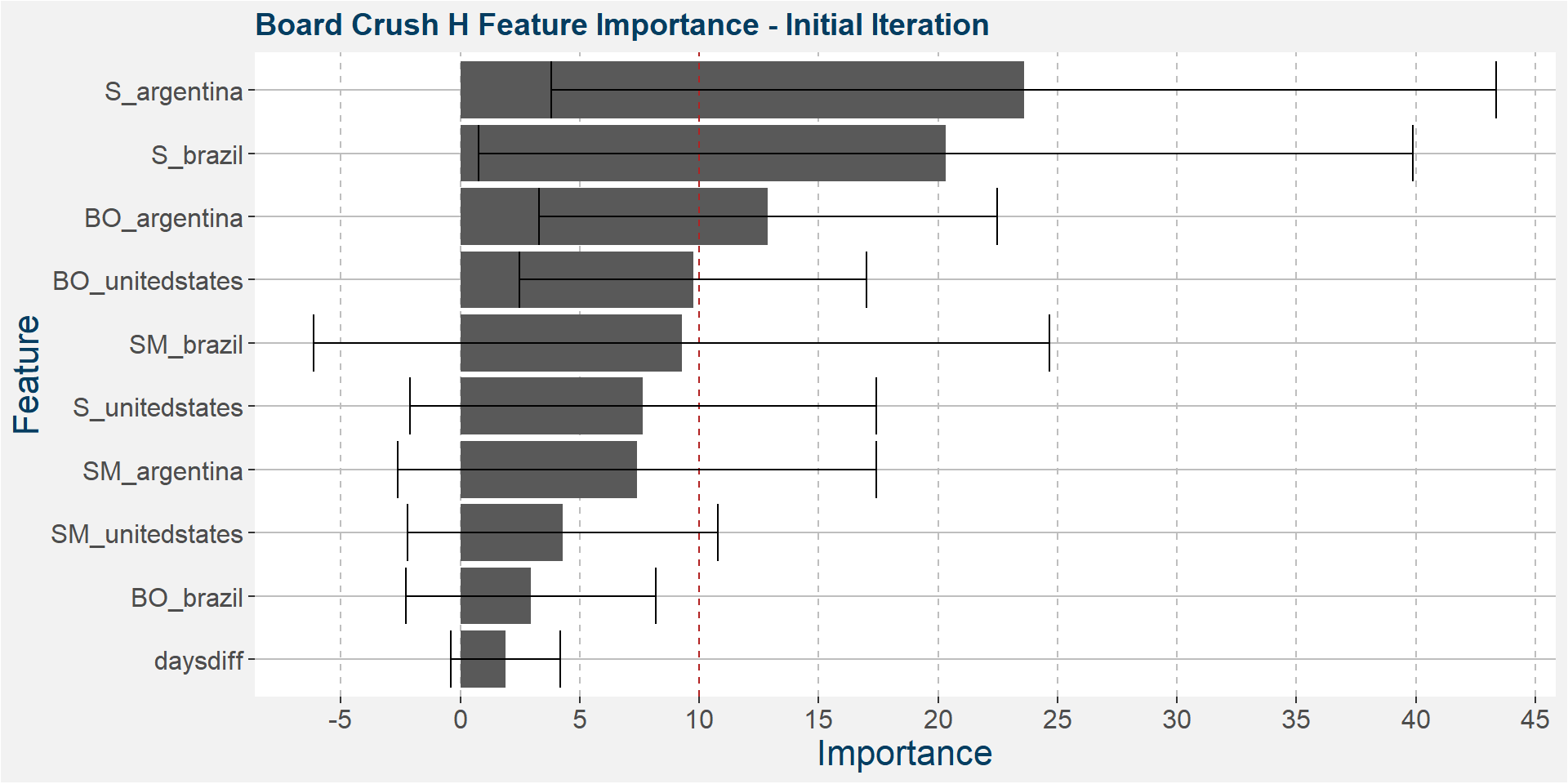
The plot below shows the average feature importance associated with each of the input features. The error bars represent one standard deviation away from the means. The red vertical bar shows the value of importnace for which all the features will have the same importance. As a general rule of thumb, only those features with importances greater than this threshold value will give significant contributions to the model predictions.
Below it is interesting to note that Argentine and Brazilina soybeans stock-to-usage are the top drivers with Argentine soybean oil in a distant, but still relative, third place.
The plot below shows the evolution of the model performance metrics for each iteration. In sample performance is stable up to the seventh iteration, however out of sample performance statististics decays substantially from the thrid to sixth iteration before rebounding. Mean cross validation performance statistics starts to break down around the sixth iteration.
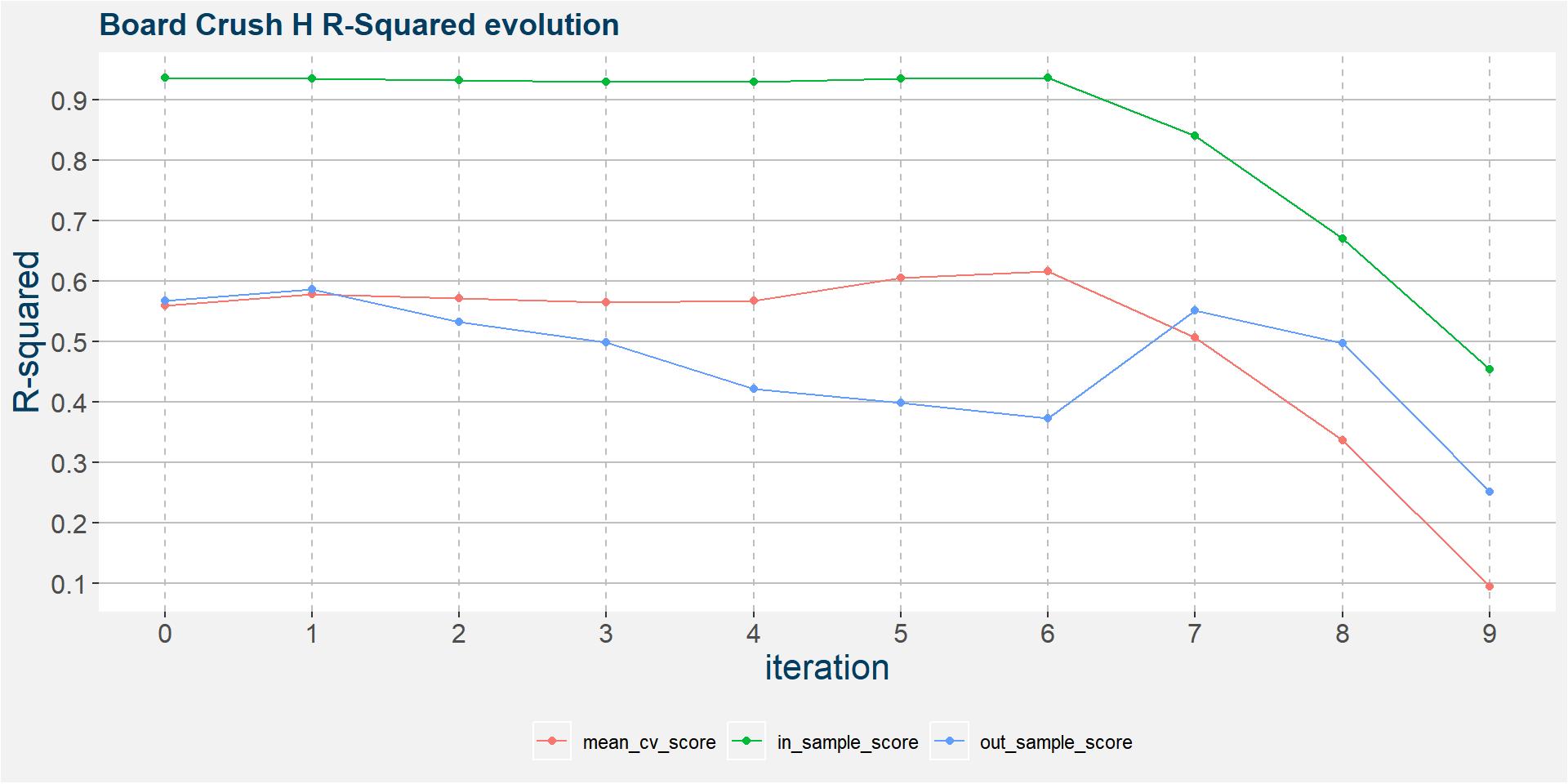
In the 6th iteration above we have
- S_argentina
- S_brazil
- BO_argentina
- BO_unitedstates
ramaining as the main predictive features without much of a loss in performance statistics from the full feature model. In the plot below we show the scatter plots of the board crush as a function of these input features. Below we see that the slopes associated with Argentine and Brazilian soybeans are similar to those of the F spread.
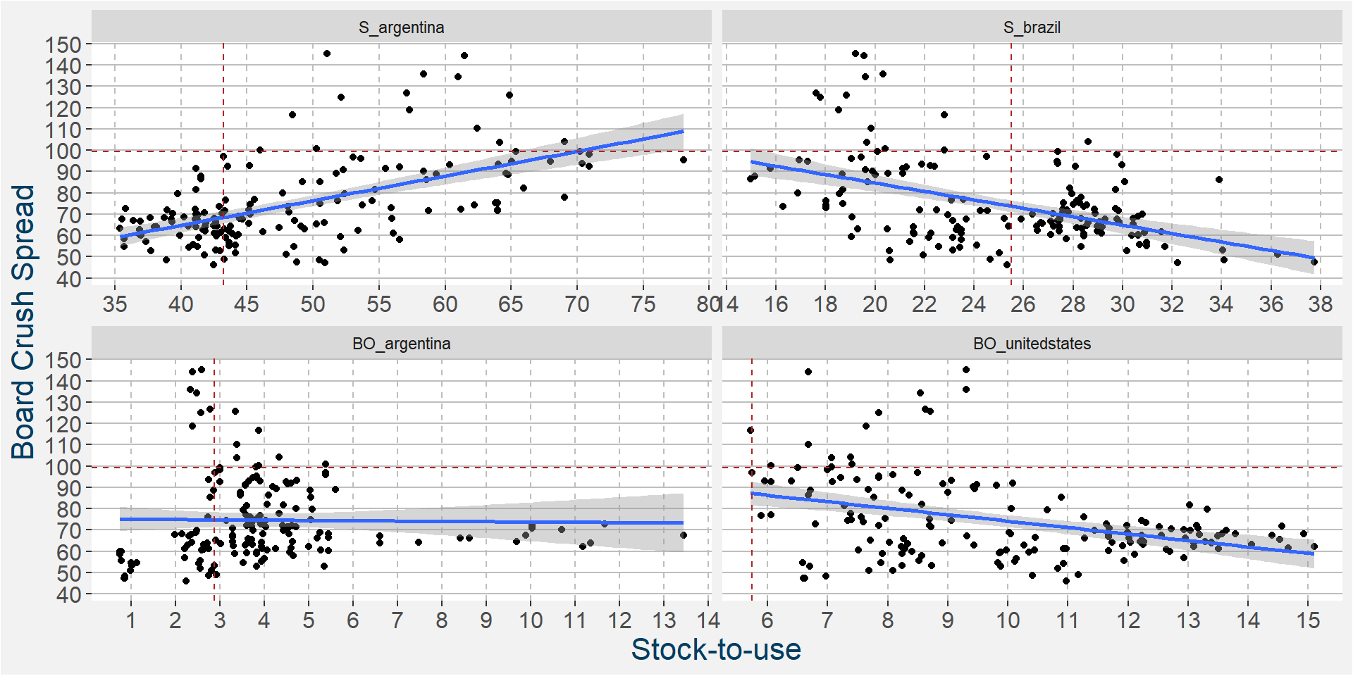
The plot below shows the linear and non linear effects as captured by the fingerprint method on the 3 dominant features above. These effects can be measured and compared by the shaded areas in the facet plot below. The greater the shaded area the greater the effect.
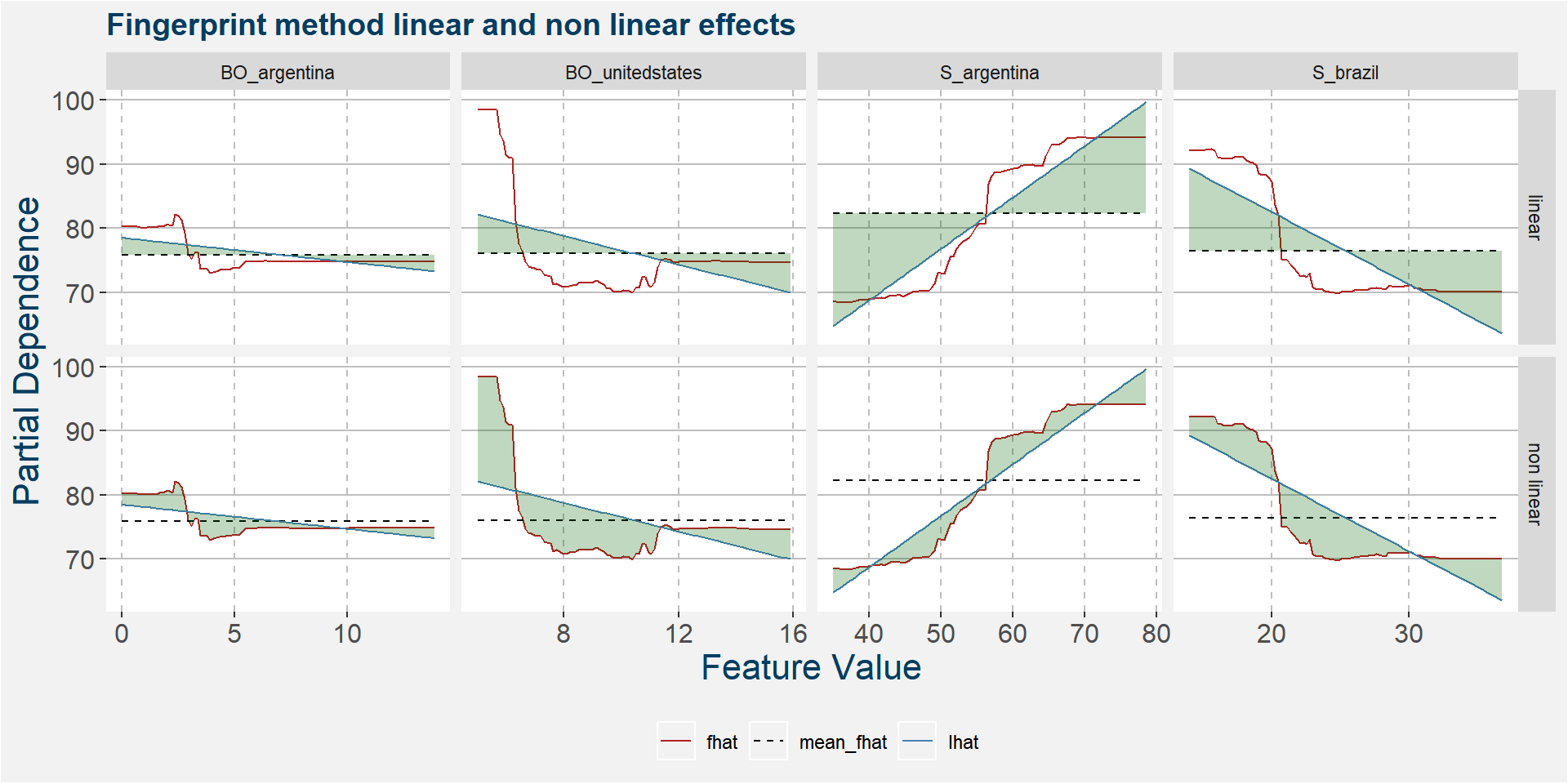
The table below shows the normalised ranked shaded areas of the plot above. Note that the linear effects from the Argentine and Brazilian soybean stock-to-usage number contribute the most. The first non linear effect that enters the picture is that of United States soybean oil stocks.
| feature | effect | value |
|---|---|---|
| S_argentina | linear | 8.81 |
| S_brazil | linear | 6.48 |
| BO_unitedstates | non linear | 5.38 |
| S_brazil | non linear | 4.35 |
| BO_unitedstates | linear | 3.07 |
| S_argentina | non linear | 2.71 |
| BO_argentina | non linear | 1.52 |
| BO_argentina | linear | 1.32 |
K
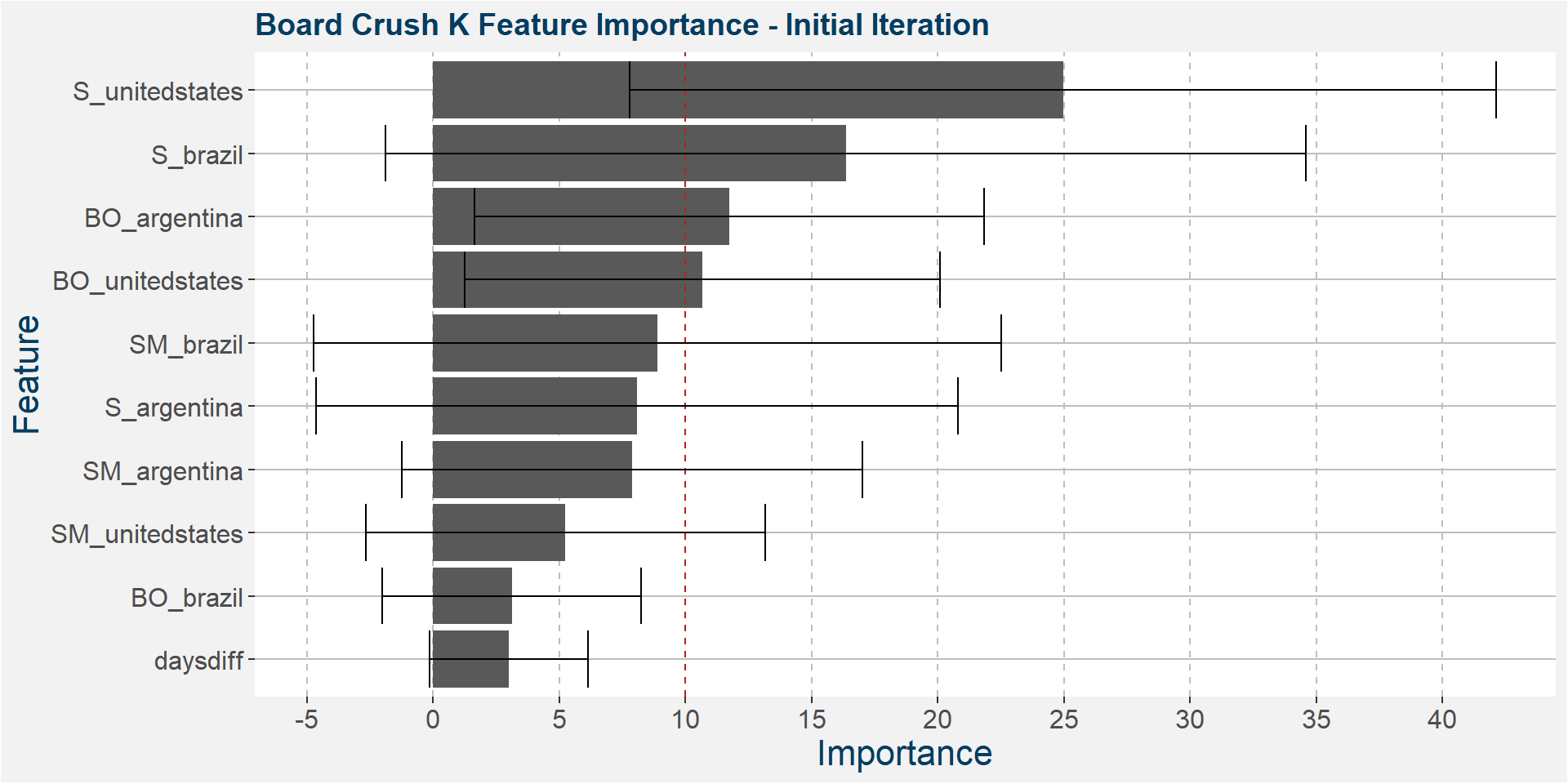
The plot below shows the average feature importance associated with each of the input features. The error bars represent one standard deviation away from the means. The red vertical bar shows the value of importnace for which all the features will have the same importance. As a general rule of thumb, only those features with importances greater than this threshold value will give significant contributions to the model predictions.
Below we see the dynamics starting to change with the United States soybean stock-to-usage joining the South American party. However, the bult of the predictive quality remains in the hands of South America.
The plot below shows the evolution of the model performance metrics for each iteration. The model is pretty stable throughout the iterations.
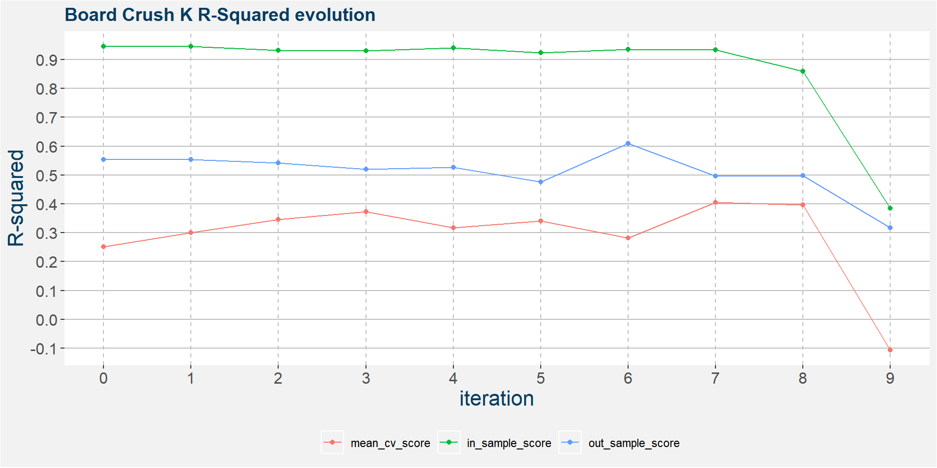
In the 6th iteration above we have
- S_brazil
- BO_argentina
- S_argentina
- S_unitedstates
ramaining as the main predictive features without much of a loss in performance statistics from the full feature model. In the plot below we show the scatter plots of the board crush as a function of these input features.
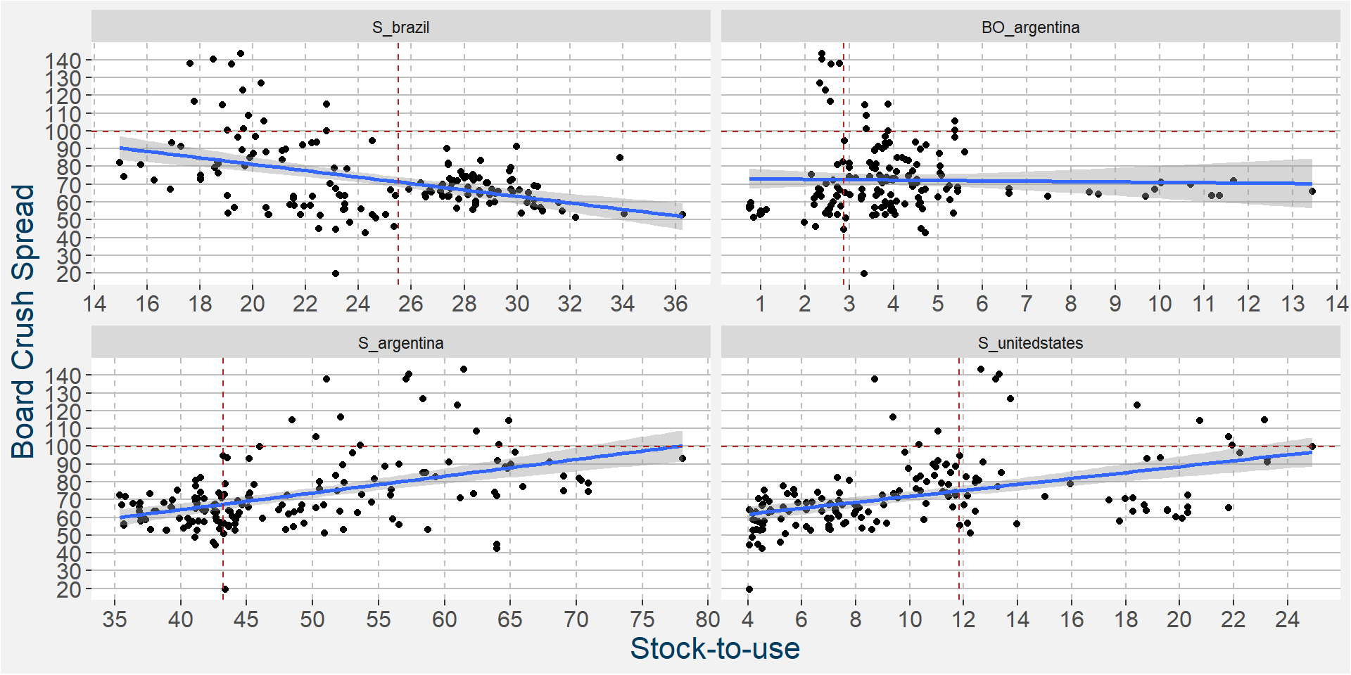
The plot below shows the linear and non linear effects as captured by the fingerprint method on the 4 dominant features above. These effects can be measured and compared by the shaded areas in the facet plot below. The greater the shaded area the greater the effect.
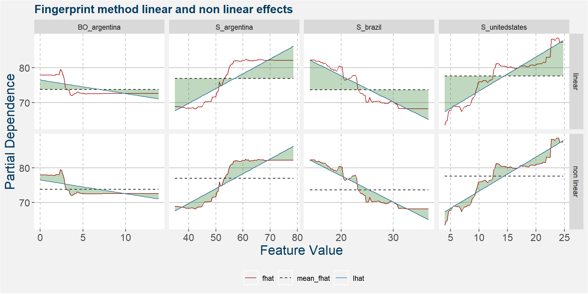
The table below shows the normalised ranked shaded areas of the plot above. Note that the top three effects are all linear in nature.
| feature | effect | value |
|---|---|---|
| S_unitedstates | linear | 5.16 |
| S_argentina | linear | 4.69 |
| S_brazil | linear | 4.32 |
| S_argentina | non linear | 2.16 |
| S_unitedstates | non linear | 1.77 |
| BO_argentina | linear | 1.38 |
| S_brazil | non linear | 1.34 |
| BO_argentina | non linear | 1.34 |
N
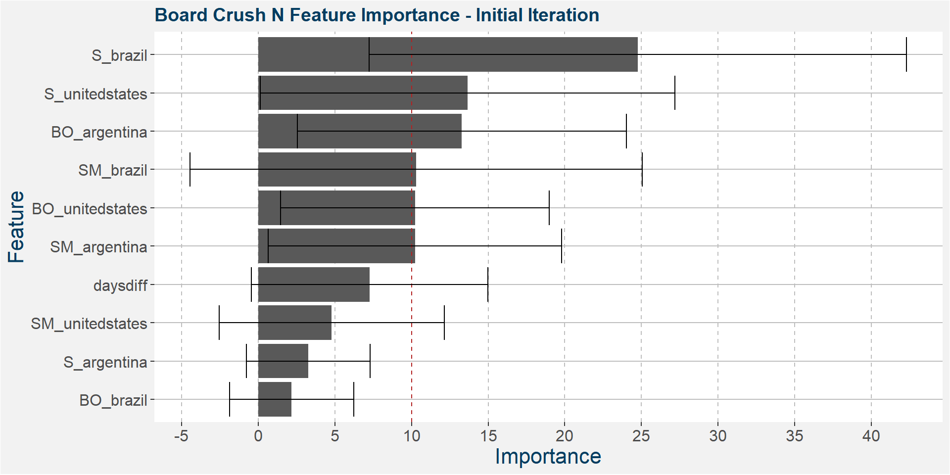
The plot below shows the average feature importance associated with each of the input features. The error bars represent one standard deviation away from the means. The red vertical bar shows the value of importnace for which all the features will have the same importance. As a general rule of thumb, only those features with importances greater than this threshold value will give significant contributions to the model predictions.
Once we have reached the second half of the year we again see the South American stock-to-usages coming into play, here Brazilian soybean stocks is the dominant predictive feature.
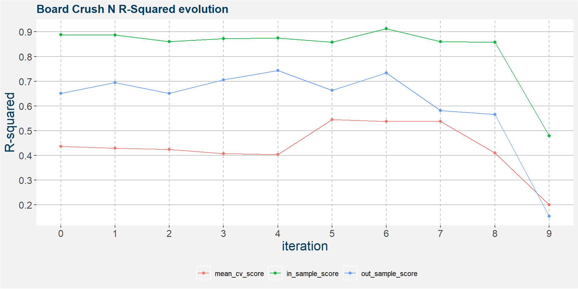
The plot below shows the evolution of the model performance metrics for each iteration. The performance statistics of the in and out of sample results are stable up to the 7th or 8th iteration.
In the 6th iteration above we have
- S_unitedstates
- SM_argentina
- S_brazil
- SM_brazil
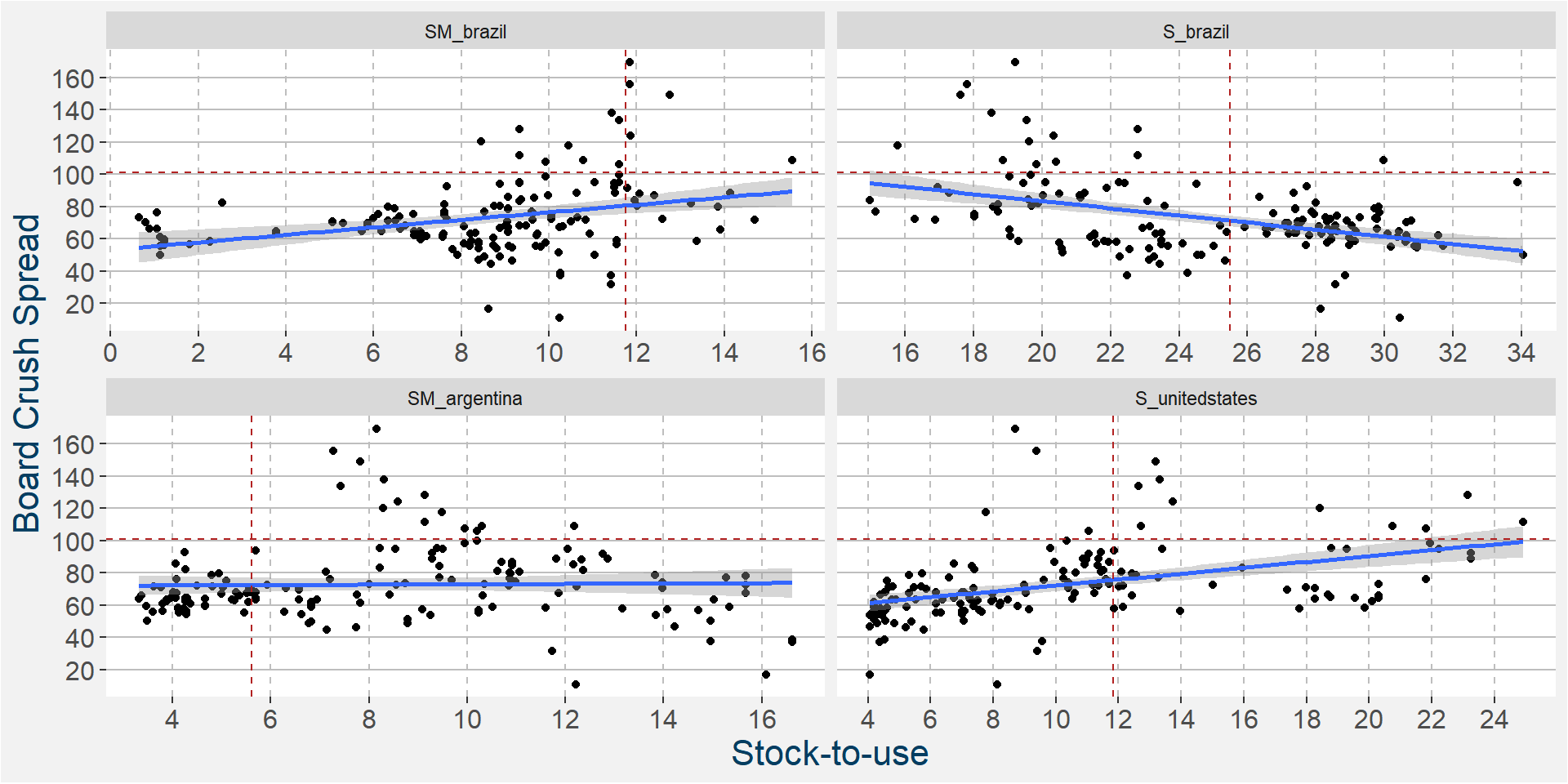
ramaining as the main predictive features without much of a loss in performance statistics from the full feature model. In the plot below we show the scatter plots of the board crush as a function of these input features.
The plot below shows the linear and non linear effects as captured by the fingerprint method on the 3 dominant features above. These effects can be measured and compared by the shaded areas in the facet plot below. The greater the shaded area the greater the effect.
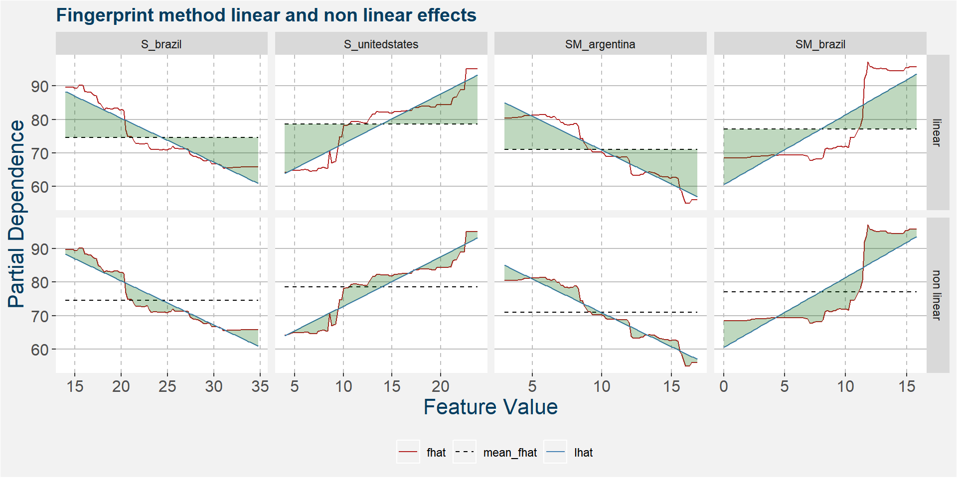
The table below shows the normalised ranked shaded areas of the plot above. Below we can see that the linear effects dominate.
| feature | effect | value |
|---|---|---|
| SM_brazil | linear | 8.33 |
| S_unitedstates | linear | 7.39 |
| SM_argentina | linear | 7.08 |
| S_brazil | linear | 6.91 |
| SM_brazil | non linear | 5.41 |
| S_unitedstates | non linear | 2.61 |
| S_brazil | non linear | 2.32 |
| SM_argentina | non linear | 1.74 |
Q
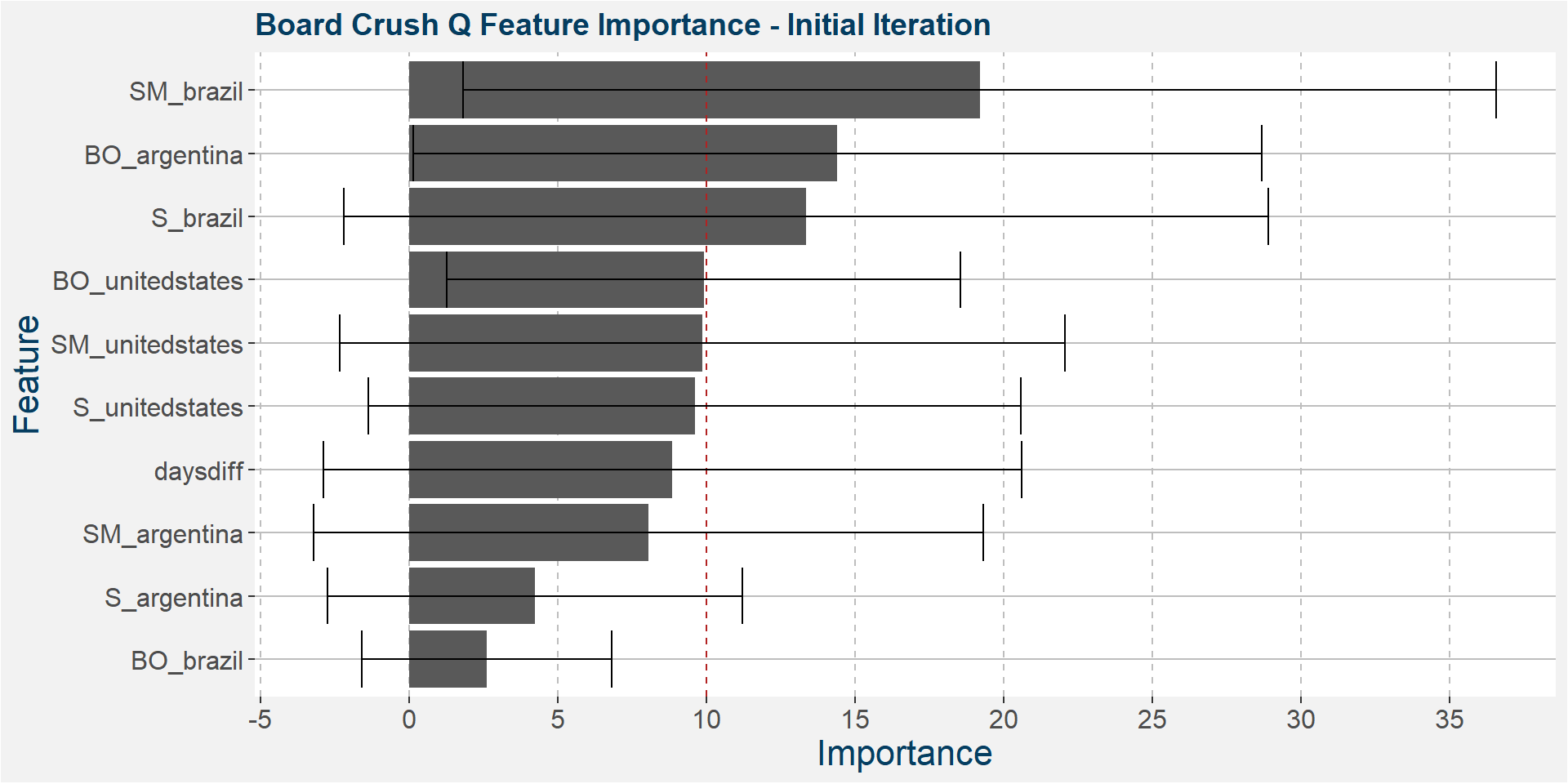
The plot below shows the average feature importance associated with each of the input features. The error bars represent one standard deviation away from the means. The red vertical bar shows the value of importnace for which all the features will have the same importance. As a general rule of thumb, only those features with importances greater than this threshold value will give significant contributions to the model predictions.
Below we see that the South American dominance in the predictive qualities remain.
The plot below shows the evolution of the model performance metrics for each iteration. Below we see that all three performance measures breaks down after the 7th iteration.
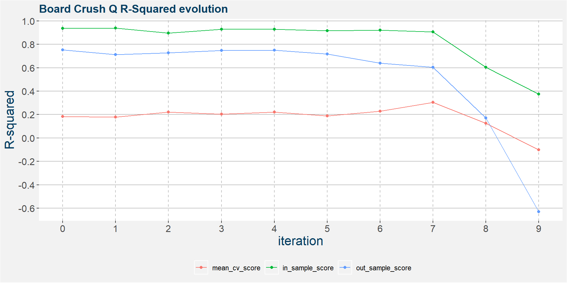
In the 6th iteration above we have
- SM_brazil
- BO_argentina
- S_unitedstates
- SM_unitedstates
ramaining as the main predictive features without much of a loss in performance statistics from the full feature model. In the plot below we show the scatter plots of the board crush as a function of these input features.
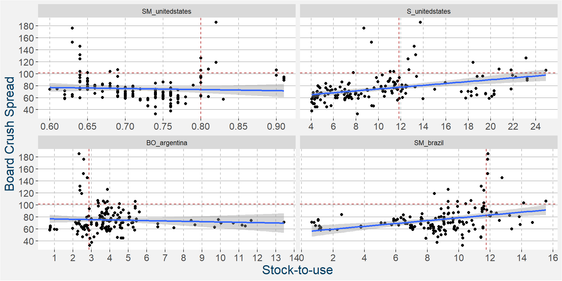
The plot below shows the linear and non linear effects as captured by the fingerprint method on the 3 dominant features above. These effects can be measured and compared by the shaded areas in the facet plot below. The greater the shaded area the greater the effect.
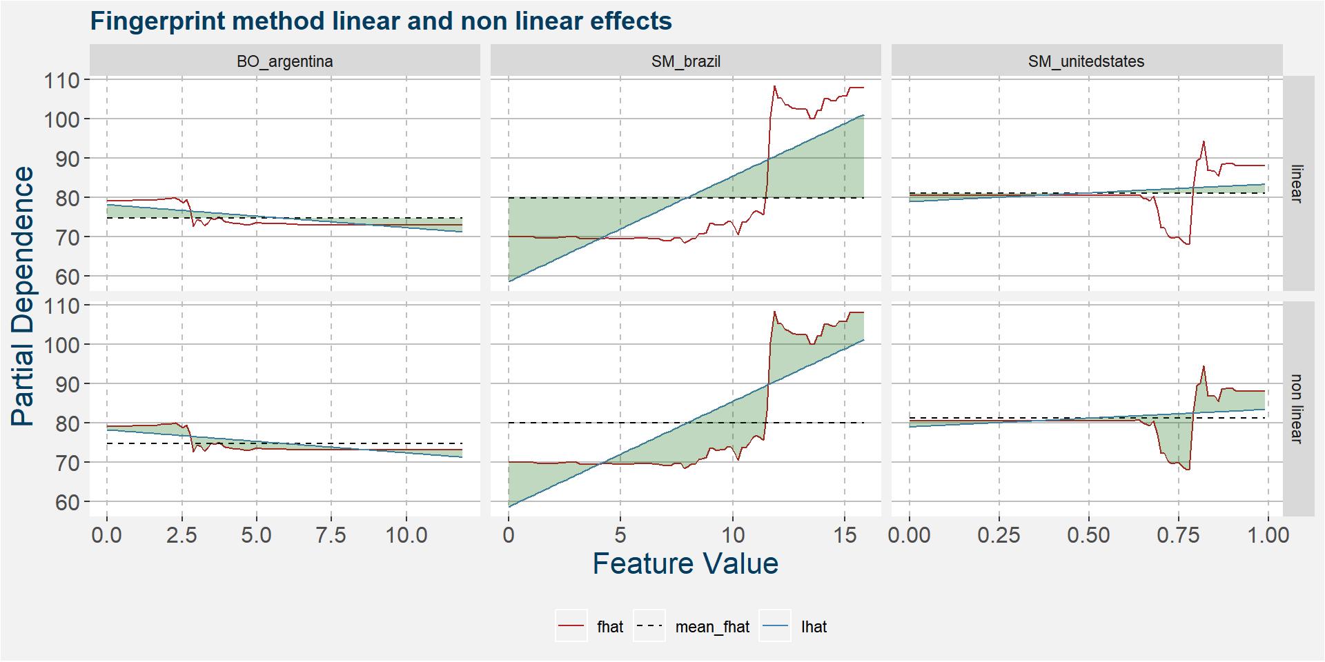
The table below shows the normalised ranked shaded areas of the plot above. The model has strong linear and non linear effect present in the form of Brazilian soybean meal stocks.
| feature | effect | value |
|---|---|---|
| SM_brazil | linear | 10.76 |
| SM_brazil | non linear | 7.82 |
| SM_unitedstates | non linear | 2.82 |
| BO_argentina | linear | 1.76 |
| BO_argentina | non linear | 1.42 |
| SM_unitedstates | linear | 1.12 |
U
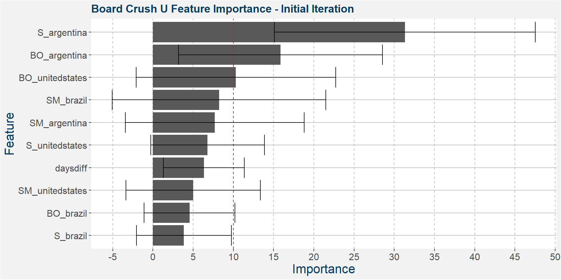
The plot below shows the average feature importance associated with each of the input features. The error bars represent one standard deviation away from the means. The red vertical bar shows the value of importnace for which all the features will have the same importance. As a general rule of thumb, only those features with importances greater than this threshold value will give significant contributions to the model predictions.
Argentine soybean stocks dominate the predictive performance. Even when looking at the bottom error bar it still remains in the top of the predictive features.
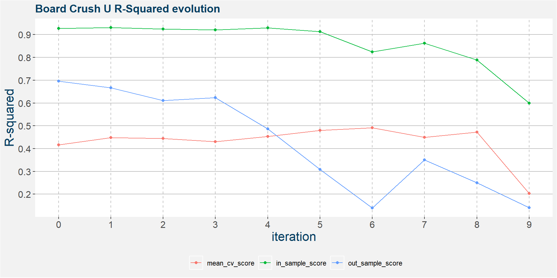
The plot below shows the evolution of the model performance metrics for each iteration. Below we see that out of sample performance steadily breaks down from the first iteration onwards. The out of sample model with iteration greater than 3 should not be used for forecasts.
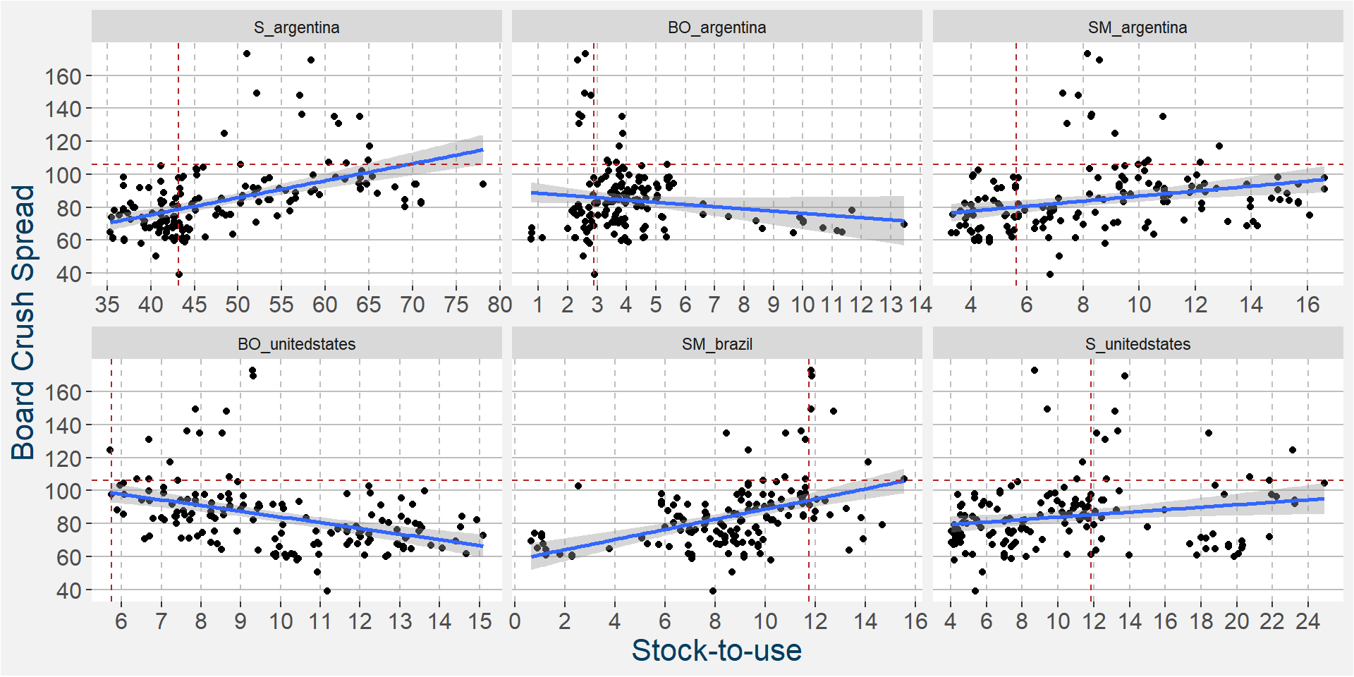
In the 1st iteration above we have
- S_argentina
- BO_argentina
- SM_argentina
- BO_unitedstates
- SM_brazil
- S_unitedstates
- daysdiff – so there might be elements of seasonality present in the model
ramaining as the main predictive features without much of a loss in performance statistics from the full feature model. Here only Brazilian soybean oil has been removed. In the plot below we show the scatter plots of the board crush as a function of these input features. The soybean oil stocks of Argentina and the United States are the first of the main predictive features we have studied, so far, that have a best fit linear trends with a negative slopes.
The plot below shows the linear and non linear effects as captured by the fingerprint method on the dominant features above. These effects can be measured and compared by the shaded areas in the facet plot below. The greater the shaded area the greater the effect.
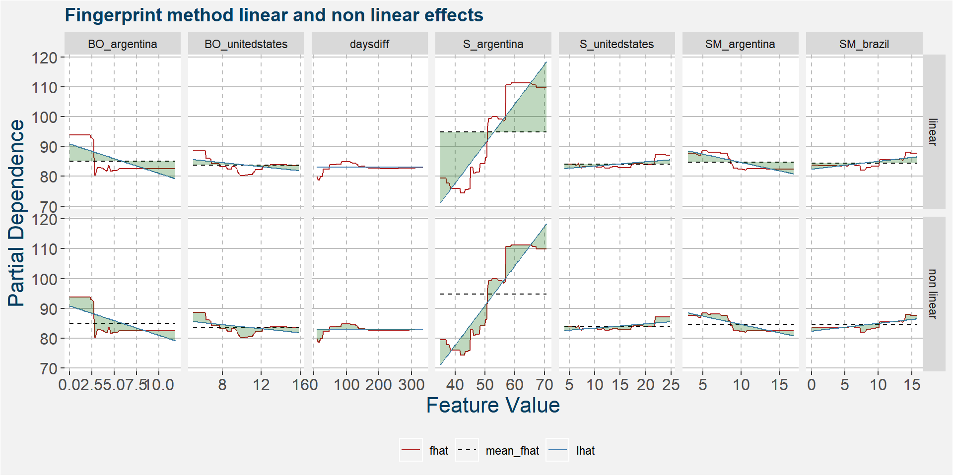
The table below shows the normalised ranked shaded areas of the plot above. The linear contribution from Argentine soybean stock is the dominate feature.
| feature | effect | value |
|---|---|---|
| S_argentina | linear | 11.90 |
| S_argentina | non linear | 4.75 |
| BO_argentina | linear | 2.95 |
| BO_argentina | non linear | 2.87 |
| SM_argentina | linear | 1.95 |
| BO_unitedstates | non linear | 1.71 |
| SM_argentina | non linear | 1.14 |
| SM_brazil | linear | 1.05 |
| S_unitedstates | non linear | 0.93 |
| BO_unitedstates | linear | 0.93 |
| daysdiff | non linear | 0.78 |
| SM_brazil | non linear | 0.77 |
| S_unitedstates | linear | 0.75 |
| daysdiff | linear | 0.00 |
V
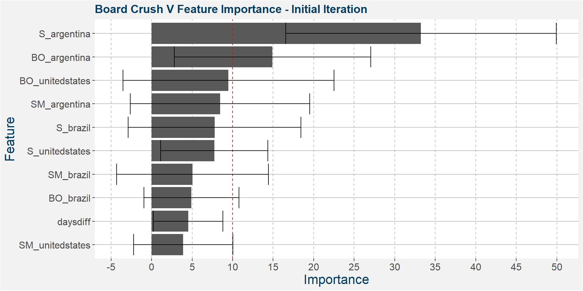
The plot below shows the average feature importance associated with each of the input features. The error bars represent one standard deviation away from the means. The red vertical bar shows the value of importnace for which all the features will have the same importance. As a general rule of thumb, only those features with importances greater than this threshold value will give significant contributions to the model predictions.
Below we see that the V board crush spread is dominated by the Argentine soybean stock-to-usage numbers.
The plot below shows the evolution of the model performance metrics for each iteration. In and out of sample results pretty stable up to the 7th iteration.
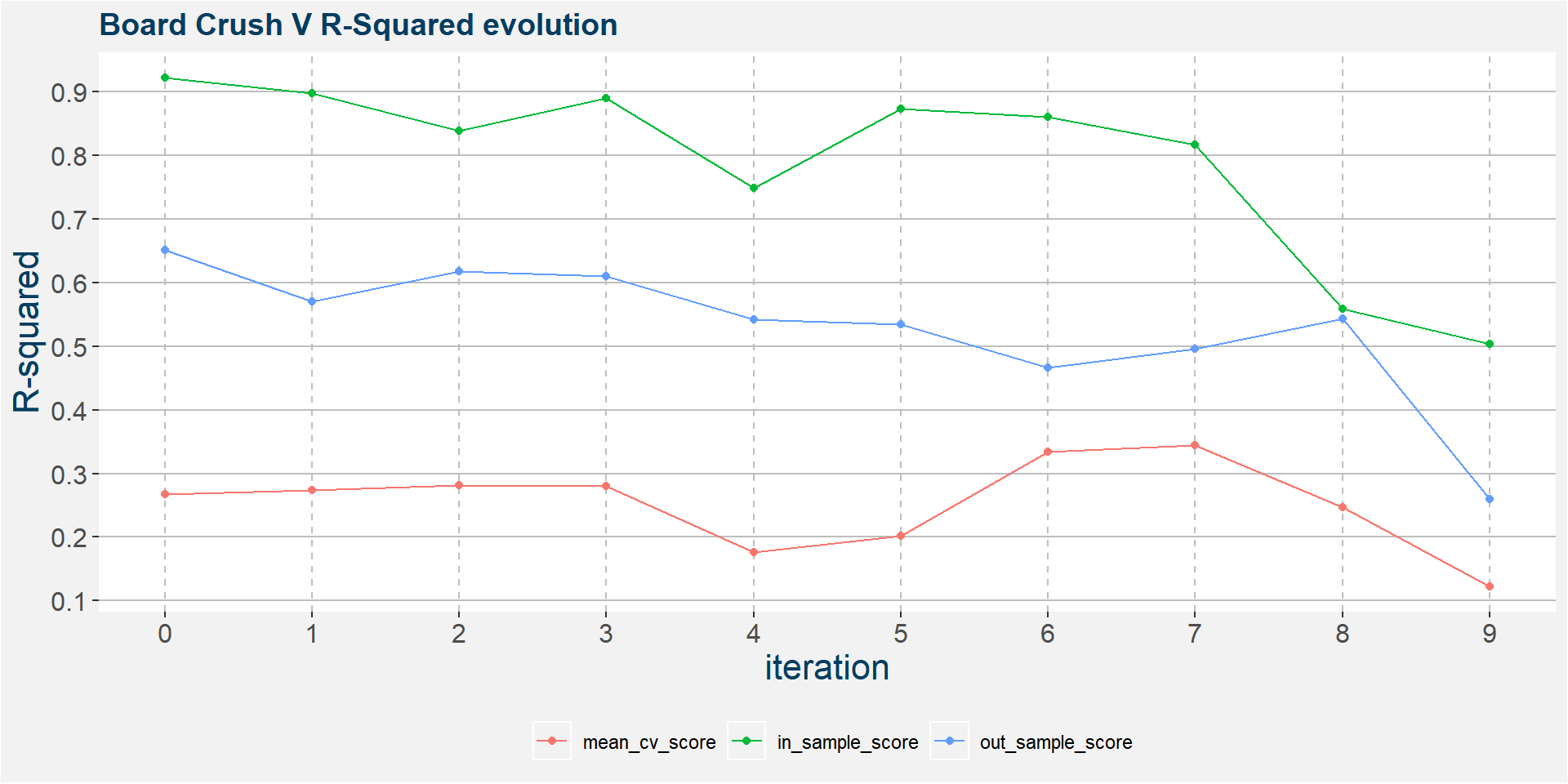
In the 6th iteration above we have
- S_argentina
- BO_unitedstates
- BO_argentina
- S_unitedstates
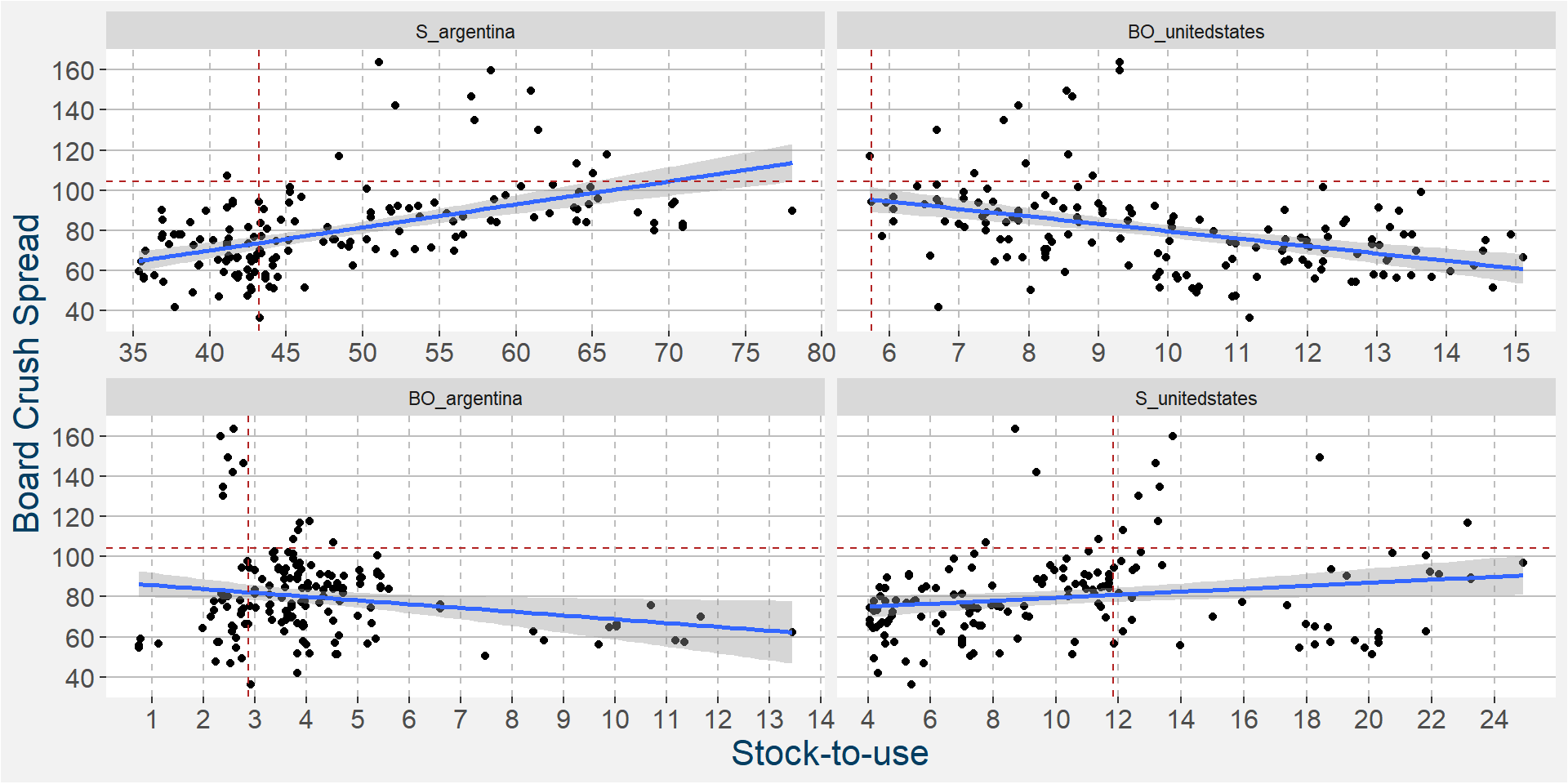
as the top four predictive features. In the plot below we show the scatter plots of the board crush as a function of these input features.
The plot below shows the linear and non linear effects as captured by the fingerprint method on the dominant features above. These effects can be measured and compared by the shaded areas in the facet plot below. The greater the shaded area the greater the effect.
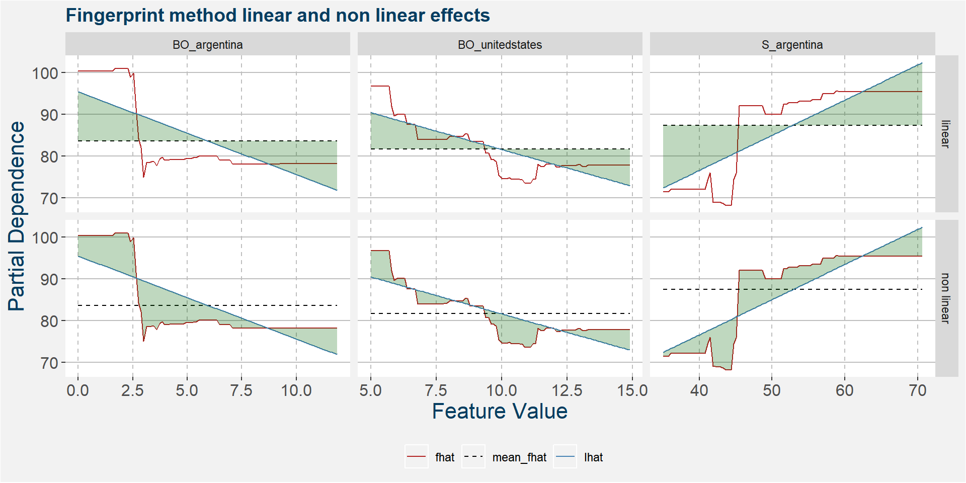
The table below shows the normalised ranked shaded areas of the plot above.
| feature | effect | value |
|---|---|---|
| S_argentina | linear | 7.57 |
| BO_argentina | linear | 5.95 |
| BO_argentina | non linear | 5.08 |
| S_argentina | non linear | 4.64 |
| BO_unitedstates | linear | 4.42 |
| BO_unitedstates | non linear | 2.80 |
Z
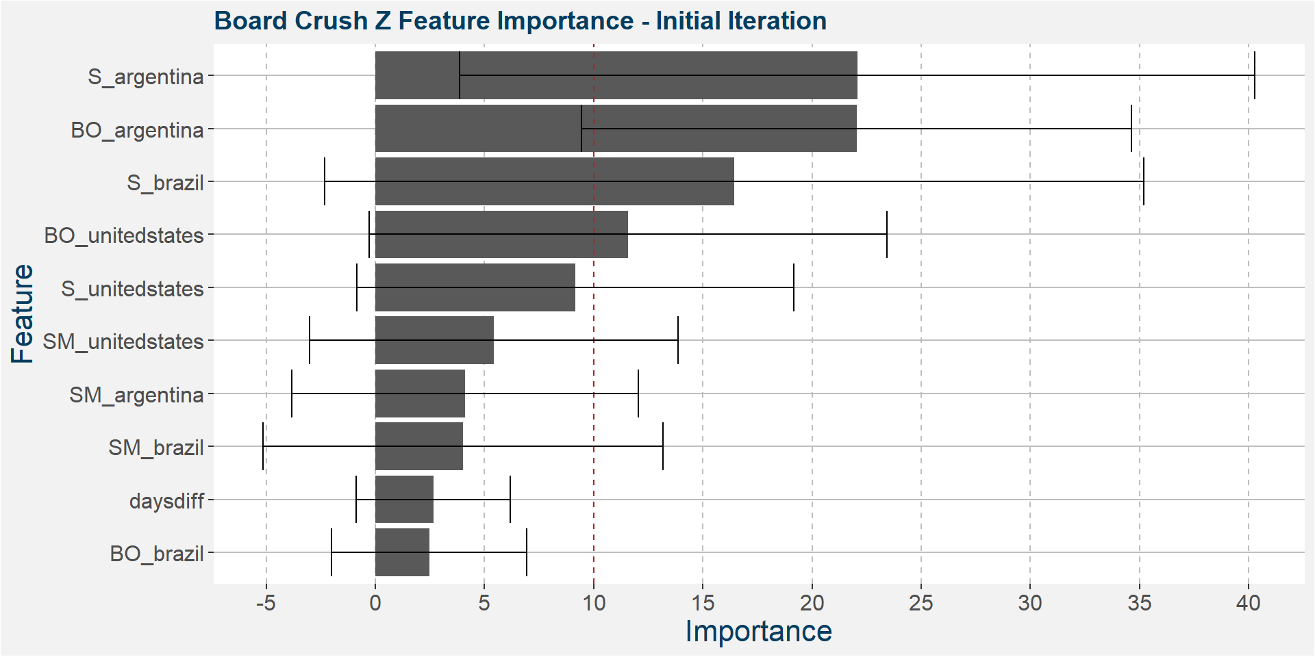
The plot below shows the average feature importance associated with each of the input features. The error bars represent one standard deviation away from the means. The red vertical bar shows the value of importnace for which all the features will have the same importance. As a general rule of thumb, only those features with importances greater than this threshold value will give significant contributions to the model predictions.
Below we see that the Z board crush spread is dominated by South America.
The plot below shows the evolution of the model performance metrics for each iteration. Below we see that the out of sample performance statistics is pretty bad from the onset. However, we can find an elbow in the in sample statistics around the 6th iteration.
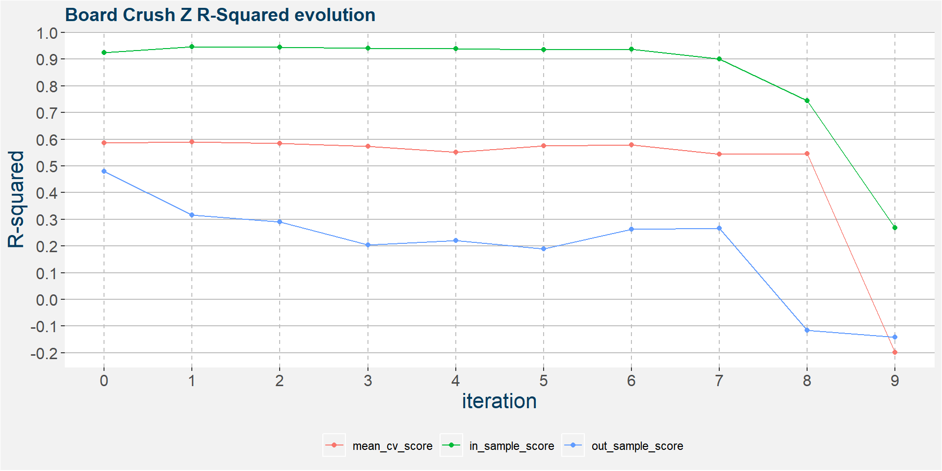
In the 6th iteration above we have
- BO_argentina
- S_argentina
- S_brazil
- BO_unitedstates
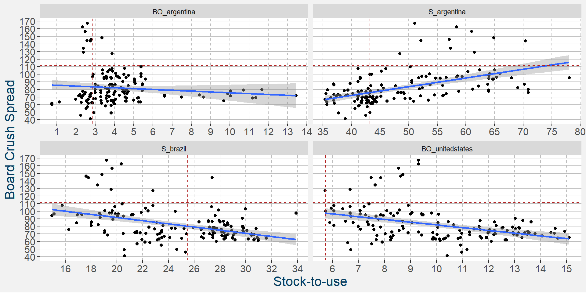
as the top four predictive features. In the plot below we show the scatter plots of the board crush as a function of these input features. In the linear regressions below we again see positve correlations with the four main predictive features.
The plot below shows the linear and non linear effects as captured by the fingerprint method on the dominant features above. These effects can be measured and compared by the shaded areas in the facet plot below. The greater the shaded area the greater the effect.
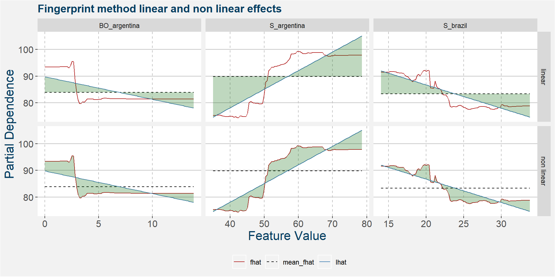
The table below shows the normalised ranked shaded areas of the plot above.
| feature | effect | value |
|---|---|---|
| S_argentina | linear | 7.71 |
| S_brazil | linear | 4.39 |
| S_argentina | non linear | 4.09 |
| BO_argentina | non linear | 3.03 |
| BO_argentina | linear | 2.97 |
| S_brazil | non linear | 2.18 |
What have we learned so far
- South American stock-to-usage numbers dominate the feature importances
- The predictive features show a mix between positive and negative correlations with the board crush spread
- Positive correlation with Argentine soybean stocks
- Negative correlation with Brazilian soybean stocks
- Is there a fundamental reason for this behaviour?
- Out of sample performance statistics from F through V is good, but the Z model doesn’t perform well out of sample.